[We’ve just put out a quick bump to 0.10.9 to include a few fixes. Notes below apply to 0.10.8 and 0.10.9]
Lots of great changes have been added by our growing team of contributors as highlighted below. If you want to join the team come and say hello at the team discussion on Matrix
Updates should appear on TestFlight and Play Store today.
v0.10.9 Release
iOS:
- App Store - preview release as 0.10.7(32)
- TestFlight (will be visible later today)
Android:
- GitHub
- Play Store
- If you want to stay up to date with the latest releases before it gets on Play Store or F-Droid, checkout Obtainium
Hey everyone! I know it’s been a few days since we’ve released but we’ve got a feature packed release today! Thanks to all our users and the continued feedback, keep it coming!
Change log
- Added MP4 and some redgif support (jjcomer)
- Added swipe gesture actions! (shocklateboy92)
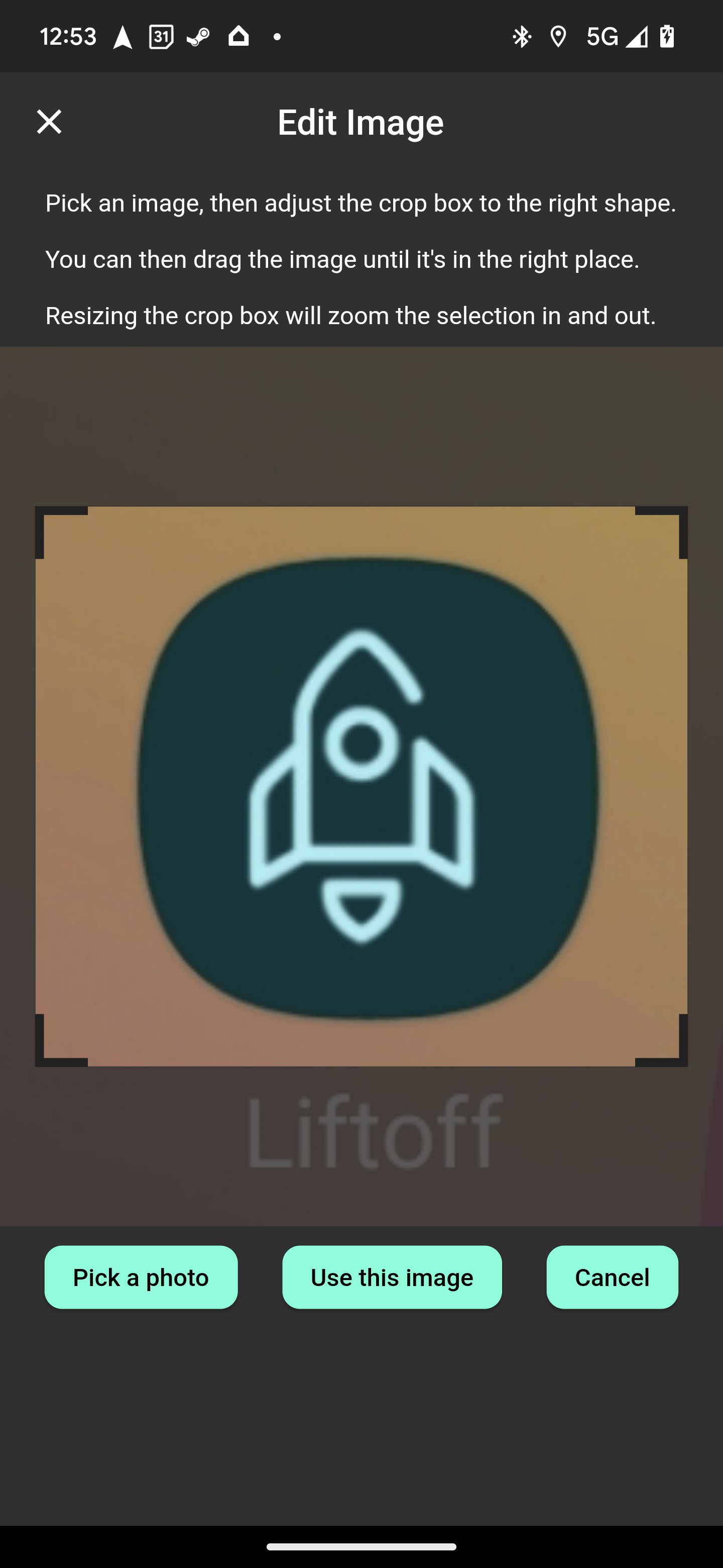
- Added photo cropping before upload! (mykdavies)
- Added code of conduct and tweaks for iOS release (mykdavies)
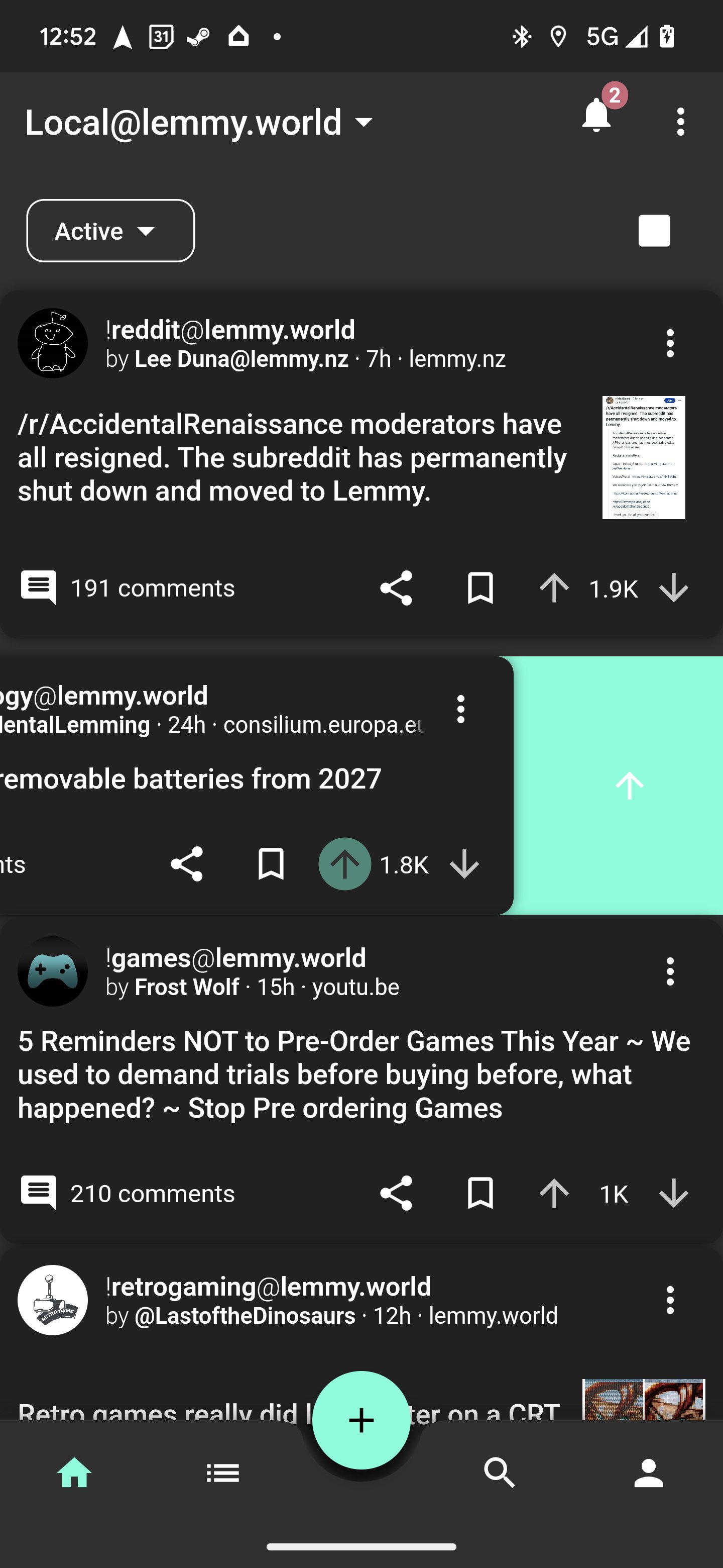
- Redesign of home tab and themes colors (swmarks & a_minh)
- Fixed alignment of post pills/chips (mykdavies)
- Redesign of compact view to be more compact (zachatrocity)
- Added help text on account page to help guide the user (mykdavies)
- Added RU (asher) and EO (mykdavies) language localisations
- Tons of bug fixes!
Screenshots
Known Issues
- We hear your concerns about dark mode and will address these.
- Swipe actions against posts don’t always update the post’s icons.
What’s coming
- iOS and Android full release! We’ll keep test flight and early access going for beta testers!
You must log in or register to comment.
Would it be possible to have an option to turn off gesture navigation entirely?
This feels way faster. Idky but thanks so much.
In the future add the ability to change sorting of posts in threads. Thank you for your work it is great
Thank you for another great update. Can’t wait to see how this app ends up 😁
Personal preference I guess but I preferred the greyer UI. I find the text easier to read on a lighter background. Be cool to have an option to change the background colours as well.
This is awesome, you’re getting on so fast!
One thought - I wonder if dark mode is a little too dark, could maybe do with being slightly grey/blue and have post shadows off by default (but on in light mode). Love the green dividers in amold mode!
Best Lemmy app by far!
Awesome keep up the great updates!
Added MP4 and some redgif support (jjcomer)
Thank you!
deleted by creator
What’s the difference between v7a and v8a?
It’s the CPU architecture the app was compiled for. The biggest difference is that ARMv7 is 32 bits, and ARMv8 is 64 bits.
Great update, but I am not a fan of swipe actions. Could you add an option to disable the feature? Maybe I’m blind and just stupid but I could not find this option in this release.
I’m going to join the gang of dark mode is too dark.
I see that it splits the comments in half, so maybe if it is possible to add a grey mode that looks like the old dark mode, both sides could be happy.
I use dark mode as much as possible, but this dark mode is migraine inducing to me due to the white on black colorscheme.We’ll add back the grey mode
Please allow users to choose, I really like the current dark theme. Maybe allow users to change all the colors, not just the accent?
Awesome! Thank you. <3
Yay! I picked Liftoff because it was so much better looking than all those other harsh black apps. This is very happy news to wake up to 🥳
will there be a fix for the sorting in our profiles not working? if you click sort by new, it does nothing :/
p.s: thanks for adding the save post button back in 0.10.9 - saving post works great now.
Great update. Thanks for it!
Thanks for the update!
I just can’t decide which app to use. they all have things I like and update so frequently
Yeah same. I like Jerboa, Liftoff, Connect, Thunder. Summit has potential too.