
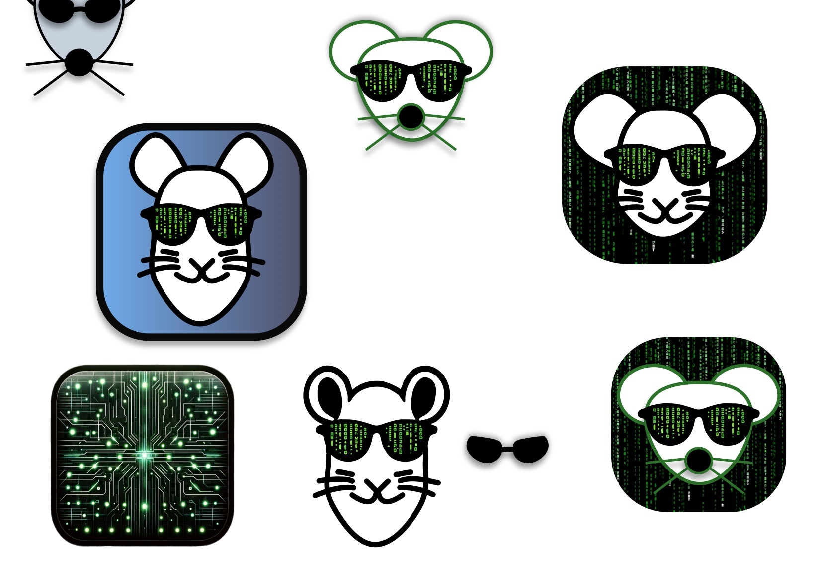
Bottom right looks really good
I like the shape of the upper right Lemmy the best
I like the one in the upper middle.
Big fan of top middle. That lil guy has some sas.
I like it too but I like the bottom right even more because of the added background
Bottom left is what I like best. Not a fan of faces/mascots for app icons.
Sorry. I don’t like any of them compared to the already existing ones…. By all means though it doesn’t mean you should stop, quite the opposite keep going
Upper right seems pretty good proportionally.
Bottom right seems most fitting.
Bottom right is the only one I like. It keeps the traditional Lemmy mascot character shape.
I should probably do a spin taking the current mascot and just add the matrix sunglasses
Yep I like that one as well
The Matrix is a little 1999, isn’t it?
Haha I’m old but I like it


