

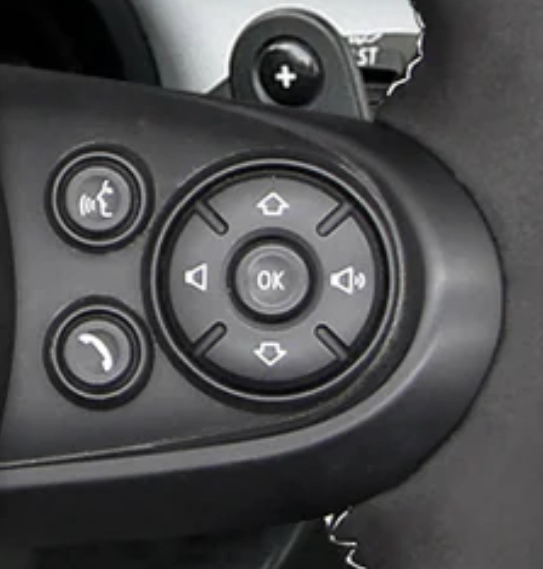
Think of it like this. Up arrow is forward and the down arrow is back. The volume then increases from left to right like most linear scales (that aren’t up and down). Yes the buttons should be the other way but there was probably some (poor) reasoning to why they are this way.
As someone mentioned in the comments, it might be because the media is displayed as a vertical list on the car’s display.
Is it a Japanese car?
explain?
I have a Mazda CX-5. The track seek buttons are counterintuitive IMO, and the Adaptive Cruise distance buttons are too.
Next track is UP, previous track is DOWN. Not like going down a list.
Adaptive Cruise control is UP to increase distance, DOWN to decrease. This seems like it would make sense, but I would prefer it the other way. UP to get closer, DOWN to pull back the distance
Hey, at least it’s not a touch screen :)
Nailed it. Even the worst interface with buttons is miles away from the best touchscreen interface. You are like driving, you aren’t supposed to look at the screen and tap things on it to switch a song or whatever. You navigate a missile that weights at least two tones and can undo a crowd of pedestrians or break a wall in a building. You are in no position to focus on this tiny LED that some insane idiot mounted there. Yet, it’s there.
I have done some research into cars, some Skoda Octavias now have the issue of the infotainment just freezing on you, now thats where you control all climate and stuff imagine getting into the car you set the AC to strong and then that shit freezes and you are stuck with your AC on max freezing you up, well actually you don’t have to imagine that’s exactly what happened, lol
Of all brends, in Skoda? I thought they are promoted as a reliable budget carmaker. That’s idiotic.
cue in the end shot from The Shining, of a guy frozen to death, but behind the wheel
They are part of VAG so kind of a meh brand imo, it’s only good if you are in a country with lots of Skodas so you have access to cheap parts. I prefer Hyundai/Kia though I know they have a terrible reputation in the USA, they often top reliability in Europe.
Rotate the
controlsthe whole car 90 degrees CCW.It’s on the steering wheel. He can just steer and that solves the problem.
Yep, steer perpetually to the left. Maybe play Beyonce in the background.
I want to know why do many cars don’t have a play/pause button on the wheel, but do have a source button.
I change my source from my phone exactly never. I want to pause the audio all the time.
I’ve been wishing for play pause since audio books and podcasts came into the world. It’s ridiculous that nobody has this button in 2024
My Jeep has it and it’s from 2018.
bro I swear whoever designs the interfaces in cars must be the CEO’s nephew
deleted by creator
My Hundyai has a programmable star button on the steering wheel that can be tied to media on/off.
Fully remappable steering wheel buttons is a great idea.
My Tesla has one, but I haven’t yet figured out what best to do with it. The current leading contender is wipers - auto wipers are not sufficient. Also I hesitate to rely on and get used to primary co trol in custom places
Kia also.
I change the source regularly between my phone and the radio, but I don’t use any of the wheel buttons, so I’m not even sure if my car has a source button on it.
I would risk life and limb to crack that open and find a way to right this wrong.
So my question is, which is next: up or down?
I was confused first too when my car had the same kind of control for media. It’s completely logical when you take a look on the playlist on your phone.
I believe my Prius is up for next, as in go to the next highest index song.
Both make sense, so in a way neither do
Gen 2 Prius had both left and right, with the volume clearly labeled as up to the right
Down
Fucking Christ that is stupid. That would drive me insane.
…drive me
I see you
Wouldn’t it be nice if an engineer had decision making power?
You mean a designer right? Developers and engineers are the ones making these weird decisions
Managers make weird decisions, engineers and developers just do what they’re told when it comes to user facing experiences.
Yeah engineer, developer, and designer all give their input. Designer proposal is likely the most user friendly, but, changes come with real tangible engineering / development costs. Manager says “ok stick with what we have, it’s cheaper.”
I’m a software engineer and UX designer.
Being in both those roles can sometimes be incredibly frustrating. Like “yes, this is the best solution for users. It helps dev by being more future proof, using more common patterns with more readily available open source software. It will take considerable dev time so we should do it now rather than later. If we don’t do this now it will just lead to more technical debt and a worse experience”
CTO: “sounds expensive, let’s not do it”
A year later, CTO: “why is this so convoluted? Shouldn’t we have worked on these changes earlier?”
suprised_pikachu.jpg
As an engineer with a boss I really do not like and who makes moronic decisions ALL the time (that I then have to go along with), I agree
Engineer here. It’s like that because that’s the way it’s always been. To change it would mean retooling silk-screen printing on the D-pad, and changing the wiring underneath. And they probably use this D-pad everywhere, so someone like me will have to talk to someone else like me, and right now I have phone shyness (can’t just be an email, have to call a meeting). I’ll also have to talk to a supplier and get them to change the wiring, and Procurement won’t let me just change anything, because it gives suppliers a chance to requote a job, and they’ll ask for more money. And then I’ll have to talk to Production, because they’ll have to retrain the workers, make sure someone doesn’t stop the line because this new part doesn’t look exactly like the old part. Oh, and Quality of course, need to make sure the inspectors don’t start rejecting the new parts (just kidding, they never look at parts). Then there’s Marketing. Since this is a customer-facing part, definitely need their input. Might have to change catalogs and brochures with new pictures.
No, they just got the good brand of gummy bears in the cafeteria, I’m going to go buy a bag of those, and then fill out these forms my new boss has been asking about. New boss, new forms, same old shit.
deleted by creator
Sounds like a proper project to me. No wonder companies keep the same stuff for way too long. If it’s not horribly broken and on fire, don’t fix it. Being slightly broken is apparently totally fine though.
Remapping gpio pins doesn’t require changing wiring, but it might require tracking a unique firmware revision.
Nothing personal, but that’s bullshit on the company. Rotate the entire assembly 90° to the direction where the next track arrow points right, and counter rotate the ok gel button so that it’s properly up and down. I can’t imagine a silk screen template is that engrained. There might be some mounting screw difference, but adjust that in manufacturing from your parts suppliers. No reengineering of the harness necessary. This is just pure laziness.
You have allready missed details, this would be worse than before.
For two reasons:
The customers who are used to this scheme will have to relearn the button placement, this will generate complaints, so the change will generate bad PR for the brand for years as people upgrade their car and have to relearn the controls.
If we went with your suggestion, the volume buttons would be 90 degrees off.
that’s the way it’s always been!
Made by people that use a volume slider and swipe for next… Such a horrible design in cars.
Clearly you’re meant to have the car on its side before playing any media
True. On its left side.
Well it is a Japanese car, and they drive on the left side in Japan
British car
Still left side
People actually use the steering wheel controls??? I use the cruise buttons but that’s it
I mean… that’s what they’re there for.
I mean… Yes? If there’s a way to do something without having to take my hands off the steering wheel I’ll use that
Preach! When did you ever hear someone say “please turn the volume right” or “can you play the up track”? It drives (NPI) me crazy in my Toyotas!
I’m lucky that my Subaru has it right. Left right are back forward and up down is volume. My only complaint is that the button in the middle is mute, rather than pause. I can pause CDs, bluetooth audio, and even live radio. Why in hell would I ever choose mute over pause?
yea Subaru does have it right. i was driving a Corolla and the buttons don’t even control the touch screen at all i don’t even know why they are there.
Why have a mute button when you could turn the radio off?
Because resuming from mute or pause has less delay. Particularly if using a CD or bluetooth audio.
I drove this make of car for a while; there’s an optional head up display where the up and down buttons here let you cycle through contacts/the song queue/radio stations. I’d imagine it’s the same interface without it, just displayed somewhere in the car where you’re not looking while driving.
Having it so that up/down moves you up/down through the list when there’s a visual display is way more intuitive than up/down being volume - frankly the volume bar on Windows, Mac, many TVs etc. goes from left (quiet) to right (loud) anyway


