

And no, I will not tell you what my company app is.
You must log in or register to comment.
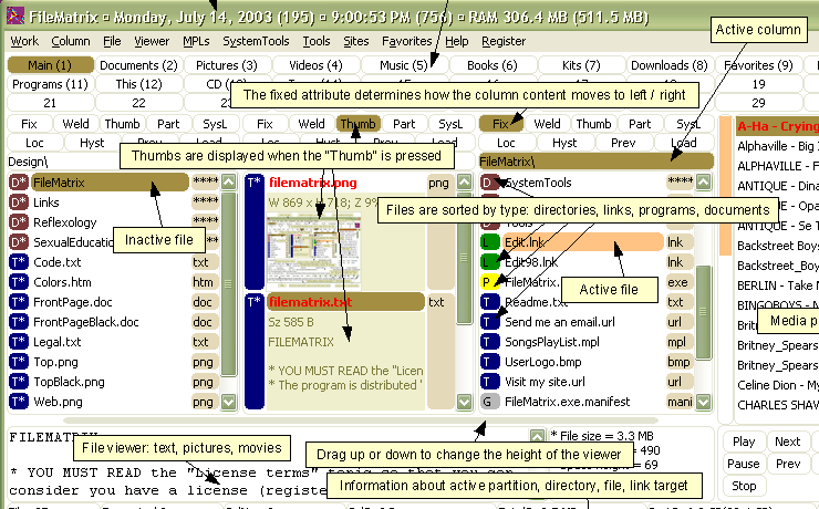
But our power users!!
This is giving me CICS interface flashbacks. Anyone who worked retail or call centre or adjacent 20+ years ago probably remembers getting really good at using these kind of bespoke CMS front-ends (Bell folks might “fondly” remember ARICS and BCRIS).
Yay, options.
Ohh its easy. Its sap
Cries in Arriba guided Buying
more checkboxes == more better

I don’t understand, what did poor codecs and bitrates do wrong to deserve such harsh treatment, viciously denied checkbox privileges forever destined to a pleb drop-down menu :'(
I actually kinda like that one.
Those are radio buttons, tho. But nice work with fieldsets 👍
Oh god I know 3rd party encoders like this from from my tape flipping days. They’re some sort of dark sorcery you never question. Just press “will try to play or encode” and then make the appropriate sacrifice at your altar.
Why is there a radio box for RealProducer if you may select FFmpeg or MEncoder? 🤔
I loved making interfaces like that for internal systems in the past. I’d find a way to put everything relevant on the screen and able to be read or interacted with any time it’s necessary. I also had it flow top to bottom and left to right, because there was typically a physical process step associated with that station.
hey this thing was great back in the day
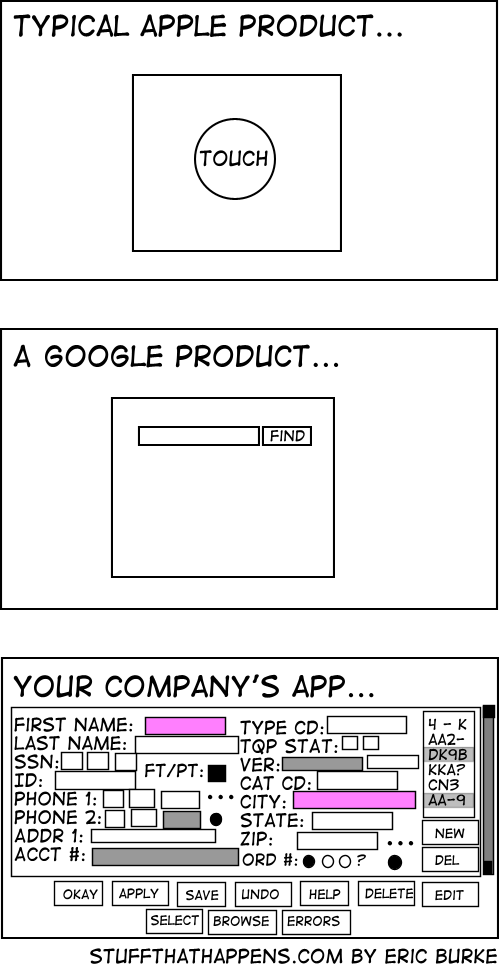
People at my company are like “why are we wasting screen real estate with white space?” and I imagine they see the last image is an ideal UX
For the first two you need hoops and tricks for it to do what you want, the last one has bad UX. I choose the later.
yeah. usability > UX
The last example has neither.
I would argue that the first two require you to jump through hoops for edge cases, while the last one requires you to jump through hoops for every case.
If I’m going to jump through hoops anyway I’d like some degree of control over the experience.
What control do you have in either experience?
Without knowing what the user is actually doing, that’s impossible to know. If the user has to input all those fields on a regular basis, then that one screen is the superior UX.
You’re right, but:
I beginner friendly UX is a safer bet. Besides, if a user has to manually enter all those fields (assuming it continues off screen) then that’s a job for a machine, not a human. Large data input jobs are dehumanizing.
Unless you’ve actually done the user research, you have no idea if a “beginner friendly UX is a safer bet” . It’s just a guess. Sometimes it’s a good guess. Sometimes it’s not. The correct answer is always “it depends”.
Hell, whether or not a form full of fields is or isn’t “beginner” friendly is even debatable given the world “beginner” is context-specific. Without knowing who that user is, their background, their training, and the work context, you have no way of knowing for sure. You just have a bunch of assumptions you’re making.
As for the rest, human data entry that cannot be automated is incredibly common, regardless of your personal feelings about it. If you’ve walked into a government office, healthcare setting, legal setting, etc, and had someone ask you a bunch of questions, you might be surprised to hear that the odds are very good that human was punching your answers into a computer.
There are more beginners then there are experts, so in the absence of research a beginner UI is a safer bet.
And yes, if you definite “beginner” to be someone with expert training and experience, then yes an expert UI would be better for that “beginner”. What a strange way to define “beginner” though.
There are more beginners then there are experts, so in the absence of research a beginner UI is a safer bet.
If you’re in the business of creating high quality UX, and you’re building a UI without even the most basic research–understanding your target user–you’ve already failed.
And yes, if you definite “beginner” to be someone with expert training and experience, then yes an expert UI would be better for that “beginner”. What a strange way to define “beginner” though.
If I’m building a product that’s targeting software developers, a “beginner” has a very different definition than if I’m targeting grade school children, and the UX considerations will be vastly different.
This is, like, first principles of product development stuff, here.
Apple/Google/Other Companies way, way over-do this. Clean, modern design is one thing, but avoiding all text, making things too small to see, and being unable to tell which option is highlighted, etc, all at the expense of the actual UX is such an annoying trend and I’ll never like it.
I’m a Millennial so of course I don’t have a lawn, but get off it anyway…
I don’t necessarily agree that they way overdo it, but I do agree those are all examples of bad UX design.
The flipside is that all of the stuff you actually use is buried five levels deep.
And the flip side of that is that the stuff you actually use is spread over 5 pages worth of scrolling and requires you to read like 100 labels until you find the text boxes you want
We’re currently trying to convince our client, that 4 different levels “mandatory” fields in a form are about two too many.
The UI they sketched looks like shit, but they think it’s absolutely necessary.
But there was this one customer, where it was so helpful to know he’s left handed. So now this is a necessary information /s
And then the logging shows that nobody uses half the fields, but the business won’t let you remove any.
They’re right
I worked for a big Euro bank for a bit and that was exactly it. JS timeouts were forbidden, so no animation to tell you something was finished, you had to keep clicking a Refresh button to know. In 2022.
And the colleagues who had been there a few years were actually defending this shit. Stockholm Syndrome is what it is. There wasn’t a day I didn’t complain about their piece of garbage of an intranet.
I’m so glad it’s behind me.Good.
You need all that information, but no more. This allows me to efficiently supply it, properly formatted, and to supply no more. Assuming this is using standard widgets instead of reinvented ones, the only better thing would be an API so we can roll our own form or automate.
The FAANG approach relies on an army of people to do the data entry equivalent of mind reading, or invasiveness, or both, and all so that you have to look at a few less boxes for a minute.
Honestly, I’d rather have an ugly app with everything right there than the terrible UX trend that’s happening of everything being hidden behind 8-10 different menus just to make the home screen “clean”
We’ve removed critical functionality from the operating system because our boss didn’t want more than 6 buttons on screen at any time. Sorry the system is 100x more difficult to use!
It would be hilarious if all these apps were secretly just like vim. They all have complex hotkey setups that enable power users to get where they need to be in at most 3 key presses.
And the unititiated has to google to find where their god damn setting is actually located.
Honestly that would be great.
Very often they do. Many of these internal applications are from mainframe computer times when interacting with applications exclusively via the keyboard shortcuts was the norm. In most companies, they never dared to remove those because the Power Users are used to them for decades.
Problem is, few people are trained directly by those power users so they never learn those efficient shortcuts. And they are never well documented.
One of my favorite extensions is vimium. It enables vim like navigation on web browsers. If you press ? It brings up a menu showing all the key bindings, it’s very helpful. Adding that and a hotkey highlighter would be a good way to document such programs. It’s too bad that sort of thing isnt a priority
On the one hand most power users feel this way. On the other hand power users probably aren’t the majority of users (although it depends on the product).
The trend definitely comes from the fact that new people get overwhelmed by cluttered user interfaces. But just having a clean initial screen doesn’t mean good UX. Good UX is the art of providing a clean, logical user interface that’s simple and efficient to use. Unfortunately, too many companies just go for minimalism and wind up with things both taking longer and ending up being harder to use.
Yeah, or like having a separate screen for entering your username and one for entering your password …
Gave me flashbacks to my time working with Philips’ Tasy system in 2017.
By now they’ve surely finished implementing their HTML5 system which was somewhat better, but back then it was still a desktop app made using Delphi and Java, and it was basically as unsightly and unwieldy as the example in the meme lol
I am getting flashbacks on dealing with SAP “inspired” software that looked worse than that bottom image. I am glad my new company does not use that garbage. It was especially depressing to see how SAP entirely ruined Concur.
Wrong, the google product is dead
And the Apple product would probable say “gloat about me to your friends”
And it was one they bought, just to kill it… Google: the sadist of the tech world.
Ngl I prefer said company app rather than “new” stuff which runs on Electron and breaks just from looking at it
Fuuuuuuuuck Electron
This is not true. Literally all of apples computers lack the touch feature on their primary screens.
Did you see the word “computer” somewhere in this image?
Every few months the layout gets reshuffled as well for no fucking reason.


