Wow, I’m glad Apple engineers finally figured out how to invent this feature. I can’t wait to be told at a keynote how bold, innovative, and courageous this is.
LOL
this is an unpopular opinion but i know the aesthetic reason for apple not implementing this for so long, and like eveything, it’s to make money.
android design is pretty good, but user created android phones home screens can often look pretty hateful, often with 4-6 screens of more empty space than icons, tons of widgets with an inconsistent design scheme, random half empty folders and a notification bar overcrowded with overshrunk icons. android phones often look like old Windows XP desktops—even on flagship distributions.
in contrast to google, apple cares what your phone looks like because they have a highly visual brand.
apple, by not allowing placement anywhere intentionally enforced a consistent top-left to bottom-right aesthetic which is now ubiquitous to the brand. among other design decisions, the result is that when you blur your eyes and look at a phone home screen you can tell whether it is apple or not.
- but the functionality is worse, yes i know.
- but it actually does look worse too, to you maybe, but not to apple. my belief is they did this for the same reason they put the magic mouse’s lighting port on the bottom (to keep users from always using it plugged in. which looks “ugly”).
the power of a strong and unmistakable brand is incomparable. in many cases, the value of a brand can even outperform raw product utility when it comes to customer satisfaction, a theory which i believe apple has been leveraging in this case very much intentionally despite the seeming paradox of utility.
edit: already getting downvoted to heck i should have known better than to be aware of basic marketing principles lol. i promise you im not defending apple im just explaining why they did this to make more money.
I have to disagree on one point – that iOS home screens somehow look more orderly because they’re full of icons arranged in a strict top-left-to-bottom-right fashion. It doesn’t look any less cluttered than an overly full Windows desktop.
I found desktops that limit themselves to core functionality and maybe a nice wallpaper to be better looking and more usable since the days of Windows 95 and that hasn’t changed since.
That “strict grid of icons” look certainly is uniform across iDevices and that’s what appeals to Apple but I never found it to be particularly attractive.
we actually agree on this point. i don’t argue they look more orderly i argue they look uniform across the ecosystem which was central to my thesis :)
I totally agree, and would argue that this enshittification for their own benefit began around the iPhone 4 and iOS 7. Things were beautiful to see in promotional videos but they wrecked years of visual conventions and features for aesthetics. The actively choose profits and aesthetics over their users.
I’d be shocked if they just cloned Android’s default functionality and called it a day. Like the App Library, they’re probably going to try to have a unique spin on it, and will try to address some of the user experience quirks that a lot of iOS users don’t like.
I’ll bet money that it’s going to be pre structured layouts that look nice, like the Apple Watch, with one layout being “go nuts.” A CMS template system for the Home Screen.
I actually overall like the App Library, I just hate that the categories shift around seemingly at random. But I slowly keep removing more apps from the Home Screen; at some point my goal is to get down to one Home Screen with my most used apps and everything else is in the App Library.
Im manifesting this 😭
i could definitely see that happening
The Magic Mouse thing is also about the battery, a battery kept plugged in all the time is more likely to swell.
It’s also about cable wear and tear. With a molded, fixed cable you can do proper boot and strain relief. A pluggable charge cable would be ribbons in like three months.
Wow… I never thought of the Magic Mouse thing, yet you’re entirely correct. Everyone would use it like that, and honestly it does look better without being plugged in (although everything else about it sucks, I hate that damn mouse)
thanks haha this is the first time ive brought up the mindset behind it without being called a shill or something 😭
i personally do like the magic mouse i like the lil touchpad on top but i can definitely see how it would suck weeeeeener for gaming or perhaps design applications, probably a lot more than those examples too
removed by mod
okay
Your explanation and the whole comment in general didn’t make me like and understand Apple. It made me understand and fiercely hate Apple products even more.
absolutely fair
You wrote all that and only used a single upper case letter. Impressive
i count at least three but thanks lol
Don’t second guess the willingness of an Apple-hater to spend that much time dissecting something bad Apple has done.
Your comment isn’t even that pro-Apple, and it’s much more generous towards Android’s design than you’d find on any other space titled apple_enthusiast.
And generally speaking isn’t that the exact reason they gave for not adding widgets right away? I thought this was more well known fact than an opinion.
i was getting close to -10 points for a second 😭 i guess the sane people that don’t just knee jerk vote were asleep
idk about the widgets lore i literally don’t follow apple at all i just happen to know about marketing and design stuff
I noticed lemmy to have way less reactionary voting compared to reddit. Your comment makes a lot of sense. Just look at this mess lol but at the end of the day it’s my phone and my mess.
Welcome to apple_enthusiast, where most of the comments seem to come from people that haven’t had iOS as a daily driver since the iPhone 3 or 4.
My gf has an iPhone 14 which I bought for her. I’ve had to use it several times and I hate the damn thing ¯\_(ツ)_/¯
What part? Genuinely curious as I enjoy both. Only thing I actively despise is the inability to natively use manual focus
For me it’s that and the lack of a default native keyboard with a number line!
The number line is very cool. I do miss that, as well as long-pressing any key to get the character located “behind” it.
The native keyboard is about the only thing I dislike on my iPhone. I switched from an Android 13 months ago. But when I used Android I did not use the native keyboard either.
I wish there was something solid like the zen phone 9 when I was looking to buy a new phone. I went with the iPhone 13 pro hoping it would last me at least 5 years, since Apple tends to be pretty good about their software longevity. I like android but I wasn’t about to switch to a Samsung because I just don’t like the weird “look we made our own app, now you have two browsers!”
On my five year old XS Max, which runs like a brand new phone with 20k+ photos and every text ive ever gotten since my iPhone 5.
My longest lasting Android was the moto Z4 i had just before getting my iPhone 14 pro. The Z4 had stopped being updates like two, if not 3 years prior to the switch. And when it did get a security update it was from 9 months prior or something. I used to do the custom ROM and flash daily-weekly, but then someone stops updating your ROM and you have to find another, to me apple has been a great switch. Again, just miss Gboard.
Wild. I switched to an iPhone when my partner got one, because I hated all of the Android keyboards I had ever tried (and Swype) felt like garbage to me. I came from an OG HTC Dream, the first-ass Android phone and had physical keyboards all the way up until typing on their iPhone 4s. Ever since then, I’ve hated touchscreen keyboards WAY less. It does help to use the gigantic iPhone version too, and set all my dumb shit I say in shortcuts.
⢻⣿⣿⣿⣿⣿⣿⣿⣿⣿⣿⣿⣿⣿⣿⣿⣿⣿⣿⣿⣿⣿⣿⣿⣿⡟⠛⢻⣿ ⡆⠊⠈⣿⢿⡟⠛⢿⣿⣿⣿⣿⣿⣿⣿⣿⣿⣿⣿⣿⣿⣿⣿⣿⣿⣿⣷⣎⠈⠻ ⣷⣠⠁⢀⠰⠀⣰⣿⣿⣿⣿⣿⣿⠟⠋⠛⠛⠿⠿⢿⣿⣿⣿⣧⠀⢹⣿⡑⠐⢰ ⣿⣿⠀⠁⠀⠀⣿⣿⣿⣿⠟⡩⠐⠀⠀⠀⠀⢐⠠⠈⠊⣿⣿⣿⡇⠘⠁⢀⠆⢀ ⣿⣿⣆⠀⠀⢤⣿⣿⡿⠃⠈⠀⣠⣶⣿⣿⣷⣦⡀⠀⠀⠈⢿⣿⣇⡆⠀⠀⣠⣾ ⣿⣿⣿⣧⣦⣿⣿⣿⡏⠀⠀⣰⣿⣿⣿⣿⣿⣿⣿⡆⠀⠀⠐⣿⣿⣷⣦⣷⣿⣿ ⣿⣿⣿⣿⣿⣿⣿⣿⡆⠀⢰⣿⣿⣿⣿⣿⣿⣿⣿⣿⡄⠀⠀⣿⣿⣿⣿⣿⣿⣿ ⣿⣿⣿⣿⣿⣿⣿⣿⡆⠀⣾⣿⣿⠋⠁⠀⠉⠻⣿⣿⣧⠀⠠⣿⣿⣿⣿⣿⣿⣿ ⣿⣿⣿⣿⣿⣿⣿⣿⣿⡀⣿⡿⠁⠀⠀⠀⠀⠀⠘⢿⣿⠀⣺⣿⣿⣿⣿⣿⣿⣿ ⣿⣿⣿⣿⣿⣿⣿⣿⣿⣧⣠⣂⠀⠀⠀⠀⠀⠀⠀⢀⣁⢠⣿⣿⣿⣿⣿⣿⣿⣿ ⣿⣿⣿⣿⣿⣿⣿⣿⣿⣿⣿⣿⣷⣶⣄⣤⣤⣔⣶⣿⣿⣿⣿⣿⣿⣿⣿⣿⣿⣿
But the iphone keyboard does not have have numbers and symbols on the keys like Gboard and other Android keyboards. And the Finnish iPhone keyboard does not have swipe typing.
Exactly. Most of the comments here are not from people daily driving these experiences.
I feel like most people here are just sliding in from c/all
I also worked in software QA with iOS devices for 4 years. Does that make my opinion more “legitimate”?
iOS is like using an operating system with parental controls and it sucks ass.
Yeah, that’s more experience than occasionally using your partner’s phone. That said, when I QA my apps on a test phone, I tend to use it very differently than if it was out and about with the phone. I’m primarily staying within the confines of the software I’m developing.
Maybe you’re different, but I’m usually not downloading apps and spending hours on the phone outside of the stuff I’m pushing.
When I was doing that I often had to get screenshots/videos that I needed to report the issues and sharing files in iOS sucks if you’re not using their ecosystem. We’re in 2024 and you can’t just plug your iphone to a usb port and just view the damn files on the thing.
They’ve been doing scummy stuff since forever. Like when the iPod touch 2nd gen had Bluetooth but you could only use it for the retarded Nike+ features some shoes had back then. It was inaccesible if you wanted to share files for example. Back then it was also a new “feature” when they finally decided to let people use a custom wallpaper.
Seriously, Apple is a like the capitalist equivalent of a toxic relationship. Maybe this video better illustrates my point.
You can import photos directly, over USB, via the stock photos apps in Windows or MacOS.
On Windows: Start > photos > import > from a usb device
My point remains, a lot of the comments here are people that seems to be ranting about something that they don’t spend much time with at all, and according to this community’s name, this is apparently a user group of “apple enthusiasts.”
You do realize that you’re telling me to use an “app” when it would be a lot easier if it just showed up as an external drive in the file explorer, right? Not to mention that media is just an example. What if I want to use it as a thumbdrive for random files? It’s very stupid limitation and there’s no way to justify it.
this is apparently a user group of “apple enthusiasts.”
enthusiast =/= blind
Here is an alternative Piped link(s):
Piped is a privacy-respecting open-source alternative frontend to YouTube.
I’m open-source; check me out at GitHub.
They’re getting this now? I could do that on my old LG G5.
G5? This has been thing since I got my Sony Ericsson Xperia X10 Mini in 2010
So now they can do something that nearly every Android home screen installable can do.


I was about to comment but you already edited it lmao.
I know people have been horny for this for the longest time - just like the app drawer, but honestly if I wanted this, I would’ve bought an Android phone. I need a way to disable the shitty app drawer and this upcoming “feature” cuz I never asked for it.
I have yet to see anyone use the app drawer in the wild (gods know I sure as hell don’t).
Completely useless especially since pull-down Home Screen to search is so robust.
I use it semi regularly because I’ve limited myself to just two pages of Home Screen, and spatially, it is faster to launch a couple of apps that I use semi regularly, but didn’t make it to the Home Screen. It is faster than Spotlight search for me because it is super fast to short swipe twice and tap the icon, instead of longer pulling down spotlight, orient the keyboard and wait for search results to populate. I understand this is not for everyone as most people I know have more than two screens of icons, and would take more time to get to the drawer, but at least it works for me.
I think another thing that might make it faster is if Focus based Home Screen is used, the amount of pages could be drastically reduced in various customized focus modes… but I’ve never gotten into that and frankly I’m inclined to think that’s a super power user mode very few outside of Apple dives into.
Edit: also spotlight search is slower when you’d need to change keyboard languages to search for a non-default language app, especially if the other language is slower/less familiar to input (Chinese and Japanese comes to mind for me).
EXACTLY! It’s so annoying and I remember you could disable it until you couldn’t for whatever stupid reason. Now I just leave the apps that I don’t use more than once every two weeks in there and search for them. Imagine actually wading through those folders looking for an app and not calling yourself a lunatic when Spotlight is so much faster.
This should be fun to play with for a little bit, but I put a lot of thought into my current layout and I’m not sure how much I really want to mess with it at this point.
My next phone is an Android probably because Apple stopped making “small” phones.
There’s the 2nd gen SE although they said it sold poorly.
I got my parents those. They are crap devices.
What’s crap about it? I really like mine. Small, thin, snappy, good battery, never heats up. Beats the hell out of my Zenfone.
I got the second gen SE and thought it was great overall. Sometimes I still miss the fingerprint scanner.
Yeah I like mine a lot. There’s not a lot of small phones nowadays that aren’t just meant to be as cheap as possible.
And so did android manufacturers. The last small-ish Android phone, the Asus Zenfone is now also ginormous in its latest revision…
Like, below 6“ there’s the ZenFone 10, the iPhone 13 mini (both not current gen but still up to date), the Sony Xperia 10 IV (the V is above 6“), and a bunch of rugged phones (that aren’t exactly small either) and a few cheap af phones that are exactly 6"
The marked is harsh to us small phone fans…
The big ones, true. But at least with Android there’s some sort of a possibility that somebody tries. Like the Unihertz Titan and Jelly models. Unfortunately stuck at Android 13 officially.
Yea and also their screens are comically small. The Jelly‘s 3“ are barely useable… I want sub 6“ not sub 4“…
It’s a matter of how you use it and for what, really. My watch screen is 1.5"
Yea but like, then why bother with android at all? KaiOS seems to do everything you‘d want it to do, if you’re looking for a device that small. Or really just a standalone smartwatch.
When I talk about small phones, I want a phone without compromise (besides maybe battery). I want to be able to use any app, consume content, communicate via mail or chat apps on a useably sized keyboard, etc. I just want it to be below 6“ (Or rather around 5“ considering modern borderless designs). I loved the 4“ iPhone sizes and I love my 5.4“ iPhone 13 mini. Wouldn’t really want a phone bigger than those 5.4“ and also wouldn’t really want a device much smaller in footprint than the old 4“ iphones.
How courageously innovative. I bet their implementation will be extremely polished because they waited so long. /s
Guess they’re doing the easy stuff now that the hard stuff is out of the way.
Welcome, to the world of 2015!
Wake up babe it’s 1.153695229E+5785
The original iTunes Store app was placed in the bottom right corner. How they resuscitated this tech is beyond me.
Oooh wow will they let you change your brightness and font too?
What an amazing cutting edge breakthrough. Truly frontier technology. The mind boggles.
What was Android’s most recent groundbreaking feature, and when was it released?
Nobody said android is making leaps and bounds recently either. Just a stupid joke about how long it took them to add this very basic feature lol
Oh, you mean the same stupid joke we can read in literally every comment thread about Apple adding features to iOS?
Oh… you’re one of those apple fans.
Oh… you’re one of those critics.
Lol dude I made a joke and you are clearly just taking it personally. Showing clear anger over phones.
Not sure where I showed ‘clear anger’ but you do you.
I thought we’d seen it all when they finally let people change the default notification sound in iOS 17!
I will be shocked if they figure out how to use MP3 files as notification sounds. Then I’ll believe we are truly living in the future.
Now that’s just fantasy talk
I’m sorry, I’m browsing from /all. You don’t actually mean they only started allowing notification sound customization 17 versions into their OS, right? You’re making a joke?
Because holy hell, what basic functionality that should have been included over a decade ago.
You could change the defaults for a number of things, but not the miscellaneous stuff. The “default” category is new.
It’s really weird, because Apple has been selling tones forever, and they had a tone selection component already. It’s like someone just never prioritized the day of work in their jira backlog.
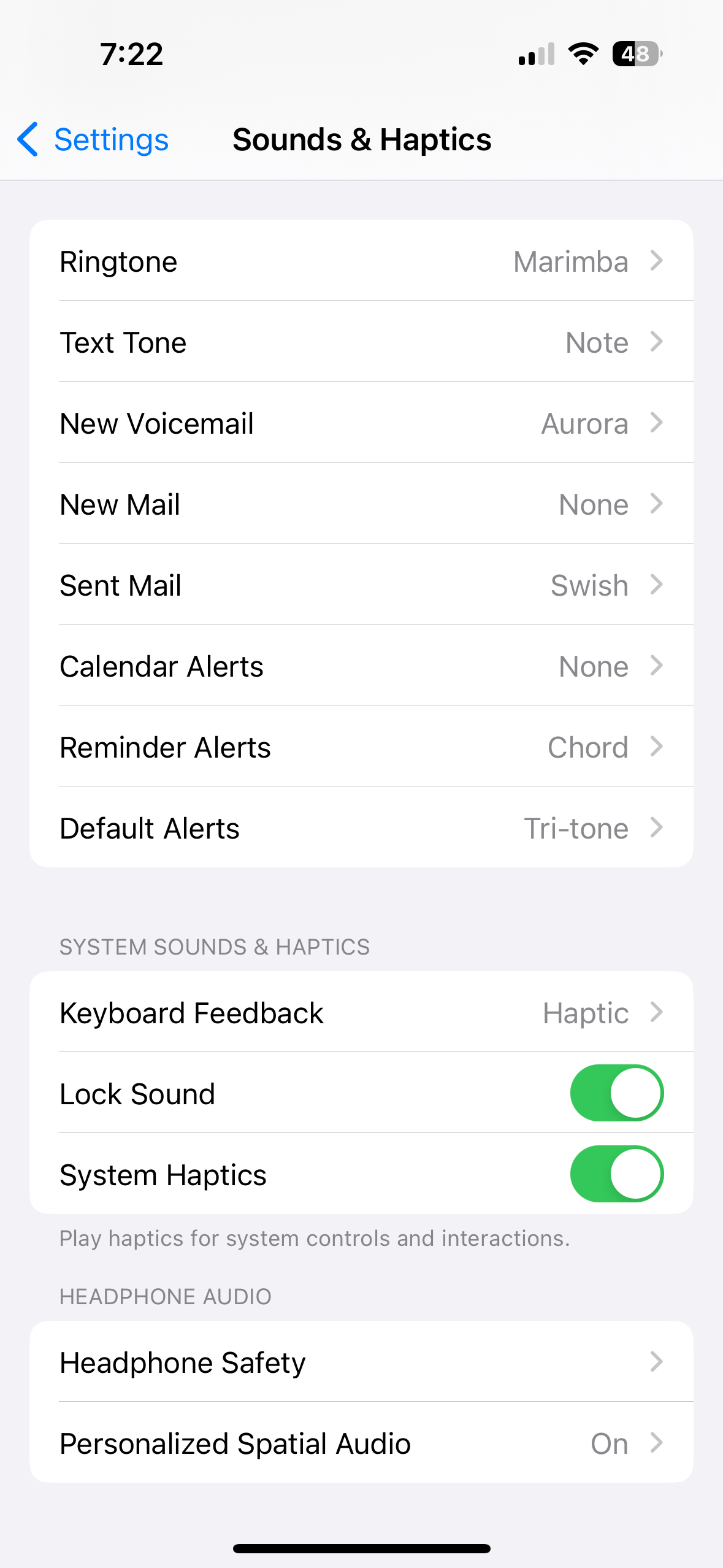
You’ve always been able to change it for built in applications (messages, mail, phone, etc.). I assume the above poster was joking? Or maybe there’s some nuanced feature they added around it recently.
You could only change certain applications, if they allowed it. But the general, default notification sound was decided by Apple and couldn’t be changed until 17.2.
You could change certain notification sounds, like for iMessage, the built-in mail app, ringtones, etc. Individual apps could set their own custom notification sound as well, or enable a setting that allowed users to change them. But there was also a default, “general” notification sound set by Apple that would be used by any app that hadn’t specified a notification sound, and that could not be changed by the user. It was perhaps the single most annoying thing when I switched from Android.
More specifically, it looks like the change came in iOS 17.2 after Apple changed the default notification sound for everyone in iOS 17 from the one they’d used for years. I guess enough people hated the change and wanted to go back that they finally gave users an option to pick their own.
Still can’t change the Apple Watch default sound, apparently.
Look at the new emojis though. Pure art