


As usual, Mozilla doesn’t come up with new things. Only when Floorp and Waterfox start doing stuff do they think “Oh wait, people actually like that? Well, let’s kill an extension or fork!”.
Tree Style Tabs have existed for years. I guess it took them a while to wake up.
Christ. If they don’t do vertical tabs people act like it’s the end of the world and Firefox is a piece of shit browser that deserves to die, and when they do they aren’t being original enough!
They can’t win. What do you actually want? Diagonal tabs??
The very first version of Tree Style Tabs was published in… hmm…
2007
The shameful part is the fact that Edge-Chromium added a native tree style tabs feature over three years ago, and has been eating Firefox’s lunch. Vivaldi has had native vertical tabs for eight years! Mozilla’s leadership is asleep at the wheel.
deleted by creator
I just spent 3 days learning a basic level of css and messing around in my userchrome and NOW they decide to add it…
Your CSS knowledge is still useful to customise other areas of Firefox UI.
Useful … and mandatory!
I migrated from Edge for the last time to avoid Manifest v4, I’ve been missing vertical tabs a lot. Sidebery just didn’t work for me. I really like how this is looking.
Edge mentioned on this sub? Brave.
Brave mentioned? Edgy.
No, Edge.
Oh I don’t even use Linux lol, this is the first post I found on this news
You mean the thing that Opera had in the 90s, and Vivaldi since inception?
Never saw the appeal in vertical tabs, but maybe Edge or FF extensions just don’t do them well enough… Good for Mozilla though, I guess
For 16:9 (ish) displays you have more pixels left to right than up and down, it makes sense to use up your horizontal space first when placing permanent UI elements on your screen. Still up to preference though.
The real crime here is the death of full screen monitors. Full screen just works so well for Internet browsing and programming. The switch to widescreen became common because games and movies were becoming more widescreen and that caused them to look smaller on full screen monitors. These days, the problem can be solved by getting extra large full screen monitors. Back then, that was not financially feasible.
God damn, what I wouldn’t give to have a 4k 4:3 CRT.
Agree… Too much screen real estate horizontally, not enough vertically
Especially with the gigantic tab buttons the browser uses by default even in “compact” mode.
To think that I have lived years without knowing about those little features like combining title and menu bar to save space
Yeah, but combining those doesn’t make the buttons smaller and tab-like. Enabling userchrome.css support and tweaking it yourself does, though. Still dumb that Firefox uses giant buttons instead of tabs.
A lot of websites are optimized for reading at around 1024 pixel which means many sites just give you the void to look at on both sides of a centered site (worse in naïvely scaling up all UI to the max so widscreen monitors get billboard-sized text)—so you may as well have more vertical reading space. The other part has to deal with keeping the titles readable with several open as the Latin script is horizontal. Either the titles disappear & you are left with tolerate logo favicons like Chromium or like Fx where the tabs move to vertical scrolling which is difficult to parse quickly—there’s a reason why you write your grocery list with a newline as a separator than trying to cram it all on a single line. Given the current Fx implementations using the sidebar are kind of a hack, I for one am happy to see this finally being worked on.
Top right of my tab bar in firefox, there is a little down pointing arrow. I click that: BOOM vertical tabs. Now make it an optional fixed thingie and let me stack them. I may be missing something here, but that sounds like something an experience Firefox dev can implement in half an hour.
Wake me up when we have Chrome-style tab groups in FF.
No, I mean Chrome-style tab groups. Existing FF add-ons are okay, but nowhere near as nice as in Chrome.
I’m not sure if it’s the same, but floorp has Workspaces which I find very useful
I don’t get their allure. Why not Tree Style Tabs? You can create “groups” and endless subgroups. Also, no need to scroll horizontally, which takes way longer to find stuff, just scroll vertically or collapse trees.
Tab groups seem inferior to tree style tabs.
Tab groups for the friendly name at the top of a set. Edge implemented vertical tabs. Not as good as tree, but better than across the top.
deleted by creator
Shit just got real
I completely hid my tabs with custom css and I’ll never go back. With something like vimium-c you can switch tabs with vim-like bindings and an fzf-like menu. If you have lots of tabs, the fzf way is way faster to pick out a specific tab than it is to look for it in a tab row (or column). If you have few tabs, you don’t even need to see them to know where they are. I’m being very serious. Tabs are bloat. I recommend trying it out if it is something for you.
(edit) On top of that, it looks so clean. You get a bit more space for the actual content (I also hide my url bar, it pops up when you use it). It fits right in with a keyboard focus workflow, you get consistent keybindings across vim and your browser (I use the same keybinds for switching buffers in vim so it feels the same).
Downvotes with no replies explaining why? This is happening a lot.
I use qutebrowser and still show tabs, but this is a very interesting approach. Thanks for the rec.
Pretty sure it was just emacs users instinctively swatting the vim enthusiast.
Qutebrowser is very cool! Personally I want to use firefox’s engine (or at least not something chromium based). Otherwise I would have jumped ship to qute or surf already. Currently my only gripe is that the plugin doesn’t work on pdf’s and other special pages, which is not an issue on qute.
Crazy that you are getting hate for this perfectly reasonable and well-expressed opinion. No counter-arguments, just “muh i no like muh go away”.
Apparently this place is not so different from the R-site at all.
deleted by creator
Ff with sidebery is pretty amazing. Although, it’s annoying you need to add a CSS file to disable regular tabs.
I have a CSS file anyways to make look the giant buttons like actual tabs.
Hundreds? Why? I never have more than like ten, and each time I open my browser I start with none
Not the person you replied to, but I can help with an example:
- I have the browser reopen the tabs I had open last time, but keeps unloaded until I click on them.
- The tabs are in a tree hierarchy, meaning I can collapse an entire group while keeping them all open.
- My work involves juggling up to 50 different accounts each for a hand full of websites, so containers allow me to quickly swap between accounts signed into the same page.
Fair points, though what advantage does keeping unloaded tabs serve over using bookmarks?
Personally, I can’t use bookmarks because if they’re out of sight, they get forgotten. Keeping things in an open tab is like having the browser constantly bugging me to remind me that I have to do this thing. It doesn’t guarantee that it gets addressed in a timely manner, but with the alternative it’s guaranteed to not be done at all.
It also helps to keep my place in my work. There’s things that I’ll always have open because I need quick access to them and don’t want the friction of trying to find the page to lead to procrastination. Same with anything that’s relevant to work in progress.
When you’re keeping things in a tree structure for visual grouping and using containers to manage different logins, bookmarks will lose the tree structure, and you’ll have to specify which container to open it in. If your workflow involves a dozen tabs per context, locating the bookmarks and reopening them every time you switch contexts is a significant time and productivity loss.
Consider the classic Evidence Board (also known as string wall, crazy wall, conspiracy board, etc.). Saving everything to bookmarks is the equivalent of putting your board’s contents into a drawer, then pinning everything back up whenever you need to look at or update that particular conspiracy. It works, but it’s cumbersome, error-prone, and wastes a lot of time; you’d only do this if you only have one board but multiple things to inspect. Leaving tabs open and simply unloading the inactive tab trees is like having multiple separate boards where you just roll them into a closet when you aren’t using them.
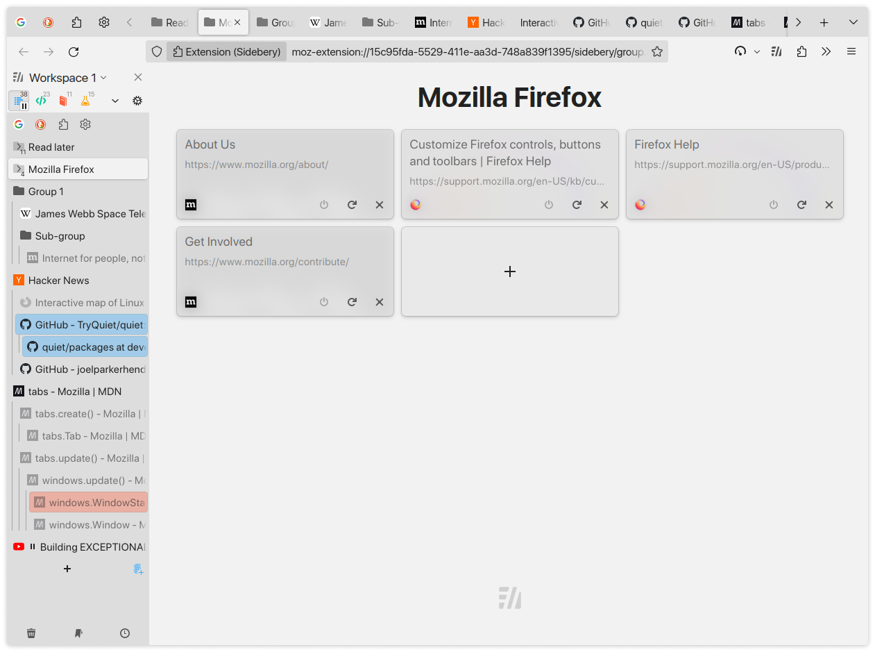
What are these tab trees? Is that an addon?
There are several addons that organize the tabs in the sidebar with a vertical, tree-style layout, with nested tabs that can be collapsed, just like a classic folder structure. This is what GreyBeard was referring to earlier in the thread when he said “The tabs are in a tree hierarchy”.
Tree Style Tab has been around since 2007; Sidebery is much newer, and IMO looks and performs better.
You are correct, TreestyleTabs was my jam for years, but I have moved over to Sidebery because it performs better and has better support for containers, as well as being considerably more customizable.
My work involves juggling up to 50 different accounts each for a hand full of websites, so containers allow me to quickly swap between accounts signed into the same page.
So like astroturfing?
Not at all. Just managing clients stuff on portals that don’t allow for delegated access to a single account.
Those screenshots look really nice, ngl, hoping this goes through. Edge and Vivaldi have had their own vertical tab implementations for a while now, and there are Firefox forks that show it can be done. No reason for base Firefox not to have it at this point.
While I’m here, Mozilla bring back compact spacing, plz k thx.
Edit: Just tried it, it’s got that nightly jank but it’s promising. I hope Mozilla continues with this. It looks and feels great.
My goodness yes, having to enable it in developer settings every time so annoying.
You can enable compact spacing in about:config
That just feels like Mozilla wants to hide the option tbh.
congratulats to the people liking them i guess. i personally dont get it, since most languages are written horizontally and i like ux to reflect this structure. such things are subjective though
since most languages are written horizontally and i like ux to reflect this structure. such things are subjective though
You might be misunderstanding what we mean by vertical tabs - we aren’t literally turning the tabs sideways and putting them on the side of the browser. We’re placing the tabs, still horizontal, into a stacked, scrollable list on the side of the browser. The superiority of this display method for tabs on widescreen displays is not subjective, and here’s why:
- Tab titles are not typically very long, but there tend to be a lot of them. This data is far more readable and accessible as a bulleted list than a long paragraph.
- Beyond about ten to fifteen tabs, tabs displayed at the top, side by side, must either shrink and obscure the title, go off-screen and be invisible without scrolling, or stack in multiple rows across the top. A vertical tab setup can easily display 30-40 of them in a vertical list, all with the maximum visible amount of their titles which helps distinguish them from one another.
- Modern desktop screens are wider than they are high, but webpage content scrolls vertically, often leaving a lot of empty space on the sides.
- Eyestrain is reduced and readability improves when the width of the reading area is reduced. This is why text on the web almost never fills the full width of a widescreen display, why most books are taller than they are wide, and why newsprint articles have many narrow columns rather than filling the entire page.
- Given points 3 and 4, tabs at the top of the browser window on a widescreen display leave slightly less room for the actual page contents, while tabs displayed in a vertical list on one side only cut into the white space that exists on the sides of the content, while keeping the titles readable and causing less eyestrain.
- With one change, a list can become an outline with sections and headers, following your own train of thought as you branch out and expand on each idea. In the same way, tabs displayed as a list can be very easily displayed with a tree structure, allowing tabs to be grouped, collapsed, and generally organized in ways that are impossible for traditional-style top-tabs.
This is why Tree Style Tabs exists, though I prefer Sidebery these days, being more customizable and performant than TST. There’s no way I can ever go back to top-tabs.
In a real life scenario that I can ad hoc reproduce here on my PC, only point 6 makes sense. With the others I can not agree when looking at my open tabs here.
The counterpoint is since 16:9 became the de facto standard for monitors, vertical resolution is at much more of a premium than horizontal resolution is.
i get where youre coming from, but imho the eye tends to parse information more effectively if delivered vertically, since it knows it that way from other media. just my personal opinion though.
Then why I struggle a lot to navigate through Discord compared with any other messaging app, such as Telegram, don’t answer, probably because Discord UI is trash.
Not to mention that most sites will put their main content into a container with a limited width anyway, since overly long lines are awful to read. So unless you’re using the browser side-by-side with other content on a low-res monitor it’s a net benefit. And even if it’s not I usually find the extra vertical space to be worth more, as you said.
I think you’re missing what’s going on. The text is still written left-to-right. You don’t need to read the tabs vertically. The tabs are stacked on top of each other in the sidebar instead of lined up along the top of the window.
I believe their point is that their language is left to right, so it just makes sense to them to have the tabs structure left to right as well.
I happen to share this sentiment, but can understand why some people may like it different.
Try out Tree Style Tabs for an hour. I’m curious how you’ll feel about it.
This is my main, but I struggle to find a good CSS theme that integrates with this instead of Sidebery.
I’ve been using TST for years and while it can be a bit buggy at times I couldn’t imagine going back to the default tab system.
This feels like something that should be a extension
I don’t think extensions as they are now will be able to do everything this can do. Specifically modifying the userChrome.css. Yes, there are existing vertical tab extensions, but they just reuse the existing sidebar used for the bookmarks and history. Nothing quite up to the quality that Edge or Vivaldi have.
Hard disagree. “Tab Center Reborn” has a ton you can do with CSS.
Do you use vertical tabs? If so, why?
I’m not the parent commenter, and I don’t use it, but if you have a lot of tabs, it’s easier to navigate between them in a vertical list if you are used to looking at the tab titles to decide which one you need.
This is partly because the tab items get very narrow when there is a lot, but also because in a vertical list there’s just a lot more room for them. The top bar is ok when you know the tab you need by it’s shortened title or position, but a vertical list is better when you don’t and you need to search for it by it’s full title or when it’s further away.Maybe I should use it too.
I agree that userChrome.css must be modified, but once it is, Firefox is way better for vertical tabs. When you mix in the tree style that is common in the extensions and containers, there is nothing that competes, especially if you work involves managing a large number of accounts for the same few websites, as mine does. It is not uncommon for me to have 10-20 active tabs, and 80+ inactive tabs at any given time. Horizontal tabs can’t compete, and the flat nature of the tabs in Edge certainly turn into a mess quickly.
So what you’re saying is vertical tabs and tab groups are the perfect combination.
I used to use Chrome at work. When Edge added vertical tabs I jumped to that immediately.
Now that IT is allowing FireFox I switched to that with Tree Style Tabs. I am missing the tab groups from Edge, but the tree is worth it.
Yes tree tabs with groups would indeed be perfect.


