
I like flat design.
I feel like everyone here just prefers the design they grew up with.
Maybe that’s the point of the post. OP wants to know the average age of Lemmits
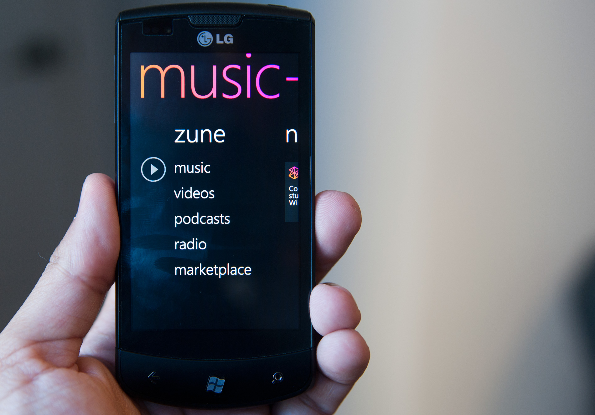
Early flat design, around the WP7 era, was good. Modern flat design has a lot of wasted space and a lack of descriptive text :<
Later

I’m a big fan of flat design, too. To be fair, I basically loved every style in its time. Regardless, I like flat.
I remember being stoked when IOS 7 came out because it looked so much better when the design was overhauled to be flat.
I personally don’t like Aero too much. Win 7 looks decent but I prefer the look and simplicity in Windows 10.
Yeah, the 90s are in style right now. A few years ago, we were all cringing st the styles we wore/had in the 90s. Now it’s hip. In a few years, the early 2000s will be back in style, and everyone will think the 90s is tacky again.
I was born and raised throughout the whole Memphis Design era, reluctantly tolerated the Y2K era, gained a little hope for humanity during the Frutiger Aero era, then subsequently lost all hope once the Flat Design era hit.
Peak design was late 90s and 2000s, where you got to see the new crazy designs of a new era while 80s design still existed all around you prevalently. That fusion is peak nostalgia for me.
Y2k was a really exiting phase, but my nostalgia lives for the late 80s and early 90s. But who is the asshole who did neither include a C64, not an Amiga in this?
Right?? And the MSX too.
Probably someone outside of Europe, that was Commodores main market. Especially the Amiga generation.
2030s design:

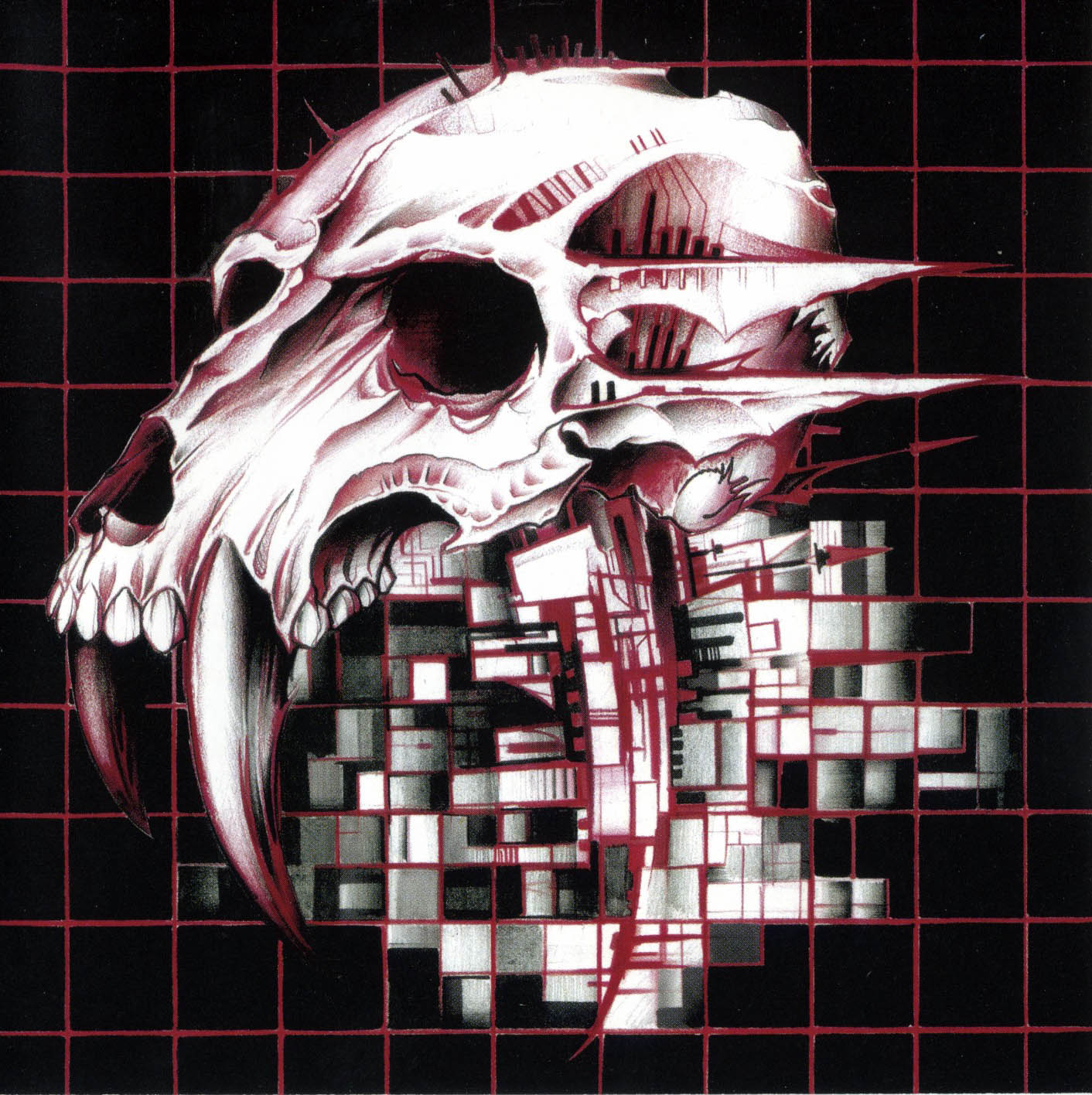
Now I’m no apocalypse expert, but I feel like a knife taped to some rebar doesn’t make for a very viable arrow, or at least not one that the pictured bow could fire
Edit: is that a curtain tassle they’ve used for fletching?
I’m also unsure about the purpose of the blood-stained bandages that keep you from holding the sub-machinegun’s foregrip.
Or whether the sharp, jagged edges on the frame of the goggles might be an issue.
And what the fuck is the skull used for?I can’t comment on the other things, but the skull is obvious - it’s for drinking, and the top half functions like a lid you can flap on and off, like a German beer stein.
Me, in my ivory tower: Man, bandages as an art style really seems to be trendy amongst the wastelanders. I wonder why?
This comment actually made that choice click in my head, I’d never asked why that was before and kinda assumed it was to help protect the internals of a machine you couldn’t fix from the environment but really it’s more likely to be so you always have some bandages on hand (however sanitary)
oh, I figured it was just the ideal binding material for broken parts (e.g. limbs, rifle butts) whilst providing comfort and stretch/tightness control.
Disappointing lack of chrome spray colour
I’m biased towards Y2K from the nostalgia, since those were the prime years of my childhood right before my teenage years kicked in.
But, I love the design of that time because of how obsessed with futurism everything was. It took the future chic look of the mid-late '60s and revamped it, taking that hype for the future- with the Space Race- bringing it back, and updating it for the Information Age.
It felt like we, as a society, had so much optimism for the world that was to come. So, if anything, I think that’s what I’m mostly nostalgic for. I was so excited to grow up in that world. Damn.
Me too, on the design, what I like about it is it wasn’t the ultra clean look futurism of the 1980s it was sort of collided with grunge.
It felt like we, as a society, had so much optimism for the world that was to come. So, if anything, I think that’s what I’m mostly nostalgic for. I was so excited to grow up in that world. Damn.
As with anything regarding the past, there’s a lot of rose-tinted glasses going on. Be careful what you wish for
I would also argue we lived in a pre-9/11 world.
It us shocking how much the world changed in response for the sake of security and safety, and I know it’s a controversial take but the terrorists succeed in changing the world to their image.
Before: wow, this new thing is literally 4 times faster with a fuckload of features.
After : wow, this new thing allows 800 companies, fifty countries and 2 superpowers to spy on me at the same time and has 4 times the bloatware!
And all the alternatives do the same thing!
Frutiger Aero was when design peaked
The music. The early 90s saw the rise of independent record labels which then gave rise to bands who wouldn’t have stood a chance otherwise, aka Indie Music. After the 60s, the 90s is by far the best era for modern music ever.
I’d say that it was the 80s, because most types of art peaked in 1984 (in terms of cultural significance).
I agree, and also the 1984 David Lynch Dune movie was the pinnacle of film making.
Deleted my previous comment, felt like I should give this a bit more attention.
To be honest I feel like all designs are good in their own way. I like the general vibe of Memphis, but being that I was born in the mid 90s, it’s probably just that general energy you get from things that happened before you did, where they are “cool” due to how just-old-enough-to-be-old-but-not-old-enough-to-be-an-antique they are, yanno?
Y2K design – Well. I like the transluscent plastic on Gameboys and Macs. Really underrated aesthetic, wouldn’t mind having it back. The DreamCast had some very sleek angles too.
Frutiger Aero will never not “look like the future” to me. It was the age of computer interfaces having all sorts of fun colours and transparencies and animations, and it just LOOKED futuristic and neat. Don’t care for the product designs of the era though. That shiny finish would draw in filth and fingerprints from accross the room and after a very short time it’d lose its prettiness.
Flat design I have issues with, like the hamburger menus and the abandonment of descriptive text in favour of abstract icons – It is also a bit too serious, but I understand and accept that, even if I miss the playfulness of Frutiger. – But it DID finally bring us dark mode. And my eyes are forever grateful.
… Just wish solarized themes were the norm instead, no idea why they must have such high contrast. I’d even give light mode its time of day if it was a solarized light instead.
Yeah I like the first three for the reasons you gave though flat design’s main issue for me is that it feels empty and corporate but like it thinks it isn’t or it’s trying to hide it. It’s the design opposite of the long form ad. The other designs here had a message and feeling, and yes it was always “futuristic” but this one isn’t. It’s simple without purpose, animated without life, and artistic without message. It’s the art style equivalent of my landlord asking for a quote about “the unique culture and experience of [complex]”.
Compare it to art deco which calls on you to acknowledge the grandiosity of the time. Honestly it could use a modern reinterpretation and revision of something like soviet realism to challenge it.
deleted by creator
Aero looks futuristic and sleek.
90s, BeOS
I’d say PS2 belongs in flat design, even if it falls outside the dates they think: its design language was ahead of its time
And the PS5 isn’t really flat design, especially compared to the current Xbox.
Judging by the comments I think I must be alone in loathing the Frutiger Aero style of design, both now and at the time. So self-conscious, so fake-looking, so plasticky.
Much prefer the clean lines and flat colours of nowadays (although that’s not to say there aren’t issues - eg Google’s stupid icon design policies in the last few years)
I actually really like Metro, live tiles are criminally underused and imo it gets a lot of hate becauae of how microsoft pushed it in windows 8, but for a touch interface it’s clean and really nice to use. Loved the sideways laid out apps too on windows phone and windows rt, wp itself was actually really nice to use and I actually kinda miss my lumia 1020
deleted by creator


