

More info about it here: https://www.ghacks.net/2024/08/13/windows-11-start-menu-is-getting-a-new-layout-to-organize-your-apps/
I love how microsoft never learns their lessons.
No wonder why alot of people are on windows 10
Windows 10 IOT Enterprise LTSC until the heat death of the universe
Oh yeah it’s for business
I like the phone link integration. I’ve never been a fan out auto-populating app folders though.
Where’s all the ads though? They’ve gotta be thinking about turning one of the folders into a recommended apps folder or something dumb. They’ll sneak something in somewhere.
Amazing! Reading this headline made my bazzite partition grow by 2 whole disk drives!
Not my home screem!
These people are stupid fucks.
Every update with these new UI changes seems to increase empty wasted space each time
And create more steps to get places.
how else are they supposed to get you to use their AI for everything
What the fuck is the point of the start button in the middle? Like, did they forget why the space to the right of it even exists.
It’s actually ideal with an ultra wide I have come to realise.
Makes sense on ultrawides.
Also, a start menu that opens in the centre is technically the best. It’s in the most prominent part of the screen, and your mouse typically isn’t far from there.
The start button is harder to hit than simply flinging it into the corner though, definitely.
If you’re the kind of person who opens the start menu with the Windows key, a centre start menu is only an upgrade IMO.
Makes sense on ultrawides.
In which case, the question becomes: what percentage of users are actually using ultrawides? If it isn’t >50%, then the default should be the setting most appropriate to non-ultrawides. Unless you’re going to autodetect screen resolution and set the button’s location appropriately.
This is not rocket science, but Windows has been blowing it for quite some time now.
Never thought about ultrawide screens, that makes sense. Other than that I see no improvement whatsoever. Corner space is way easier to hit with a mouse, but even when using keyboard shortcuts having it in the middle is just an additional adjustment from what it used to be.
An OS should get out of my way and let me do what I do. Changing design language forces me to relearn what I had already had a flow for. In other words it’s utterly useless.
And I just know I’m gonna hate that automatic categorisation of apps, just as I hate web searches from start menu. Alphabetical order is predictable, but this I’d have to relearn.
even when using keyboard shortcuts having it in the middle is just an additional adjustment from what it used to be.
How? It’s closer to where your mouse will be, and to where your eyes naturally gravitate.
An OS should get out of my way and let me do what I do.
Yeah. Windows moved from that path a long time ago.
It’s an easier click target when it’s in the corner. Moving cursor from the middle to the corner is negligible for me since I can reach the whole screen with relatively minor mouse movement.
In the end it’s a muscle memory thing for me. Having the button in the middle just means I have to look for it in a different location than I’ve used to over the years.
Yeah that’s why I said corner is superior if you open it with a mouse, and centre is superior for if you do it with your keyboard.
I wouldn’t consider it superior, just different, in case of a keyboard shortcut.
I actually prefer it in the middle, it’s easier to get to.
Weird, but I’m glad it works for you.
But it changes position depending on the amount of apps open
I don’t have enough apps open at any given time for that to be a noticeable inconvenience ¯_(ツ)_/¯
I actually use it like that. I dont really see the reason pepole hate it so much. Geniuenly a better place for it (mind you im only talking about placement. The design itself is something else ). Since generaly if you use start menu you focus on it to launch something so it might as well be in tge middle of your screen.
I guess that’s fair, but then keep the button on the left.
Yeah, I moved that back the minute I upgraded to 11. It’s much better in the bottom left.
That change was absolutely idiotic. It reminds me of that time Apple changed the scroll direction. Who ever asked for any of this?
I’ve used StartAllBack to get the start menu exactly how I want it.
I dread having to upgrade at work, I set the group policy to deny the upgrade for the moment. They won’t allow me to use ASB.
Aw that sucks. My biggest issue is the thickness of the new bar. Wastes so much space
Oh god yes, you can modify it in the registry (or you used to be able to) but then the date/time gets fucked up. I hate W11 so much
I like w11, i just hate the taskbar
I couldn’t get past the Taskbar long enough to not hate it unfortunately. I also missed quicklinks, which I use a lot.
i keep forgetting it’s in the middle by default. first thing i did was change the setting to put it back on the left corner.
well they essentially copied the Mac dock for no reason. The icons will still go to the right of start but overall the elements will be centered.
What goes to the left of the center start button?
That’s the septic tank to store the waste from enshitification.
Enshittification is when minor UI changes break my boomer brain
In this case the person you were responding to was right. It is where they put their news and weather widget. Which only exists to push people onto Bing. It is annoying, and by default pops up on rollover, not click, so it is trivially easy to accidentally pull up, pumping those Bing engagement numbers.
I don’t see how centering it changes that. They could just as easily leave the start menu left aligned and put the widgets button next to it
IF the categorization works well, and that’s a big if, I like it.
And if the categorization isn’t absolutely perfect, you can bet everyone will be clamoring to be allowed to customize it or disable it.
ha, oh look another revision no one asked for.
i had to use this recently, and its all kinds of useless now. the ‘search’ didnt find my installed app, the ‘all apps’ list is a click or two in, and then absurdly inefficiently styled… the win98 start menu was easier for me to navigate.
Nobody asks for mayor UI changes, nothing would change if you wait for that.
sometimes things that are not broken need no fixing…
unless youre some middle management pos attempting to make your mark in a terrible corporate environment
Caves are perfect, why change anything?
We have always done it like this!
All terrible arguments.
Are you genuinely arguing that this start menu is better?
Many here do, others feel like they are the gold standard. And no, I did not if you actually read what I said.
Well that looks like pure garbage. Glad I no longer have to deal with it.
Can write reskin Windows 11 to look like 95/98?
Cuz that would be cool. Just hide all the bullshit. Have a functional desktop again.
@RangerJosie @Blisterexe Best I found online. https://uxthemepatcher.com/windows-98-classic-theme-for-windows-11/
I don’t know how good it is though. I don’t mess with my windows installation.
theyre killing that stuff in the new windows 11 version
It’s easier to 🏴☠️ a copy of Windows 10 than trying to work around Windows 11 I’m sure.
You can’t rewrite windows to look like that, but you can make linux look like this:
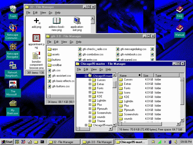
That’s awesome.
Looks like someone at Microsoft saw someone’s iPad and went “That’s what we need! Icons in boxes that need an extra click to be used!” and their MBA boss figures they’ll get a bonus for “increasing user engagement” by making everything take two actions instead of one now.
Sigh.
From the linked article:
One interesting thing about it is that clicking on an icon instantly launches the app, without opening the folder.
Isn’t that what start menu icons do already?
Yeah but soon they’ll be automatically grouped together into something that looks like folders
200%+ engagement ratio
Llol, it’s funny but also probably true. God I hate statistics and MBAs.
I disagree. Microsoft is learning its lesson. It’s just that the vast majority of people are teaching Microsoft that its actions are perfectly acceptable, or, at the very least, not totally unacceptable… so it continues.
Linux and gnome pretty much gtfo of the way for me - as an OS should. I used to care a lot about what Microsoft did, now I couldn’t care less - F em
KDE is the best and much easier and polished to ex windows users
It looks like the little windows you’d use to organise your applications in Windows 3.1


