
- cross-posted to:
- [email protected]
- [email protected]
- [email protected]
- cross-posted to:
- [email protected]
- [email protected]
- [email protected]
You must log in or register to comment.
How about you go back to making a decent libre browser, Mozilla. And keep the BS roar down for a bit, thanks.
I don’t hate the new logo, but I would have preferred they kept the italic l’s
Same
those were slashes
Yeah. You can even visit moz://a in Firefox.
We teamed up with global branding powerhouse Jones Knowles Ritchie (JKR) to revamp our brand and revitalize our intentions across our entire ecosystem. At the heart of this transformation is making sure people know Mozilla for its broader impact, as well as Firefox.
Sure sounds like they’re trying hard to make sure everybody knows how great they are. I still want to believe they won’t abandon the mission, but I’m losing hope.
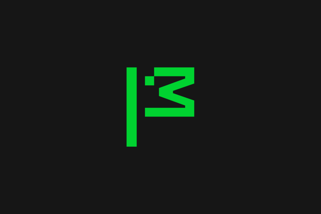
I want someone explain what does the flag next to mozilla mean.
It’s in the article …
The flag symbol highlights our activist spirit, signifying a commitment to ‘Reclaim the Internet.’ A symbol of belief, peace, unity, pride, celebration and team spirit—built from the ‘M’ for Mozilla and a pixel that is conveniently displaced to reveal a wink to its iconic Tyrannosaurus rex symbol designed by Shepard Fairey. The flag can transform into a more literal interpretation as its new mascot in ASCII art style, and serve as a rallying cry for our cause.
Oh alr Ty
A flag is also the symbol of conquest and submission. It is also the symbol of surrender.
Surrender and submit
Nailed it, both you and the marketing firm they likely blew millions on
That’s ugly as fuck. I’m a Mozilla fan all the way, but what the fuck guys??
I don’t get why they’ve started behaving do corporate recently
It’s what happens to all companies when professional managers finally take over the entire control of the company. They have no values, no personality, no genuine vision or spirit to speak of.
A person who knows and is passionate about a topic can benefit from learning management when they get to leadership positions. But a professional manager who has never done a single productive or creative activity in their lives is an empty husk of a human being who will add no benefit to an organization. Buzzword rapping is not a valuable skill.
There are a fair bit of Mozilla engineers on Mastodon. They don’t control stuff like rebrands, but at least they show that there are definitely still values in Mozilla. And in the end, they’re the ones who do the work.
I hate these rebranding wanks companies love to do.
I always assume rebrands are attempts to cover up something.
Unless they coincide with an entire board of directors change, it’s bullshit.
Right. It’s just a money wasting wank.
Think of all the money that was wasted on this for no reason at all.
And they just laid off a shitload of people too, didn’t they?
To hire more AI people, of all things.
FFS. We can’t escape it
And all of that for the radical idea of writing “Mozilla” in some font that seems cool at the moment.
I can’t help but feel like this is another bad omen.
“Mozilla isn’t your typical tech brand”
Lisa is not like other girls.
This sucks. Mozilla used to be cool, but now it sucks.
Is that a duck?
I was thinking chicken.
The flag of Nepal.
They changed their logo into… a stick figure chicken head.
That’s certainly something they did.
Green on black though. Like a terminal. For hackers! Bet you feel dumb now.
Drat, foiled agian! Damn you Stick Figure Hacker Chicken! Ill get you yet!
Is this a bad sign or omen ?
I guess you could read it as an indication of commitment to their change of direction. And their new direction sucks.
So yeah, I don’t read it as a good sign.
I would love to love Mozilla. I still like Firefox. But it seems everything they are doing is the opposite of what I would have wanted them to.
Haven’t been keeping up, like what? Do you read this as just classic soulless marketing? Or is that too far?
For me, their commitment to hire people working on generative AI while dropping a bunch of smaller projects is the biggest red flag.
A lot of users are also upset about their efforts to create privacy respecting ads. The counterargument being that we don’t want ads at all.
They seem to be making increasingly corporate decisions, or at least that’s the fear of critics. Some people previously close to the organization has spoken out against it.
I’m sure there are a lot of people on here better suited than me at giving a summary.
Thanks very much!
Big corpor who overpays their higher ups while ruining their most important product for years does a rebrand to show how quirky and amazing they are instead of fixing the problems at their company? Nah. I’m sure “this is fine”!
Mozilla isn’t just another tech company
-> proceeds to act like any other tech company
Aw shit, Mozilla is dying and Google is losing Chrome. Google is going to buy Firefox and do what it did to Chrome.
Great use of donations.
Don’t remember this one on their questionnaire!
can’t say I’m convinced of anything by a logo change…
What don’t you remember how much better Meta and x are?
Wtf… mozilla had like the coolest logo among current companies and they just decide to replace with… whatever this is 😶
I agree. It was fire.
They’re waving the white flag 🤦
Which coolest logo? The Dino head or the moz://a?
That second one was clever
For me it was mostly the moz://a
I love reading how companies justify their expensive rebrands.
The flag symbol highlights our activist spirit, signifying a commitment to ‘Reclaim the Internet.’ A symbol of belief, peace, unity, pride, celebration and team spirit—built from the ‘M’ for Mozilla and a pixel that is conveniently displaced to reveal a wink to its iconic Tyrannosaurus rex symbol designed by Shepard Fairey. The flag can transform into a more literal interpretation as its new mascot in ASCII art style, and serve as a rallying cry for our cause.
Fuck off. This was designed by the intern the night before submission. It’s a fucking ascii dinosaur. The green doesn’t represent nature, it’s giving old monochrome monitor vibes, which doesn’t really scream “futuristic”. I’ve submitted enough bullshit design projects to know one when I see one.
Also, I love how these things always need a lengthy explanation of what all this design vomit is supposed to mean and what it symbolizes, because there’s no way you could tell by, you know, actually looking at it…
You’re saying half-baked monochrome pixel art doesn’t come across as futuristic to you? Crazy!
To me it just reminds me of assets from the Dino game in Chrome. Good going, Mozilla.
To be fair, Mozilla had a dino first.
Yeah, and I very much associate it with Mozilla - the red one anyway. But the pixel art aesthetic brings Chrome connotations these days, and combining it with a dinosaur doesn’t help.
I’m happy to see the mascot get its time in the spotlight though.
This was designed by the intern the night before submission.
YFW you realise this was designed by a well payed marketing and digital design team that make more money in three months than you make in a year, publishes straight to production, regularly bypasses the VPN for work, and still doesn’t know how how to use the Oxford comma!
payed
Complaining about not using the Oxford comma
Mighty fine glass house you’re living in bro
Ha! Jokes on you I’m one of those well paid marketing execs. And I was referring to the nautical term “to pay” which means seal a wooden deck to prevent leaks. And my marketing team can be referred to as being well payed, as in slick as shit.
😅
This is an excellent comeback.