

- cross-posted to:
- [email protected]
- cross-posted to:
- [email protected]
cross-posted from: https://midwest.social/post/21866907
You must log in or register to comment.
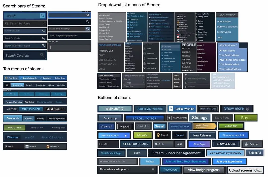
Counterpoint: I can identify which part of the UI most of those come from. This level of variety between various UI functions is actually good. I don’t want the interface tabs or the settings tabs to be confused with tabs in the store, even though they are all tabs. I don’t want buttons to all look the same, especially not the huge purchase button. But even accepting that as an outlier I want some buttons to be clearly part of the steam UI and some as part of the site page I am on, so I don’t get confused.
probably boosts user performance for users who have more experience like you but slightly hinders new users who haven’t got the hang of it yet
if steam prioritizing retention of growing userbase is one of its goals, it’s not a bad strategy in my opinion
Really insane that companies will pay for memes like this to be posted but refuse to develop viable competition
Are you genuinely insinuating that something like Epic Game Store paid for this as guerilla marketing?
There’s a current effort being made by games companies who see themselves as a competitor to valve to sow criticisms of Valve in online spaces.
A ton of it is inorganic.
It really doesn’t
There is certainly worse but it isn’t stellar either
That’s the joke
Your lack of sorting makes it look worse than it is.
Just looking at the buttons, they clearly have design documents, green is only used on buttons dealing with money.
Blue buttons primarily deals with social interactions or midrange store tasks
Grey buttons are for the local client
That would be 3 buttons not 40 like in the picture
No?
I only mention colors, not styles.
Lol, must be a headache for the devs maintaining it, but from the end user perspective it is way more pleasant of an experience than epic, origin, gog, ubi and whatever else is out there.
Steam has a decade of different design choices stacked on top of each other. It’s weird AF that they just don’t update some of their old styles, but what’re gonna do?
i really hate the custom window controls in the steam client
Reminds me of Windows UI — usable, but inconsistent. Obviously a lot of glommed on tech debt that was never updated.
Why did that get downvotes? This meme here is a remake of the meme about Windows’ UIs.
Miraculously still better than GOG Galaxy…
this might be THe only thing i like about steam
Wait till you discover windows ui. Fucking backup tool having advanced options that display 2 of the 3 options and you have to click more to see the third option. and then you realize the advanced options are the basic options. Absolute clown os.
Wow. This comments section reads like 50 various versions of Colin Robinson, all swarming on this very post. Every single one of them finding a way to be more pedantic or curmudgeonly than the other.
Well, how else would the energy vampire recharge? Huh? Random Internet person?! HOW?!¿¡
I have never noticed this. Shows how the average consumer doesn’t really care about consistent design languages.
Given Valve’s history of taking play testing really seriously, I wonder if this is something they’ve realized through user testing?
Maybe there’s some advantage even because for the ones I’ve used a lot i know at a glance which part of steam they’re in, which wouldn’t be as easy if the only difference was the text. And each part of steam is usually internally consistent, at least mostly.
And i hope it never changes. It works. Don’t touch it!
I prefer it to most ui these days, tbh. Everything is either hypergeometric and boring, or forces mobile website design into desktop use for no good reason.
Steam does just that though, it’s design is shit for desktop.
Short of one window with multiple columns functioning as one long list of your games I fail to see how you want steam to act even more like a desktop application UI wise.
Flat design overdone like today is horrid
It certainly has character!


