
- cross-posted to:
- [email protected]
- [email protected]
- [email protected]
- cross-posted to:
- [email protected]
- [email protected]
- [email protected]
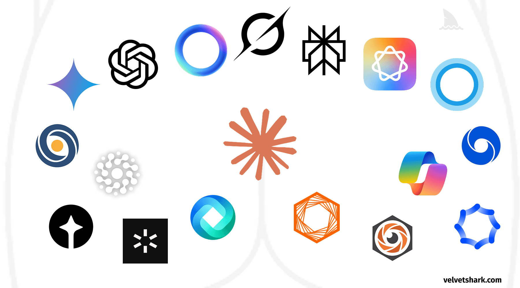
A humorous exploration of the uncanny resemblance between AI company logos and human anatomy. Discover why circular, gradient-based designs dominate the AI industry, and what this design convergence tells us about branding in tech.
You must log in or register to comment.
I was just about to shit on the article without reading it (as is tradition), but it’s an absolute blast. You really can’t unsee it. The Electrolux especially will never be the same to me.
Skip the gradient - flat design still works
Except for this. No. The flat design was an awkward phase we silently suffered through. Don’t confuse the lack of rebelion or some kind of catharsis for the acceptance. We just wanted the suffering to stop without reliving the trauma.
Cause they are all full of shit.
My boy Le Chat is the only one with a friendly face as its logo 😎 Vive la France ! 🇫🇷
For anglophones : Mistral’s Le Chat works just as well in English.
Also works in German and probably in most other languages.
self-report
because of your dirty mind
deleted by creator