alphacyberranger to [email protected]English • 3 months agoAverage LinkedIn usersh.itjust.worksimagemessage-square47fedilinkarrow-up1484
arrow-up1484imageAverage LinkedIn usersh.itjust.worksalphacyberranger to [email protected]English • 3 months agomessage-square47fedilink
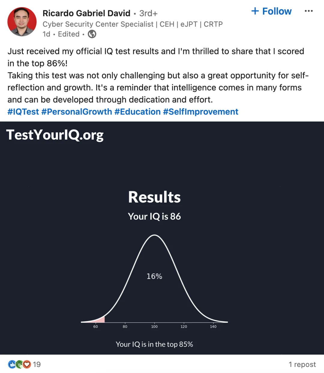
minus-square@[email protected]linkfedilink11•edit-23 months agoHow the fuck does that graph even works?! Shows the very left of the graph, then says you’re in the top? Doesn’t make any sense. Edit : clearly I belong in the top 85% too. I guess I confused % and percentile!
minus-square@[email protected]linkfedilink10•3 months ago85% of people have that IQ or higher. Maybe they do it this way so those that don’t get it don’t feel sad about the results?
minus-square@[email protected]linkfedilink4•3 months agoi hate how IQ tests use both percentages and percentiles for the results
minus-square@[email protected]linkfedilink1•3 months agoI just realised that was my mistake yeah -_-;
minus-squaremy_hat_stinkslinkfedilink13•3 months agoIt says top 85%. In a room with 100 people the 85th smartest person would be in the top 85% but they’d also be in the bottom 15%.


How the fuck does that graph even works?! Shows the very left of the graph, then says you’re in the top? Doesn’t make any sense. Edit : clearly I belong in the top 85% too. I guess I confused % and percentile!
I am going to believe this is comedy gold.
85% of people have that IQ or higher. Maybe they do it this way so those that don’t get it don’t feel sad about the results?
i hate how IQ tests use both percentages and percentiles for the results
I just realised that was my mistake yeah -_-;
It says top 85%. In a room with 100 people the 85th smartest person would be in the top 85% but they’d also be in the bottom 15%.
Top 85% could mean bottom 15% (±1%)