- cross-posted to:
- [email protected]
- [email protected]
- [email protected]
- cross-posted to:
- [email protected]
- [email protected]
- [email protected]
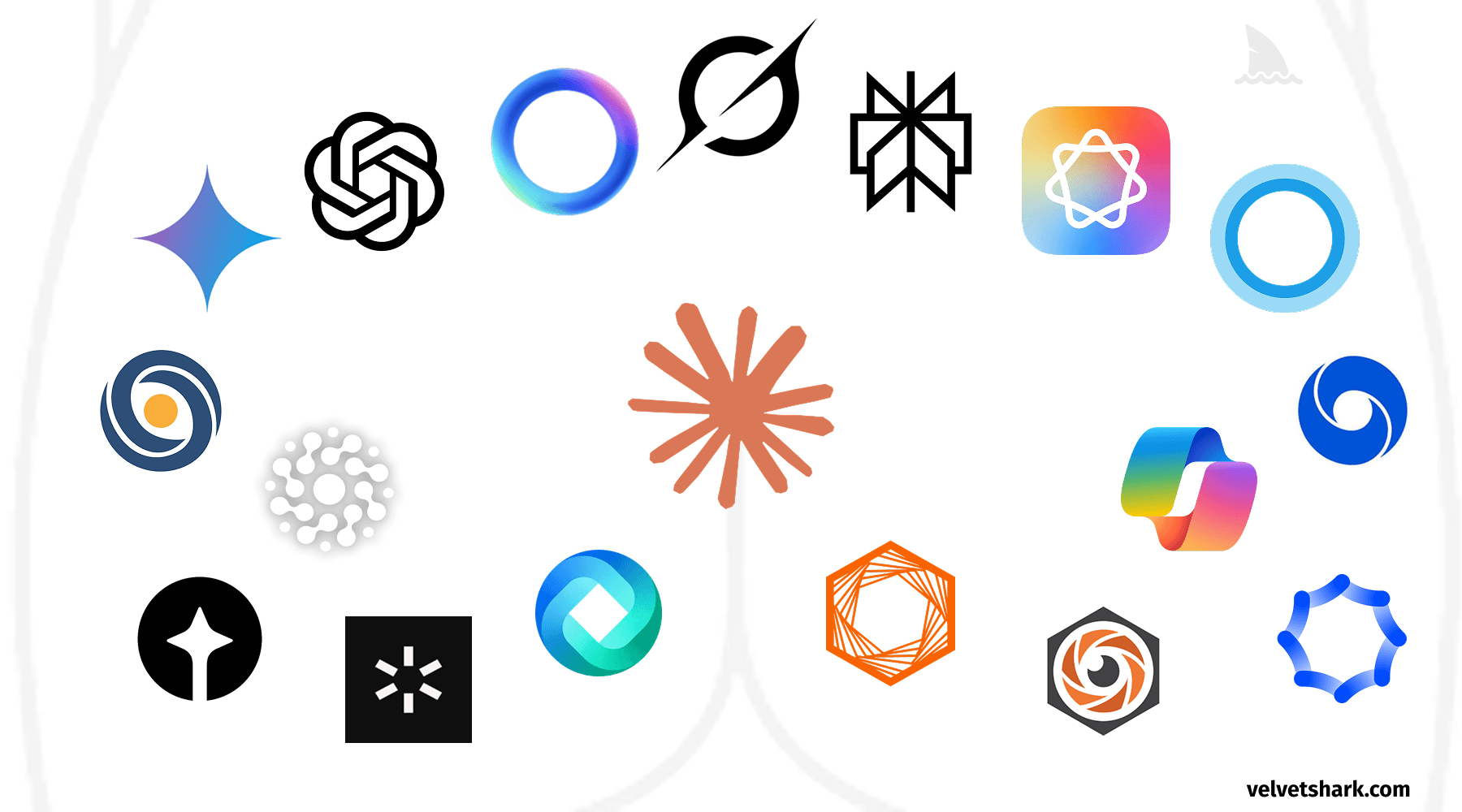
A humorous exploration of the uncanny resemblance between AI company logos and human anatomy. Discover why circular, gradient-based designs dominate the AI industry, and what this design convergence tells us about branding in tech.


I thought they were supposed to look like Singularities. You know the Whole AI singualarity being a theoretical point where AI becomes smarter than humans and they also suck everything they can into them. So make the logos look like a stylised singularity.
The Grok logo is just a simplified version of the black hole pictures you see every time you google “black hole”