
![[river] Yellow On Black](https://lemmy.zip/pictrs/image/9a732ed7-c08a-45d6-ba2e-dff723478360.webp)
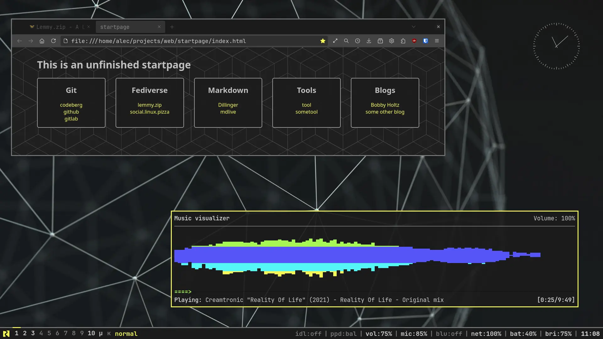

After having my desktop look like a rainbow for a long time I went for the opposite end. It’s not a very cheerful color-scheme but my eyes suffer much less after long hours behind the screen.
Anyway, thank you all for introducing me into this new world just about a year ago.
Thanks for nice template to tinker with. I like how clear it looks without nerd symbols or anything flashy. You got my star :)
It does use nerd fonts for the River Logo though, I use JetBrains font so I thought might as well have some logo to aknowledge the project. Other configurations on the repomight make use of more icons.
Have a good one tinkering!