The whole argument is ridiculous because it’s only the messages that you wrote and sent that are even on a blue or green color. The messages you read are always on the same light gray background regardless of how they sent.
It’s just an incredibly weak argument. Messages that you, yourself, wrote are in slightly lower contrast? Who cares? For users who actually have vision problems with low-contrast, there’s a single Reduce Transparency toggle in Accessibility settings that will resolve this issue and a bunch of other ones.
People do care for some reason. Psychology or something, here’s Marques Brownlee’s pretty in depth explanation of the whole thing. It seems like Apple has been aware of the issues and happy to keep them/make them worse since at least 2013
People care that SMS and MMS suck. “Green messages” is just a shorthand, nontechnical way of describing it. Nobody legitimately cares that the green background is every-so-slightly lower contrast than the blue background.
An incredibly weak argument is saying that it’s fine for Apple to intentionally make their UX worse, because they didn’t make it worse enough to matter.
They picked a tint of a color used on low priority text. Someone argued that this particular tint is slightly worse for certain people. If you don’t have vision problems, it’s not really worse for you at all. We’re talking about small differences in relative contrast between different elements. If you do have vision problems, you can easily make it and other similar situations across the entire platform easier to read with an accessibility toggle.
No, I don’t buy the argument that the UX for reading SMS messages is meaningfully worse than for iMessages.
Yeh, not very compelling. Apple has been screwing up usability by reducing the contrast of a lot of screen elements. MacOS window component are horribly washed out these days. Wouldn’t surprise me if they reduced the contrast of the green bubbles just to “improve” the aesthetics


Out of curiosity, when do you think Apple started using green bubbles?
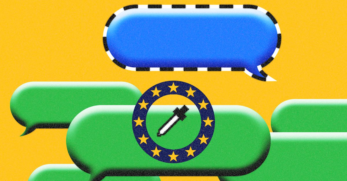
It’s not “when” they put green bubbles in but how they’ve been maliciously modifying the design of green bubbles. They have made them progressively harder to read, here’s one article about it: https://uxdesign.cc/how-apple-makes-you-think-green-bubbles-gross-e03b52b12fed
Looks like I’d need an account to see the full article, but did the green bubbles have better contrast in previous iOS versions?
Here you go, fam.
Thank you, fellow null
The whole argument is ridiculous because it’s only the messages that you wrote and sent that are even on a blue or green color. The messages you read are always on the same light gray background regardless of how they sent.
People never re-read their own texts, good point.
It’s just an incredibly weak argument. Messages that you, yourself, wrote are in slightly lower contrast? Who cares? For users who actually have vision problems with low-contrast, there’s a single Reduce Transparency toggle in Accessibility settings that will resolve this issue and a bunch of other ones.
People do care for some reason. Psychology or something, here’s Marques Brownlee’s pretty in depth explanation of the whole thing. It seems like Apple has been aware of the issues and happy to keep them/make them worse since at least 2013
Here is an alternative Piped link(s):
here’s Marques Brownlee’s pretty in depth explanation
Piped is a privacy-respecting open-source alternative frontend to YouTube.
I’m open-source; check me out at GitHub.
People care that SMS and MMS suck. “Green messages” is just a shorthand, nontechnical way of describing it. Nobody legitimately cares that the green background is every-so-slightly lower contrast than the blue background.
An incredibly weak argument is saying that it’s fine for Apple to intentionally make their UX worse, because they didn’t make it worse enough to matter.
They picked a tint of a color used on low priority text. Someone argued that this particular tint is slightly worse for certain people. If you don’t have vision problems, it’s not really worse for you at all. We’re talking about small differences in relative contrast between different elements. If you do have vision problems, you can easily make it and other similar situations across the entire platform easier to read with an accessibility toggle.
No, I don’t buy the argument that the UX for reading SMS messages is meaningfully worse than for iMessages.
Yeh, not very compelling. Apple has been screwing up usability by reducing the contrast of a lot of screen elements. MacOS window component are horribly washed out these days. Wouldn’t surprise me if they reduced the contrast of the green bubbles just to “improve” the aesthetics