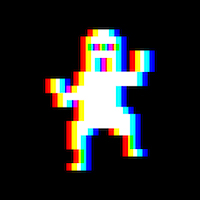
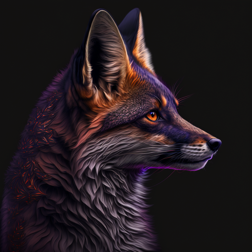
Again, based on @FixedFun 's original designs so creds to them for the idea.
Thoughts about these ones? For the one on the right, I tried a different angle to hopefully give more bird and less bald man.
deleted by creator
Both are really good but I prefer the one on the right as a logo.
Ok. I am someone who feels like kbin doesn’t really need a mascot at this point in time. It seems really early and tbh the whole thing feels a little forced. Really not into the bird design either. I just don’t get it…
But holy shit this new icon on the right has 100% changed my mind.
It is adorable and I’d put that on the first page of my phone home screen, no questions asked.
Well done.
Nice plot twist!
This is all open source so let talent do talent and let community decide.
Good “propaganda” is a must tho in digital economy and community sourced and voted product is the way to go IMHO
Lol this is exactly why I held my tongue for the first few of these posts. My first reaction was a pretty strong NO but I thought, let’s let this evolve organically and see what happens. Boy was my initial reaction wrong.
Really love this little guy!
oh wow i didnt expect that turn around in your comment lmfao. i am so happy you guys like it, i just whipped it up expecting it to fail and was like hmm not so bad, let me send it out into the world and see. its great to see positive reactions :D
Ikr? Nice short rollercoaster 😂
You had me in the first half, not gonna lie.
But why would you lie
And now we have a name for the mascot. It’s the Early Bird.
Definitely the right one! Exactly what I wanted with the last poll!
im glad i could fulfill that :D
The second one improves the original concept so much, I really like it! ☺️
thank you C:
I really like the right one. It oozes confidence :)
thanks! bald man mostly gone I’d hope!
I really don’t want a logo that reminds me of that sexist shithead troll of a Reddit supermod.
who?
From the comment they are talking about AwkwardTheTurtle, but I wouldn’t have known what avatar Turtle used, and even having now looked it up it’s a bit of a stretch to link this with her avatar.
Support :) love the logo’s.
I personally like the more roundness look of the first one, the one on the left.
I personally like the one on the left. It just resonates with me.
I must be in the minority here, I think the one on the left looks much cuter.
They are both extremely cute and I want both of them, somehow. I want a whole flock of the li’l screaming friends.
Both are good but the one on the right looks a bit more like a generic mascot, left one is more unique somehow.
Seconded
I’ll put my vote in for the second one. Cockatoos’ crests go up when they call out so it’s more accurate :-) (Source: lives in a place with them around)
@minnieo joining the Left Twix crowd, but they are both really great! I LOVE the gradient outline in these versions compared to the pure black outline in prior.
If we thinking birds for the icon, I suggest the glorious Australian bin chicken.
Such a majestic bird, constantly looking for food.
Bin chicken! Finally, a fitting description for my cousin Frank.
Looks great! And much less dude with a ponytail!
