I am so thankful for all the wonderful feed back I got on my last post. Now, I am back with some updated designs based on all that feedback.
What I got overall from the feedback was basically: The right one is cute, and better, but maybe a little generic, the left one has more character.
So, in this post I tried to work off the design on the right and give it more personality and flair, and I present 6 potential designs where I tried to be creative with shape design.
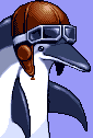
I also saw someone’s idea about “kbinauts” aka astronauts, and I thought that was so adorable, so I tried to implement an astronaut theme on what I thought was one of the cuter designs for the Kbird (Binny?). Bring on the feedback!
Edit: #1 winning by a landslide, with #6 in second, and #4 in third
Edit 2: How about #1, #4 and #6 in the astronaut helment?
Edit 3: since this is meant to be a mascot of sorts, I made a mock logo of the AskKbin mag using #1. What do we think lol?
#4 is my favorite
What do we think?
For me the Astronaut theme has a bit too much going on for it, and most users would probably be a bit confused about what a kbinaut is in the first place. I love the bird as it is in its own right. :)
you might be right, it is a cute idea but maybe a bit too much. I did enjoy playing with it though lol
After all, that’s what a mascot is for! I can totally imagine the bird driving around in full astronaut attire in some future version of SuperTuxKart.
I vote for #6
1 is pretty nice
#4 or #1
My favorites are
#4 > #1Big fan of the Kbinaut one! Kbinaut has been the term that clicked with me.
username checks out, thanks :D
I also love the kbinaut one! Requesting #4 in an astronaut helmet too!!
what do you think?
Loving this. Very good
That looks perfect to me! Ship it :)
#1 and #4 are the only ones I cannot see some (distorted) form of the balding guy looking left,so those are definitely my favorites.
I was gonna say the same, I keep seeing a balding baby elephant-looking thing 😂
#3 could be interesting because of its different shape, but overall I’d go for #6!
Can we, uh, have the whole gang? You know how some mascots have a group of friends they hangout with?
I’m still cheering #4 though. #6 is now my second favourite.
#1 and #4 are the best. Think I slightly prefer #1 at the moment. #6 is close too if you want to keep a 3rd option in the running.
I vote for #1
#1!!!
I voted in the poll. Don’t forget to utilize it everyone!
VPN voting is blocked🙁
Edit: but if I could, I’d vote for #1
Same, but #6 for me
Number 1 is great!
#1 #6
I absolutely love the collaboration you and @FixedFun have made with this design, as well as the callback to the unfortunately deleted kbeanaut thread.. I’d also like to second @birlocke_ and @Gamers_Mate’s alternate idea of the Bird in a bin (ala bin chicken).
Personally my favorite is #6, followed by #1 and #4!
If these ever become an icon pack I’d love variations of all the birds as well as kbinaut mode!
oh thats a cute idea, a variation pack! thanks for the compliments ♡
Try to make ones for the popular magazines, that’s something I was looking to do.
I actually just did this lmfao, check my most recent post! I did one mockup icon for AskKbin


