

You must log in or register to comment.
I can make HTML look alright if I have to and it’s simple enough requirements.
The real hell is making it look good in an email. Oh, you used something from the last 20 years of HTML/CSS progress? Well fuck you.
But that’s mostly because Outlook is still holding us back. Come on, Microsoft, please let it die in peace already.
They actually made it worse in the latest version! They went from using the CSS2 standard, which was already like 20 years old, to using MS Word as the rendering engine. I would like to find whoever was in charge of that idea and slap them with a large trout. My guess is that they got a bonus by laying off whatever team was in charge of the CSS2 integration and saved a bunch of money by utilizing another program attached to some other team’s budget. MS employees are always trying to shift their costs onto other teams.
Never going to happen, same for Excel.
Whatever future iteration of ChatGPT that eventually enslaves the human race will be using Outlook and Excel to keep track of the genocide.
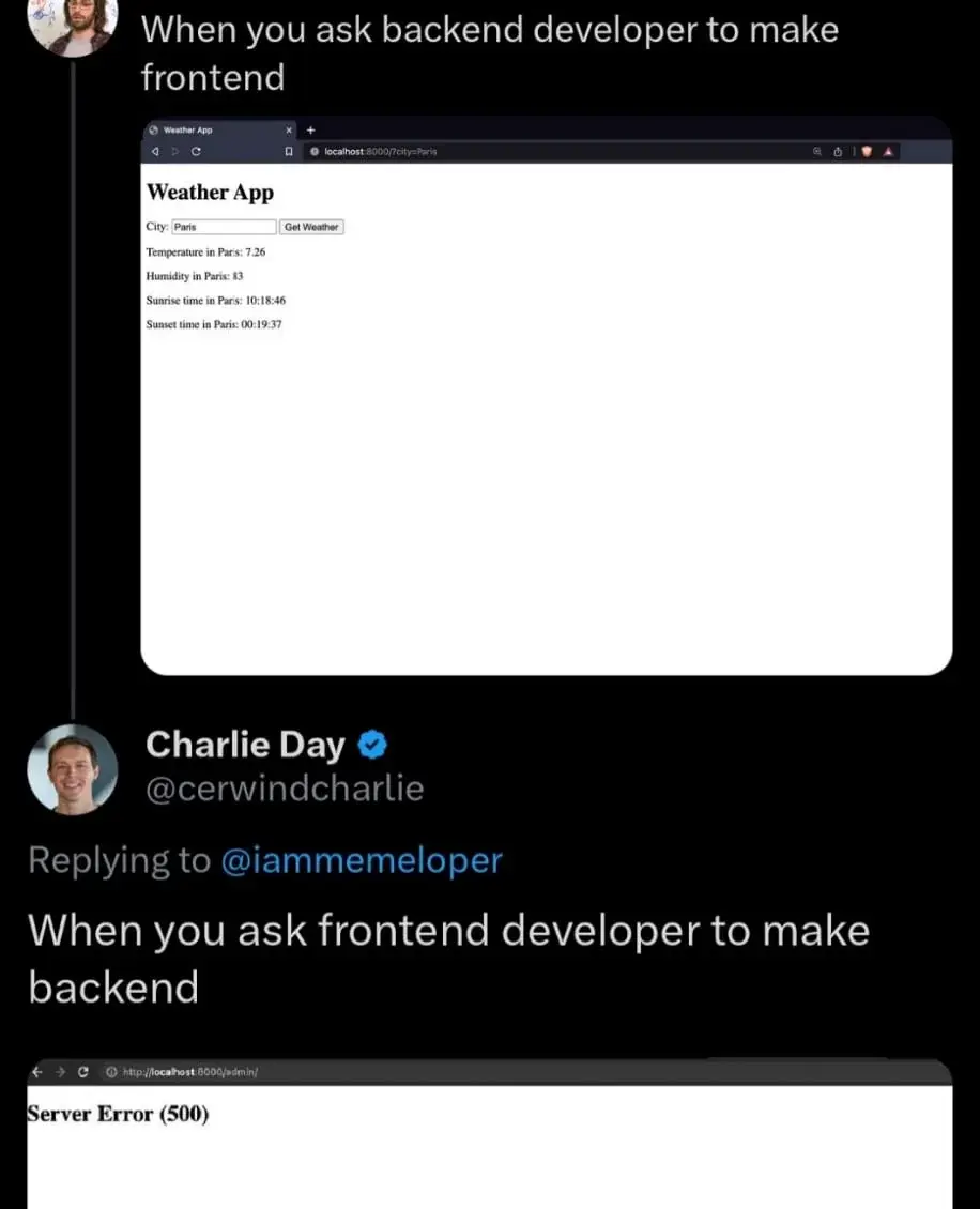
No bloat, no Javashit, no problem
Asa backend dev, it should be a 503 error. I live in 503 land.
in Paris
in Paris
in Paris
in Paris
What is this bloat? Trash site.
You can see the programmer used Copilot, who in their right mind would want to type <?php echo htmlspecialchars($city); ?> four times
Honestly you don’t even need to make the text field visible. If they can’t touch-type that’s on them.
I would prefer a dropdown list of all possible coordinate combinations.
Pfft just go there and feel the air yourself. Knowing the weather in advance is bloat anyway. If medieval sailors could launch ships without weather info and survive 30% of the time, you can too.
Imagine having to rely on physical senses to determine the weather, how pathetic. Honestly if you can’t infer weather patterns from learned data then better get back to that CSS.
It’s meant to be used like this:
curl localhost:8000/?city=Paris | grep Temperature >> TemperaturesOfTheWorld.logWho was in Paris?
Some fine gentlemen.
What’s a Paris?
I mean maybe B’Ellana if Tom was into some kinky shit but we aren’t talking about Voyager right now.
Looks like a perfectly fine frontend to me.
As a full stack dev I’d like to say that the issue I see most from backend devs isn’t a lack of styling, it’s their need to wrap every element in 15 motherfucking divs. They don’t seem to understand that most html elements are self contained and can stand on their own.
The page at the top looks perfectly fine. It’s useful, it gets the job done and it’s lightweight.
You sound like a backend developer.
maybe 🤣
almost as good as the motherfucking website. :D
I like the better motherfucking website
That person must have his monitor in vertical orientation
Shorter lines are easier to read because it’s easier to find the beginning of the next one. Rule of thumb is indeed a maximum of about 80 characters, go take a random printed book and see how long the lines are they’re like that for a reason. (Newspapers are shorter because smaller print, also, more opportunities for headlinest).
The contrast and line spacing stuff – debatable. But adjusting line-width is pretty much a must. Not doing anything somewhat worked on 4:3 monitors but it’s definitely awkward on 16:9 and on 21:9 your head is definitely on a swivel.
Oh and those large margins are very useful for things like footnotes, btw, or meta-information about the text (like those textbook “this is an exercise” stylings, just move the marking over to the margin). There’s also plenty of place for a hierarchical list of contents, always on screen, and various other nav stuff. None of that will degrade loading or runtime performance to any noticable degree.
Also of course note that that’s for text-heavy content, stuff you read as in reading an article or book, not stuff you look at in the sense of “reading” a poster. In this case you can e.g. turn those bullet-points into rectangular areas (also come up with a sixth one, then) and display them in a grid, each containing, well, what they contain now but also a link to further information. You see that pattern all over the place on the modern web and it’s a good one. Would need quite a bit more content than is present on those websites, though, otherwise you have more navigation shenanigans than content. You don’t need a fucking library index for a post-it note.
Source: My HTML is rusty as fuck but I know TeX.
Counterargument: if you need narrower text, you can adjust the size of your browser window. If I want wider text, you’ve capped it.
That is absolutely horrible UX: User interaction should not be required for your site to be legible. If you are one of the 0.000001% of people who wants all line breaks to vanish configure reader view yourself and hit that button, but don’t force 99.999999% of users to make that extra click.
…also, nothing whatsoever is stopping you from making line width adjustable within the page itself.
what about the best motherfucking website?
That’s pretty good too
Hate it, fuck that low contrast bullshit that makes me think my glasses are dirtier than they actually are.
the better motherfucking website is shit
I’m on mobile and the only difference i see is the lines of text on the “better” one are spaced more so I have to scroll farther.
Is it more legible? No, I’m not a fucking donkey and I can read a block of text like a normal person.
mobile layout on desktop, grey text, no https, slow remote font
It’s mostly about line width on desktop, the rest is whimsical filler content. Compare the sites in landscape orientation.
also no https and grey text
It’s almost fine. It needs to include units for the measurements.
Oh thank goodness my browser doesn’t have to download hundreds of js and assets just to use a damn calculator
I do front and backend work. Biggest issue I see is people not thinking through interfaces properly (e.g. efficiencies & atomicity of operations), sanitizing inputs on both sides, error handling, and putting in the appropriate validation, authorization & testing.
My SO just said your comment applies to sex just as well 🤣🤣🤣
What if I want the weather in Paris, TX?
You need to fire a gun and to a really good bald eagle impression.
As a backend developer who occasionally has to work on the frontend, that top image is pretty accurate although it requires bootstrap smeared all over to pretty things up a bit. After that it will have the “Good Enough” seal of approval.
A proper backend developer would have the query be a URL using the GET method with a parameter that the user can fill-in directly in the address bar and the result be a text/plain page with just a bunch of numbers separated by pipe characters (or an application/json page with that info encoded as JSON if you wanna be fancy).
This has the added advantage of working both for humans and as an API for use in machine to machine communications via HTTP.
The top one’s a motherfucking website, indeed.
motherfucking website
One of my all time faves!
RIP txti.es
What happened with it?
As far as I understand, they were offering free hosting and bad actors took advantage. They didn’t want to start charging so they closed down. Like giving out candies on Halloween and one asshole takes the whole bowl. No candies for you kid, sorry.
Shots fired! Shots fired!
what is wrong with this frontend? not enough ads? loads too quickly?
I would hire you as my lawyer.
Honestly, no units
It’s the temperature in Paris so I assume it’s Celsius.
Well, even when visiting this Website from New York? Or if this website is hosted in New York? So many questions arise from assuming :)
just missing some flexbox basically
love me some flexbox
No cookie banner with the worst dark patterns of UX imaginable
No designated time zone.
Man, hyperlinks need to be a different colour…


