- cross-posted to:
- [email protected]

- cross-posted to:
- [email protected]
We propose the symbol ⁂ to represent the fediverse.
…
⁂ is called an asterism. In astronomy, it refers to groups of stars in the sky, akin to constellations. We suggest that it’s a very fitting symbol for the fediverse, a galaxy of interconnected spaces which is decentralised and has an astronomically-themed name. It represents several stars coming together, connecting but each their own, without a centre.
…
@ is the symbol for e-mail. # is the symbol for hashtags. ☮ is the symbol for peace. ♻ is the symbol for recycling. ⁂ can be the symbol for the fediverse. ⁂ is standardised as Unicode U+2042, making it ready to copy and insert anywhere.
Git Repository: fediverse-symbol/fediverse-symbol
You must log in or register to comment.
Stealing an icon already designated for something else? As is tradition
It’s literally a character, like aitch.
⁂
I’m pretty sure we’re cool to use it. The advantage of using a glyph that already exists in Unicode is huge.
Are you one of the three proposers mentioned in the git repository?
No I’m just so very bored and this is the classic bikeshed issue so I figure I won’t cause any problems here.
Having a unicode icon that can be copy pasted anywhere is nifty, but yeah I’m really not a fan of choosing this one.
Why do we need to have a unicode character that refers to the fediverse?
Are we trying to replace our alphabetical language with a language of ideograms?
Can you answer, “Why do we need a symbol that represents the Fediverse?” Because modulo that, your question becomes, “Why does the symbol that represents the Fediverse have to have a Unicode codepoint?”
We don’t need it to be a Unicode character, but there are advantages if it is that are so obvious they don’t even bear discussion.
If they can’t be articulated, I lose respect for those reasons
That’s nonsense.
If you know what those reasons are, then whether or not they have been articulated should not influence how you feel about those reasons. To think I could control your mind by not saying things. Just think of all the things I am not saying right now. You’ll go mad.
If you DON’T know what those reasons are, then you are simply not able to respect them less than you do now.
How about, the same idea, but you use railroad couplers instead of buttholes? Everybody is connected! Rather than being full of shit.
Nah, It won’t happen because you can’t type it on a keyboard.
Yeah I tried it and it fell over ***
Blech
Three dots like this is also an ACAB symbol.
This looks like shit, is used for something else already, we already have an icon for the fediverse and this has 0 reason to exist
Of note: ActivityPub (the protocol) has its own logo, seen in https://activitypub.rocks/ and other places. The protocol and the community are absolutely separate things, so this is really good.
I’ve never really linked the rainbow star icon, just because I don’t really like rainbows (IMO the ace flag is the prettiest but I might be biased). I’m also still not convinced that Meta’s icon is even supposed to represent the fediverse, as opposed to just a Threads feature that lets it connect to the fediverse. So overall I’m a fan of this proposal, although it does bug me that it uses 6-pointed stars in the font on the webpage and 5-pointed stars in most other typefaces. The 5-pointed stars create some nice negative space.
I’m more partial to the pentagram/star ⛤🌟 shape of the current fediverse logo. It would be nice to have a monochrome and emoji form in unicode, just have the pentagram encased in a pentagon.
However, its design is a little too complex to be used at small sizes, as you would in text or in a button.
I wonder what the criteria are. Because ⁂ just looks like three blurry dots to me. It’s not making things worse, but I wouldn’t say it’s making them much better either.
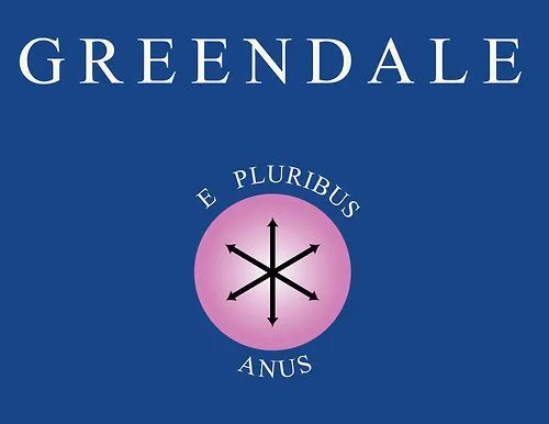
First thought: e pluribus anus
A fellow greendale alum. Streets ahead!
a bunch of assholes conected to each other… sounds about right.
I was gonna say snowflakes, but now I can’t unsee the buttholes.
https://scienceleadership.org/blog/the_use_of_illustration_in_kurt_vonnegut-s-breakfast_of_champions
That’s how I started to see them as anuses.
If Greendale Community College was a University.
Not an asterism but an assterism (or arseterism).
You mean like a human centipede
Nah, thats Reddit.
It’s a sarcasterisk.
…and it’s ruined… Thanks internet
deleted by creator
is said in webpage: the pentagram symbol is hard to distinguish at smaller typographicl sizes
I’m reading this thread on mobile, and the fediverse logo next to the community name is much easier to see than the three stars. If I didn’t already know what the three stars were from the rest of the post, I wouldn’t have a clue what they were supposed to be in the body. They look like a blurry capital A.
Obviously the fediverse logo is bigger there, which helps, but it’s not significantly bigger, and would still be clearer at a smaller size
I recommend the asterism to instead be adopted as the symbol for astigmatism.
I like it! 😁
Don’t typograh so small
1 thats not how typography works
2 im not webpage authour what u wan me to do about it moew?
So they touch upon it on their site:
The pentagram icon is the original symbol for the fediverse, created back in 2018 by Dr. Quadragon and Eukombos. It’s a great depiction of the decentralised nature of the fediverse, and has been serving the community well. However, its design is a little too complex to be used at small sizes, as you would in text or in a button. It’s also only available in image form, not as a typographical character.
I think they have a valid point. Currently on my website I use a Mastodon logo next to email and git and all that jazz. It’s not ideal, as it’s not so important that I’m on Mastodon specifically (and I might move to a self-hosted #Seppo instance in the future), but the existing fediverse icon would not work well at that scale.
It’s a huge branding effort to make it catch on though. And part of me likes the pentagram better.
My guess is because it’s unicode. But that doesn’t really matter. How often are you going to want to put the icon instead of just typing the fediverse
eg as a link where using a word 300 times on the same page would be cumbersome
“Fedi”
Already more than 50% shorter.
In comparison, asterism symbol (and any proposal that further extends into Unicode’s emoji area) still spends three, maybe four bytes.
I… umm… yes, I will grant that in UTF-8 and perhaps UTF-16, it encodes to fewer bytes. But that doesn’t have anything to do with my point.
Not so widely adopted if most results don’t include it.
my friend, please read the article. it does a great job of explaining the why. it only takes a minute to read.
I had to tell him, he couldn’t see it
Can we use dog buttholes instead of cat buttholes
no, this is lemmy.
Lemmings butthole then?
No, Lemmy Kilmister, buttholes of course!
Oh lord
Lemmy is god.