
You must log in or register to comment.
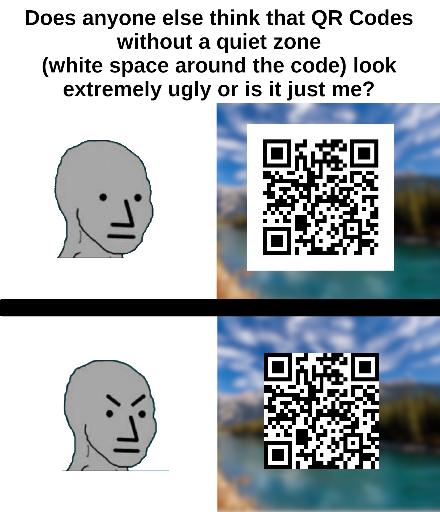
I’m no expert but I’m pretty sure that empty white space around it is to keep anything trying to read the QR code from getting confused by background noise.
I’m saving this for later, I have people send me print ads (yeah really) and this will help.
The white space is too big IMO, it should be one or two squares at most. Both of the examples look really bad.
Spec says 4.
It’s like putting a glass of water right on the edge of the table. Give it some space ffs.
the bottom one is not a qr code. The padding is part of it.
Yes, the Quiet Zone is part of the QR spec.
But the bottom one is still a QR code, it’s just an out-of-spec QR code. Most QR readers will still process it just fine, but there’s greater room for error depending on what surrounds the code itself.
Yeah… I’m pretty sure the white space is part of the spec for a QR code.
padding
Found the developer
Everyone must submit to the CSS box model!
i hate coding for browsers. To that end, I do not actually know css. I just called it padding when I wrote my own qr code library, because it was easier to say than “quiet zone”.
Just like “dots” or “pixels” are easier to say than “modules”
The bottom is giving “Here’s Johnny!”
It’s not just ugly, they don’t scan properly. I’ve had this problem many times on codes without padding because my email client or browser was set to use a dark theme.
It often goes unnoticed because most people are using a white or clear background that gives enough contrast.
It’s not just ugly, it’s against the spec. The quiet zone is meant to be 4 “dots” wide on all sides for the code to be optimally readable.
deleted by creator
Free porn site. Nothing too radical.
ha!
Another aficionado, I see.
Its oddly offputting 😂
I don’t mind in this case
It needs a frame, yeah.
I’ve never given it a single thought.
The ones without the border can look good depending on design. but often look cheap
It’s the same with text.
Fully agree!


