

GUys I’m from
20402035, here’s Microsoft’s logo
MS corporate comms army did a sik job getting across those inscrutable monolith vibes, I bet when it launched they all clapped (even though clapping is in performance reviews)
BONUS: heres Amazon, Faceberg and Nvideo too (yay diversity)
spoiler


We’ve gone full circle again

Lol well done
JOGUOR
Could JOGUOR become the new KN?
Tata cat.
Insiders might get it.
rimshot
They went from luxury car company to mediocre smartphone brand
JaGUar

You were supposed to remove the text…
I fucking hate this minimalist design trend more than it is probably reasonable to hate an aesthetic. It’s got the personality of unfinished drywall.
Honestly I think unfinished drywall has more personality. It’s utilitarian and rough around the edges, without the shiny surface veneer.
That new Jaguar logo is like somebody took a beautiful old house full of exposed brick and wood work and put a coating of white paint over everything.
It should be those puprple and yellows of Corporate Memphis
The younger generation barely reads let alone reads cursive. This is next generation marketing you aren’t the audience I imagine.
That’s what it is, isn’t it. Retirement in their design department, new hires and this is a Millenial message marketing to Gen Zers (and Alphas too, automotive preference starts early)
Even if that’s what’s going on (or at least that assumption on the part of the design team is what’s going on), this is shit. You know what requires even less reading than script OR basic print? THE FUCKING PICTURE OF THE FUCKING JUNGLE CAT.
Wow, they really took their logo from sexy, fast and expensive looking, to looking like an over priced soft drink?
That’s impressive, haha.
It looks like an off brand sportswear shirt you’d find on an African market.
I would have failed every design class I took in college if I submitted that. Why such wide kerning? Why lower case but upper G? Why so round? Why so completely unreadable at a distance because of micro serifs? There isn’t one good design element in this.
I think they want people to focus on the “agua” and the j and r are just little accents on it like its word art rather than a logo. Like, I literally picture the marketing weirdos at the meeting going off like this.
The “a” is the worst part for me. You can’t see those little stubbs at a distance. So it reads JoGuor at a distance. They didn’t just fail to create a good logo, they failed to preserve the name. One bit of advice I always give is “imagine this logo on the back of a golf card or a Pride brochure. If the logo isn’t crisp and readable in black and white in a 1/2 inch square then it sucks.” This design fails that test. Not just because of the messed up “a” but the wide spacing makes those unreadable "a"s even smaller than if the letters weren’t so widely spaced.
It doesn’t say “car” at all either; no elegance or prestige. The old logo was sexy. New one looks like a logo for bottled water or something.
Edit: it’s like going from James Bond to
Austin PowersInspector GadgetAustin Powers has style. Crazy 60s style but style.

Ya, I wanted to use a bland spy but there aren’t any-- I was going to use the Spy vs Spy guys because they are the most generic-looking, but ultimately I kept Powers because while he is stylish and fun, he is also really immature and the logo looks immature to me.
It’s not joguor?
It might just be depending on how far away you are
Top looks like it belongs on a nice sports car.
Bottom looks like you can find it on a new Multipla.
Bottom text looks like it belongs on some short-lived product for flavoring water or a gas station energy drink.
That font is awful. The G looks completely unrelated to any of the other letters.
The G looks completely unrelated to any of the other letters.
I see this, since half of the letters appear to be uppercase, and the other half lowercase:
JaGUar
Yeah, I see that, too, but at least everything else is all smooth curves. The hard angle on the g makes it stick out as super different.
JaGUar
Maybe they want everyone to pronounce it with heavy sarcasm and mockery.
No, the Multipla deserves better.
JaGUar
I too am something of a joguar
They probably paid 10 million for that and a 12 year old could have made it.
If I wanted to give it a bold facelift I’d just use the top one and remove the letters. Gives it an arrogant, “if you have to ask what this is…” vibe, which is probably a good thing for them.
Somewhere in Jaguar HQ, a marketing firm convinced the CxO suite that the most pressing problem facing the company was that the logo was wrong. So, in the interests of the shareholders they write off the goodwill value of the existing brand and dump millions of euro into this.
But who cares?
Sure, the idiots at jaguar are flushing their brand, but who cares?!? It’s their shit pile to destroy, after all…
It is more that there’s a grift happening. What’s the odds that theres a tenuous conflict of interest here with the various business and executives concerned? It’s a small cub and everyone scratches each other backs.

Hah don’t worry, the existing brand is utterly fucked now. One of the worst, most unreliable and badly made cars on the market
One of the worst, most unreliable and badly made cars on the market
But enough about Tesla.
deleted by creator
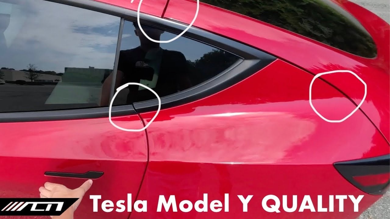
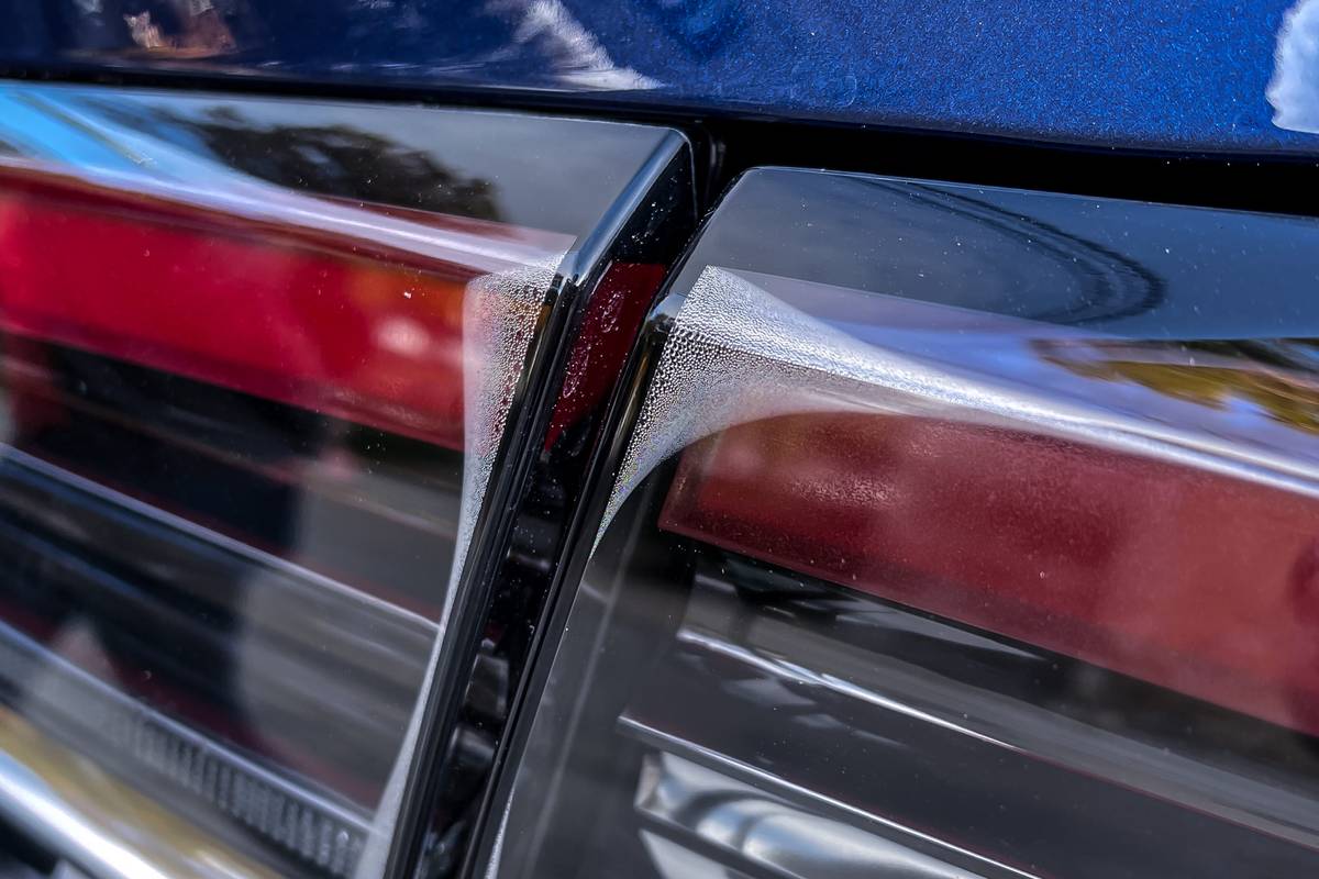
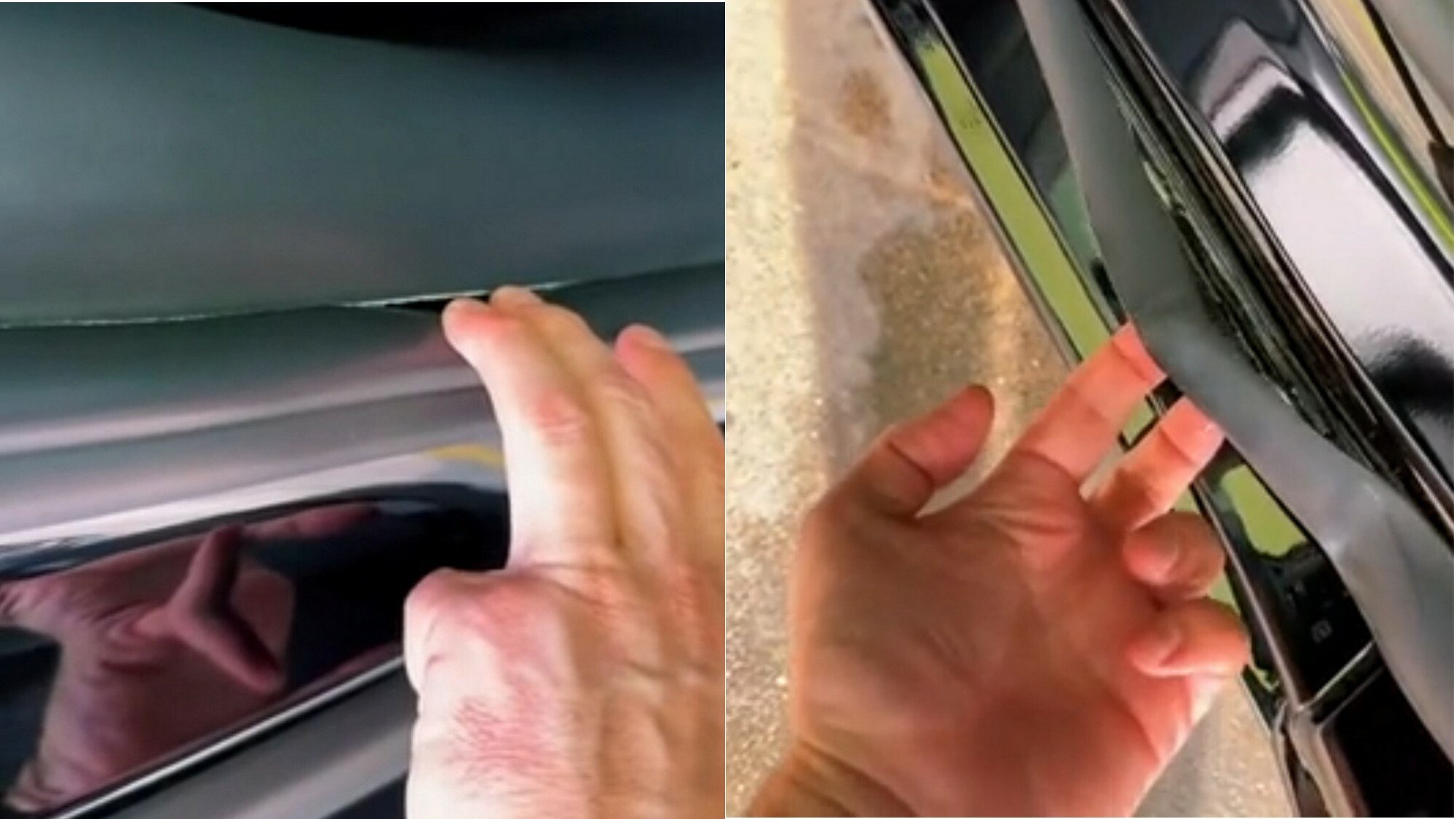
So, I’ve never owned one, but did a test ride on a con. It was the most plasticy, janky mess I ever sat in. Ok, a Hummer I once sat in was maybe equally bad.
Every surface your hand could touch wasn’t fastened properly and moved in ways it shouldn’t. The door handles wiggled about. The touch screen replacing the middle console - absolute nightmare. The swinging door got stuck halfway.
You could say, all of this is the interior and not the engine. But it’s what the user interacts with. If I can’t trust the manufacturer from my experience with the door handle, I’ll have a hard time trusting them about the brakes.
deleted by creator
I don’t know, I’m in Germany
Yeah, because who wouldn’t want to drive a car from a company whose quality control policy is “don’t” that does welding like this?
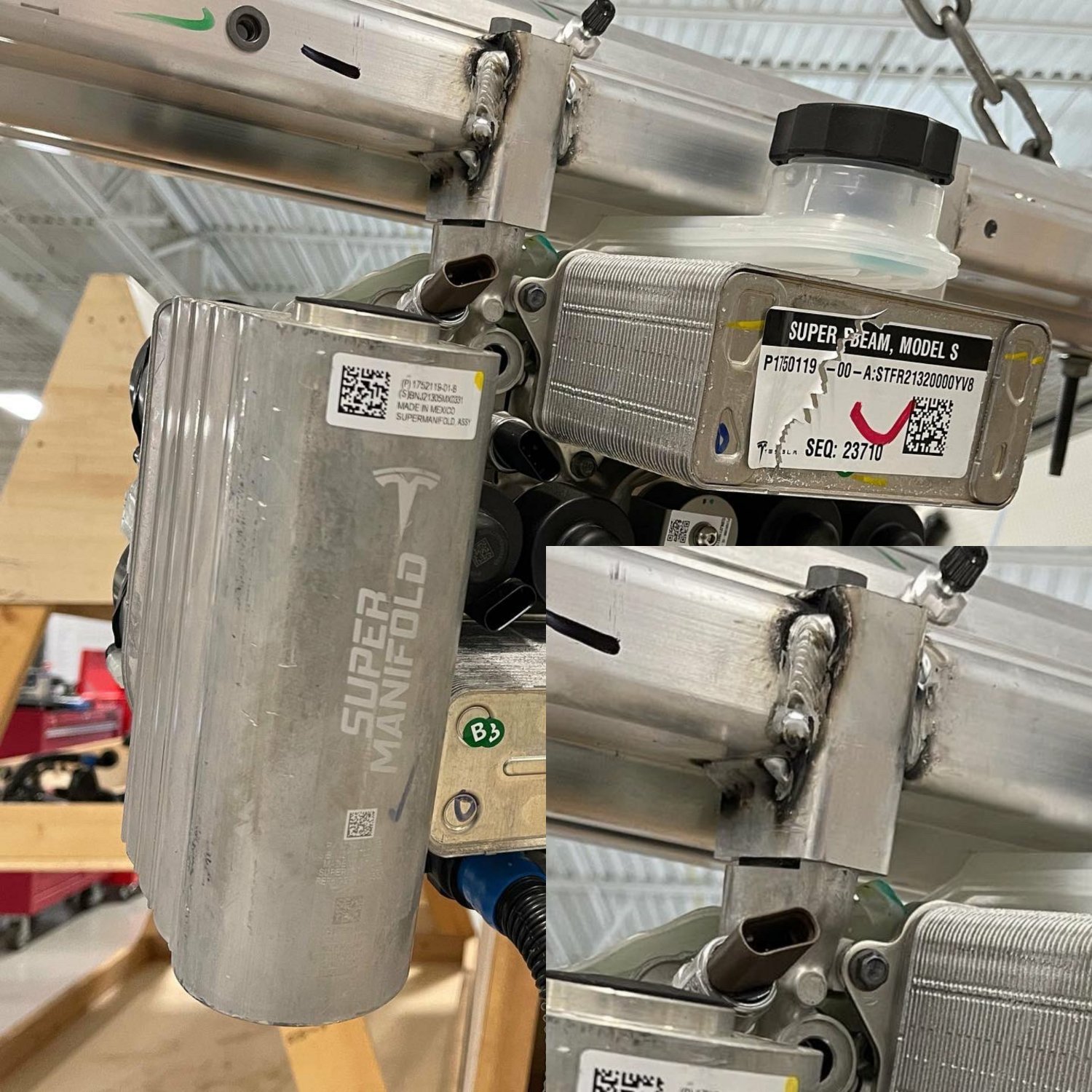
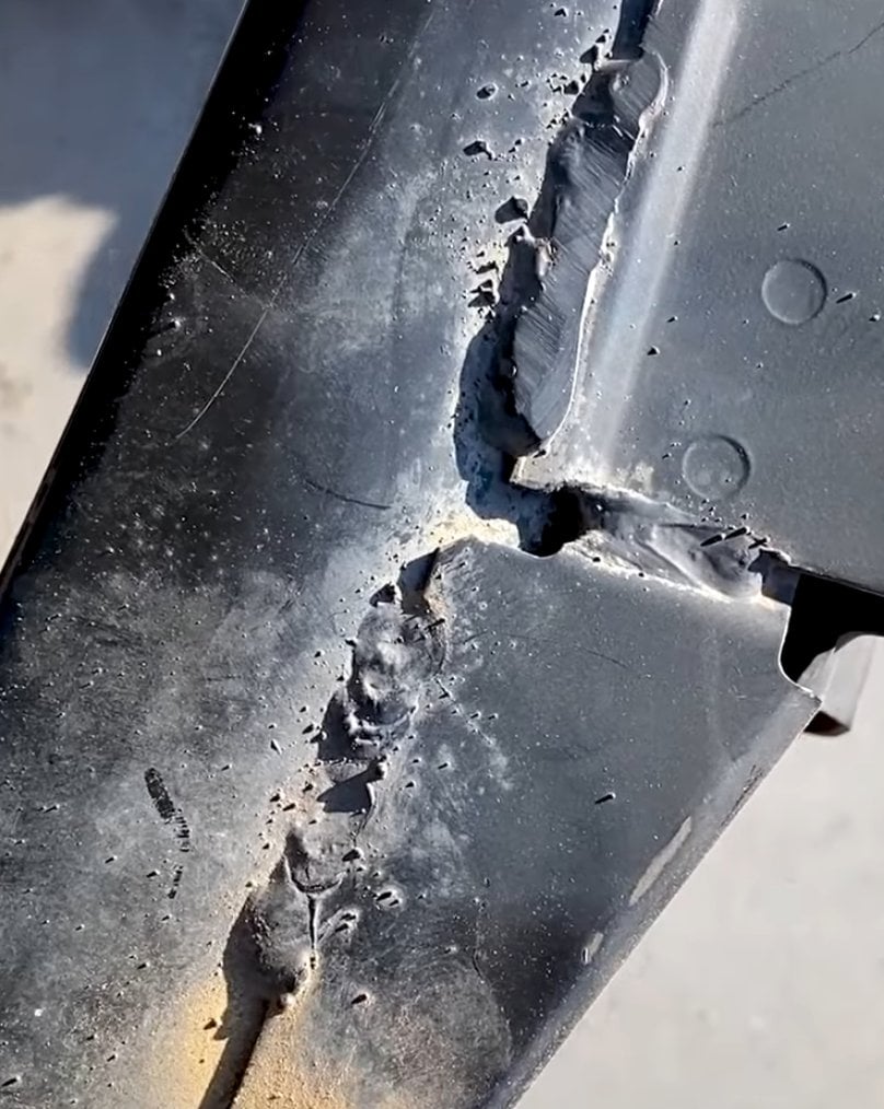

And fit things together this well
It may be quick and pretty to look at if you don’t inspect it closely, but it has the price tag of a brand new Aston Martin and the build quality of an 80s Yugo.
It’s still a prestige brand in the eyes of the masses. It might not be as good a brag down at the country club, but letting the plebs know that you can afford a car that costs more than their house still has value.
It might not be as good a brag down at the country club
That depends on if you’re buying new or you have a classic roadster.
A starting price jaguar f-pace ev is about the same price as a Ford explorer, jsyk.


![You know what, fuck you [un-Jags uar icon]](https://lemmy.world/pictrs/image/c1e5def3-4f79-4ee4-b74e-3672dac8df0e.png)