

Transcription
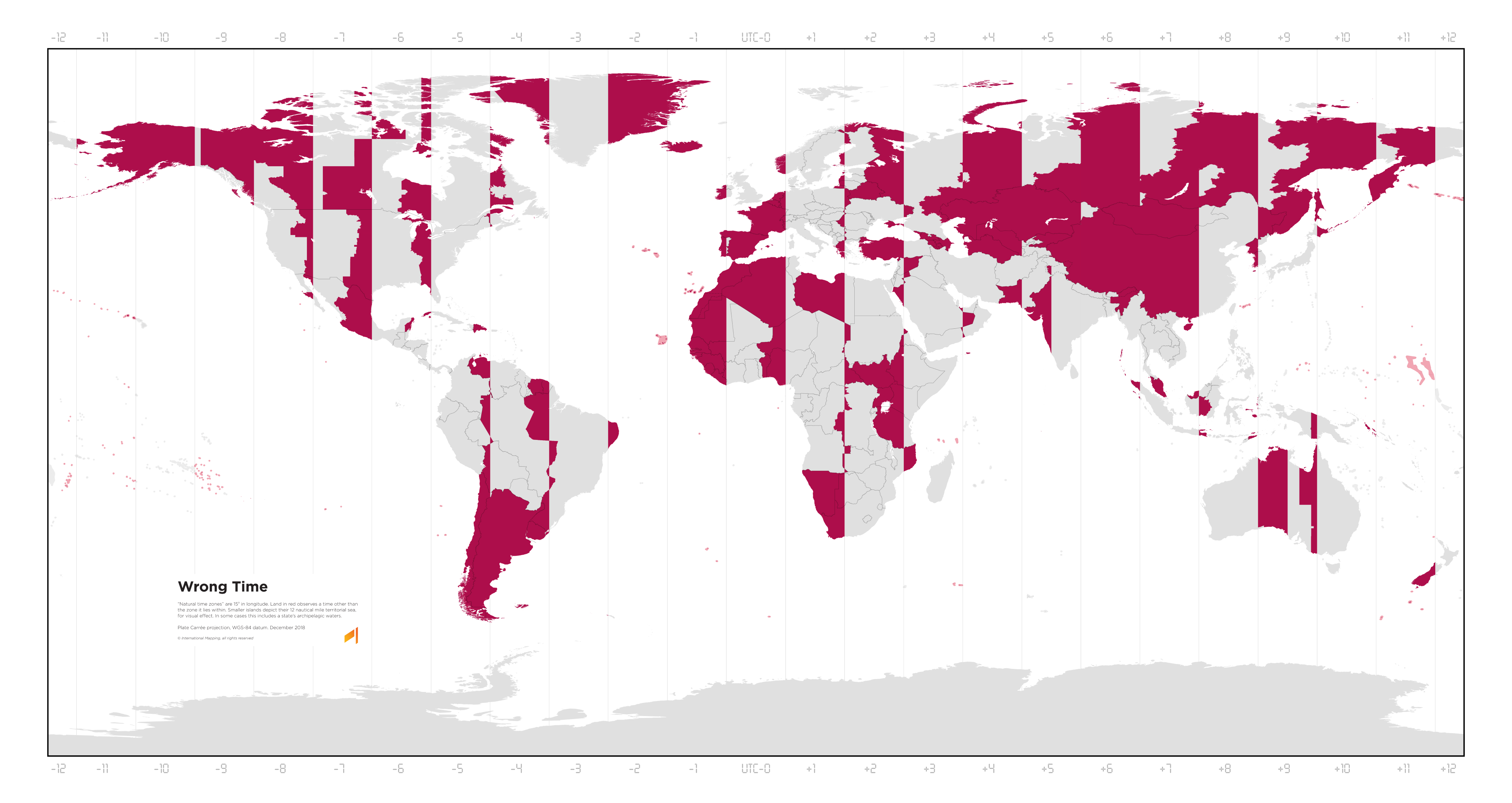
A map of the world with vertical lines marking the time zones from UTC-12 to UTC+12. It has a legend:
Wrong Time
“Natural time zones” are 15° in longitude. Land in red observes a time other than the zone it lies within. Smaller islands depict their 12 nautical mile territorial sea, for visual effect. In some cases this includes a state’s archipelagic waters.
Plate Carrée projection, WGS-84 datum. December 2018 © International Mapping, all rights reserved.
You must log in or register to comment.
You should make one that shows how much the official time is wrong with respect to the local time.
That would require way more effort than “find picture from elsewhere on the Internet, scale it down to a size my Lemmy instance will let me upload, and then upload it.”
But anyway, you can basically get that from this chart, for the most part. The rightmost edge of each red section is 30 minutes ahead, or the leftmost is 30 minutes behind of where it should be, when those edges are caused by the time zone itself (rather than national or regional boundaries like state lines), growing by an hour per vertical line.
So, the westernmost parts of Spain are about 1 hour 30 ahead, while the easternmost parts of Poland are 30 minutes behind. The westernmost tip of China is about 3 and a half hours ahead.
Yes, I know about China and Spain, that’s why it would be interesting to plot it.
Spain and western China are fucked 😬
It strikes me that the Middle East, central Europe, and south-east Asia are the best places for time zone accuracy, while western Europe, western Africa, and northern Asia are the worst.
Asia needs to get its shit together.
I don’t think Asia on the whole is doing particularly bad. The projection makes it look worse because north Asia is the worst part of Asia, and the projection makes that part look much bigger than more southern parts.
The Middle East, the Indian subcontinent, and southeast Asia are all great.
Time zones are fundamentally wrong and immoral. Only the Time Cube is correct.
If you want a real trip click through the different archive dates on this site. Dude goes through a whole progression of who he’s pissed off at month to month.
It’s great. He adds them randomly in the middle of rants too.
You are not authorized to discuss Time Cube!
even Caves of Qud celebrates this legacy

Oh man, I did not know that Qud had a TimeCube reference…
gene?
There are four simultaneous 24 hour days! It’s bellybutton math.
Absolute classic.
I would have voted for the TimeCube guy over Trump.
should I read it?
An item on my bucket list has been to create a map with “gradients” (really just 1-minute rectsngular bands) of what time the high noon is in that location. This map is just a subset of that, coloring red the areas with an over-30-minute offset. I’d make one for January and one for July to account for DST on both hemispheres.
I’ll probably convert a publicly available timezone shapefile into a Plate Carée (or similar) projection SVG, create a “gradient” spanning the entire globe and then use it as texture for the SVG shapes, horizontally offset appropriately.
That would be really cool!
when?
in the summer or winter?
One of the many reasons this makes no sense.
This uses standard time across the board. Because accounting for shifts due to pretendy-magic-time would be impossible in a static image.
We spend most of our year in daylight savings time. Standard time is the pretendy-magic-time.
Daylight saving time would take it from western Europe being red to almost all of Europe apart from Russia and Belarus being red. It would invert the parts of the contiguous US states so the current correct time places are wrong, and the current wrong parts are correct. Which means both the east and west coasts (the most populated parts by far) are now wrong. And incidentally, Alaska stays entirely red. It would make the western most edges of NSW and Victoria good, as well as the western half of South Australia, at the expense of Sydney, Melbourne, Adelaide, Canberra, and Hobart, nearly half the country’s population, before you even begin to account for the rest of the southeast.
Just pointing out the ridiculousness of getting petty and insulting about the way other people define time scales because you don’t agree. There is no objective truth here, just subjective opinions. ALL of those opinions and methods have flaws, especially your beloved “everyone should just use UTC”. There is no such thing as “correct” here, so putting that word in your map’s title and using “right” and “wrong” in this discussion is just naive.
The thing with DST is it’s not just a matter of personal opinion. Studies have been done on it, and they universally come down on the idea that it’s really bad. Heart attacks, traffic crashes, and suicides all go up as a result of DST. Economic productivity goes down. Here are a handful:
- https://www.cell.com/current-biology/fulltext/S0960-9822(19)31678-1
- https://www.ncbi.nlm.nih.gov/pmc/articles/PMC7205184/
- https://pubmed.ncbi.nlm.nih.gov/29461606/
- http://66.160.145.48/fairclough/pdfs/26/hb0019_attachment_0003.pdf
- https://www.ncbi.nlm.nih.gov/pmc/articles/PMC6692659/
- https://www.ncbi.nlm.nih.gov/pmc/articles/PMC2259373/
I’m particularly a fan of the penultimate one linked there, which states:
In summary, the scientific literature strongly argues against the switching between DST and Standard Time and even more so against adopting DST permanently.
But also, you know I didn’t make this map, right? It’s just map that paints places in red if their solar noon is more than half an hour away from their clock’s noon. Which is the “right” way to do things unless your goal is abolition of time zones entirely in favour of adapting working hours to the local conditions without adjusting clocks.
You’re so wound up about making your point and defending your point of view that you’re not actually comprehending my comments. It’s your map in the sense that you are presenting it to us, who authored it isn’t really relevant to this discussion.
Bruh, I just presented it because it was cool. You’re the one getting hung up on whether the fairly basic premise of the chart is the best premise that could have been used.
But yes, that DST is bad is a hill I was absolutely die on. That shit is terrible, and I have zero patience for people who defend it once the reason for objecting to it is explained to them.
France, Spain, Belgium, and the Netherlands are in the wrong time zone because of Nazis https://lemmy.ca/post/2220899
That doesn’t exactly explain why they’re still in those time zones 80 years later, despite only having been under Nazi control for less than 6 years.
Not only that, most of Spain (except the Canaries), the most extreme case, Is on a time zone that has a border with Russia, while actually being on the Greenwich meridian.
The entire timezone and Gregorian calendar concepts are outdated political tool. We should’ve switched to consistent UTC-only clock and natural World Calendar or Cotsworth calendar
natural World Calendar
Couldn’t find details of what that is.
Cotsworth calendar
Ok this is very interesting. I like it.
But personally, I’m a bigger fan of the Calendar of Harptos from the fantasy Forgotten Realms world. Conveniently, it also has 365 days per year, except every 4 years when it’s 366. 12 months of three ten-days each. It has a few more intercalary days than Cotsworth, but maintains a number of months divisible by 4 so we can continue having 3 months per season.
And speaking of seasons. In this idealised world, everywhere (or at least everywhere that uses the Spring, Summer, Autumn, Winter season cycle) should use meteorological seasons, rather than the ridiculous astrological seasons currently more popular in Europe and North America.
It sort of makes sense for most of the countries on there, as they (or the slice of them in the awkward timezone) aren’t big enough to justify splitting their timezones in half. Just pick the one that matches the most people and move on…
But what the bloody hell are countries like Spain, Portugal, and France doing?? Basically their whole country is in the wrong timezone!
They’re basically doing the same thing China does. It just ends up looking even sillier because there’s an international border between them and Germany.
Portugal’s a little weird because they should he UTC-1, and unlike their neighbours they don’t stretch their time massively by pretending to be in the same time zone as Germany. But they compromise by being in UTC.
Wrong title, it should be:
A Map of the world showing where the local time zone is wrong more than half hours
An hour is a human concept, we just divided the day to 24 parts, we could use whatever else division. Local time is correct only on the center longitude, which is a line with zero thickness.
Also it’s clearly visible that France and Spain are in the wrong time zone, and it was changed by the Nazis. Before WW2 France and Spain was in the same zone as Britain. France changed because of the German occupation, and they forgot to change back after the war.
Same thing with road driving side iirc
technically correct
Nazi time Nazi time
It’s nazi o clock somewhere
Correction: Spain time zone was not changed by the Nazis, It was changed by the Fascists. Franco changed it to have the same time as Germany.
Fun fact: Have you seen videos of dogs begging for food the day after the time change, having to wait an extra hour? Spaniards were the same, and after the time change, they continued eating lunch and dinner according to their biological clock. That’s why Spaniards have lunch and dinner at later hours.
So looking at the US map, it looks like a lot of the red zones are because they’ve arbitrarily defined the borders of the time zone. But US time zones are mostly concerned with making sure that the country is roughly evenly spaced across time zones. Really the northeastern part of the country is what’s out of alignment.
No? We’re perfectly fine!
I lived in New England for a couple of decades. Trust me, you’re not.
Timezone-wise though?
If you like it being dark by 4
World: So China, you are one of the largest landmasses on the planet. How many time zones do you want?
China: No thanks. * sips tea *
“wrong”. technically it’s entirely made up. you can write whatever number you want on the scale where the sun hits the zenith as long as all people nearby can agree to it.
Yeah, methinks a gradient would have been better instead of a solid demarcation
I want more sun after my work. Local time zones don’t make any sense.
Humans generally are awake during daytime hours and sleeping during night time. It makes sense that the time we assign them are fairly consistent.
Then there’s China just being ridiculous.


