What fonts are you currently using on your system? Which do you think is best for the terminal or for your desktop environment?
(updates) Ok I think I’m a fan of Ubuntu nerd fonts right now
Biolinum O for desktop
Liberation Mono for terminal
I always end up with SF Pro Display for my desktop. For terminal I’m happy with several mentioned here.
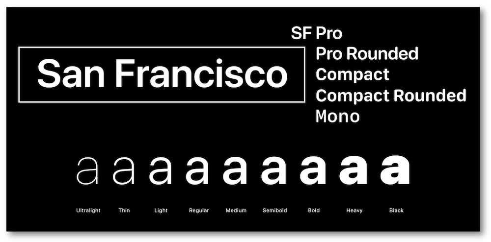
There are a lot of San Francisco fonts. Have you tried all of them? :p
🟨 preview: SF Pro display

🟨 preview: Other SF fonts
Since basically forever I use DejaVu Sans for UI elements and DejaVu Mono for the terminal.
me too, I loved Verdana before I discovered FOSS and DejaVu Sans is basically FOSS Verdana
I always use Dejavu sans mono for terminal and programming too. I think its the best in terms of readability where indentation is important
i want serifs. I use Go Mono for monospaced text. i’ve yet to find a good proportional slab serif font to match though.
By proportional slab serif do you mean unmonospacing the monospace like what Ubuntu does? I guess that’s why Go Proportional wouldn’t work being a sans serif
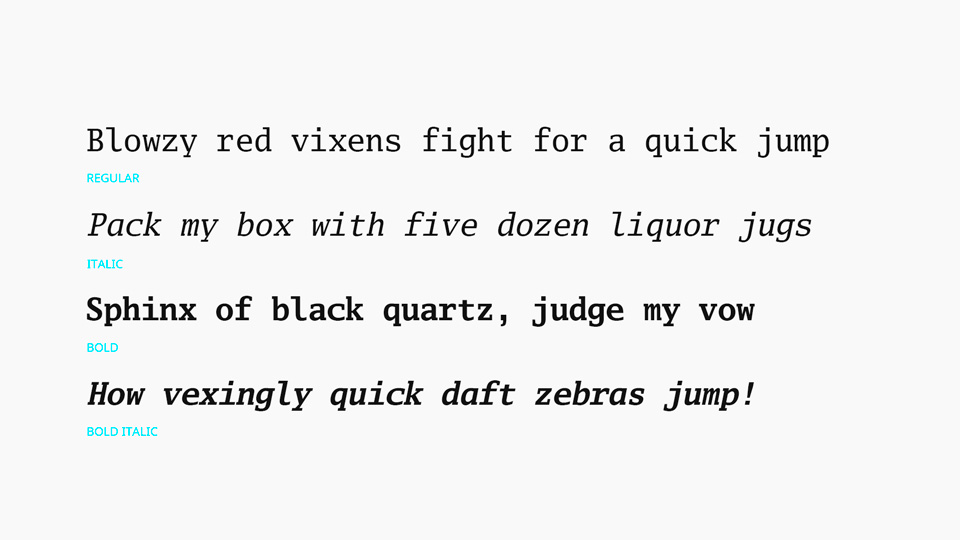
🟨 Preview: Go Mono
yeah just using the same characters but “squished” doesn’t work since the serifs take up the character space. you need a font designed as proportional. slab serif just means that the serifs are squared rather than pointed like on Times.
I switched to Commit Mono for Terminal not too long ago but I really like it. Otherwise I use Cantarell but only because it is default and I never felt the need to change it.
Anyone using Nimbus Sans?
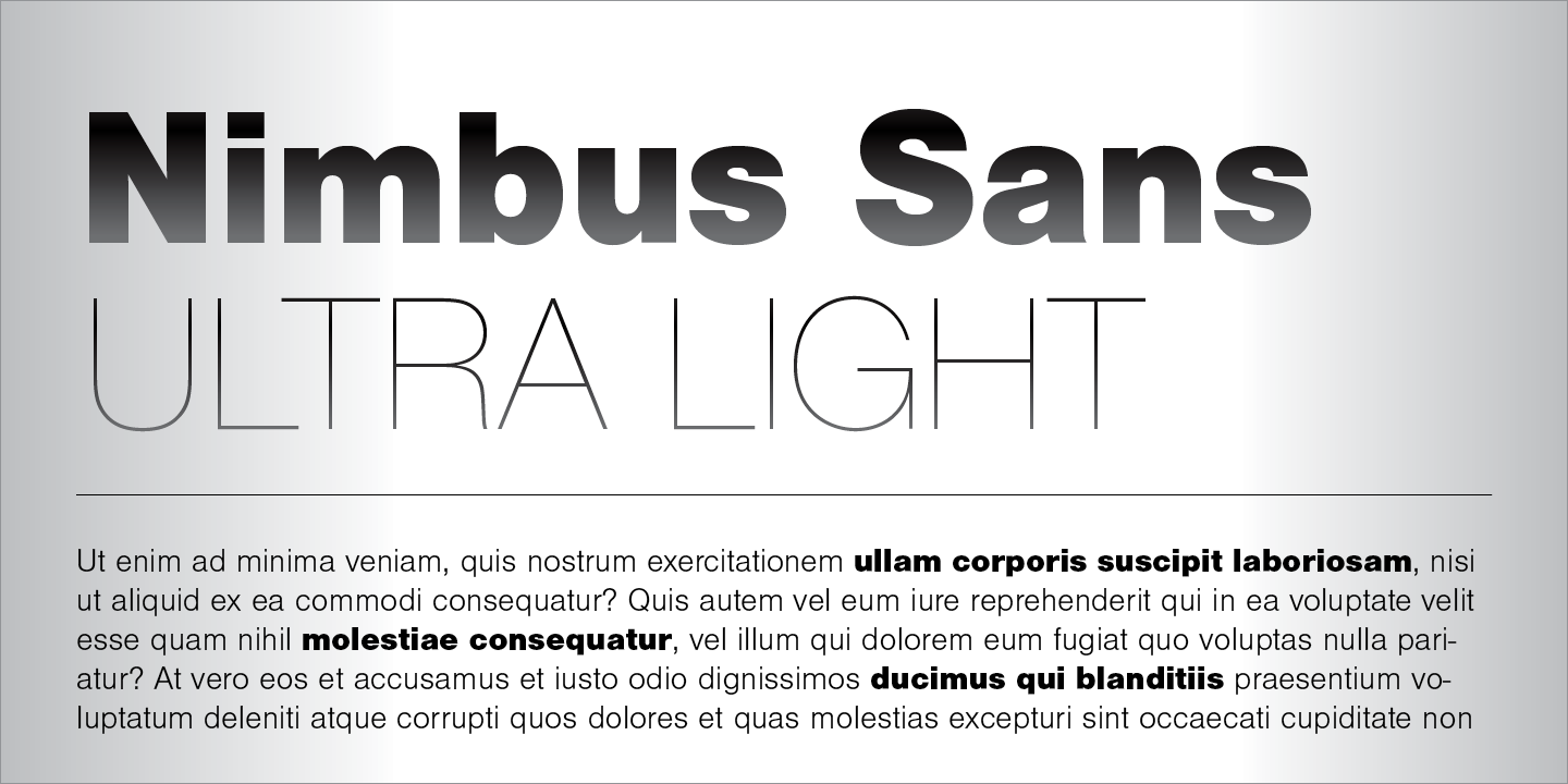
It’s actually preinstalled in a lot of systems. You can check via
gnome-font-viewerorfind /usr/share/fonts -name "*Nimbus*"@SolarPunker I use Exo2 as desktop font and FantasqueSansMono in terminal.
I know that this will anger some people, but I just use the defaults and I don’t get why there are so many fonts, since they don’t seem that much different to me.
I don’t get why there are so many fonts
Because anyone can design one.
deleted by creator
I use M+ Fonts for most of my stuff.
Hack nerd font is my go to for terminal use.
Fantasque
Iosevka
I don’t have a reason to move away from the Fedora defaults except for monospaced fonts.
Terminal wise, terminus is my default. It’s so clean, and it looks good without anti-aliasing.
Roboto Mono is my current preference for monospaced fonts.
Adobe Source Code Pro and JetBrains Mono are good alternatives as well.
Ubuntu Mono for terminal, code, and data, Open Sans for the rest