
As a strong supporter of open-source and community-funded projects like Lemmy, which prioritize serving users over investors, I believe Lemmy has significant potential, and that’s why I am here. However, it is clear that its growth is nearing a plateau in its current form. Despite the surge in users following Reddit’s API changes, Lemmy continues to primarily attract tech-savvy individuals, politically left-aligned users, and those accustomed to old Reddit. For Lemmy to reach the broader average general audience, meaningful changes are necessary.
The rise of Bluesky demonstrates the importance of ease of use and a user-friendly design. Its polished and familiar interface is a key reason for its growth and appeal as an alternative to platforms like X/Twitter. This same ease of use is what Mastodon lacked, leading to its initial hype fading quickly. The average user is unlikely to adapt to something that feels complicated or unfamiliar, and this challenge also applies to Lemmy.
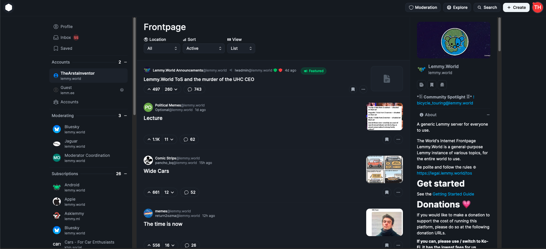
As someone who started as an average Reddit user and became more tech-savvy over time, I can confidently say that first impressions matter. When users first visit lemmy.world, the default UI is often enough to discourage them from staying. Most will not explore the homepage sidebar to explore, figure out and switch to one of the alternative UIs available, which is unfortunate because a better UI could make a huge difference.
This is why I propose that large servers like lemmy.world adopt Photon UI as the default web interface. Photon is currently the best and most mature alternative UI, offering a visually appealing, modular design that feels familiar to users of new Reddit. It makes excellent use of screen space and provides customization options like compact and cozy views. Unlike some other alternative UIs, Photon is actively maintained and ready for widespread use, although in no way is it perfect, this can also help bring in more contributors to the project development.
While it is important to continue offering other UIs as options, I believe adopting Photon as the default UI could make Lemmy far more appealing to the average Reddit user. First impressions are crucial, and the current default UI has turned off many potential users. If we want Lemmy to succeed as a true Reddit alternative, we need to prioritize user experience and accessibility. Thankfully today, Lemmy still continues to be THE biggest Reddit alternative, while our userbase is still considerably smaller than Reddit, it’s the biggest of any alternatives, and Lemmy continues to somewhat be in the spotlight for those seeking alternatives, we can’t let growth stagnate, it’s high time we make the platform more welcoming and appealing for the average joe.
EDIT: The image I attached is from photon.lemmy.world, which I just realized is using the outdated version of Photon, I have updated the image to the updated current photon version from phtn.app. There are a lot of improvements made.
Nah, the current UI is fine. We don’t need fancy shit on a link aggregator. Reddit went to shit after “updating” the UI.
Your opinions of “good” or “best” aren’t the same for everyone.
Lemmy isn’t a UI, it’s just data. Each app that connects to lemmy (not instances in the fediverse, but apps that let you sign into a lemmy account) has their own interface. A person can (and probably has) made an app with a modern interface for lemmy.
We are not confined to a specific app or interface, anyone can interface with Lemmy and present the data in their own way.
The most used UI for Lemmy is developed by the Lemmy project. Lemmy UI is modular, but Lemmy is definitely also a UI.
I forget people look at Lemmy on desktop/laptops. I just assume everyone has 15 minutes to kill and picks up there phone and opens the app they prefer, that they put on the second screen, 3rd row, 3rd column from the bottom where it belongs. If you have it somewhere else… Well maybe you have 5 columns instead of 4, or are wrong. But never on the first page … that would be obsessive. It has to hide, lurking on that second page laying in wait. For its 15 mins to shine
I don’t use lemmy, so I don’t have to suffer it’s UI. I use Mbin/Kbin and the UI is almost perfect with the settings I changed, I get like 8-9 posts simply laid out with a little thumbnail and the title, no useless features or buttons. Just like old classic reddit, just slightly less compact.
But this “Photon UI” looks absolutely disgusting, I get it might be how the modern web is, but modern isn’t always a good thing, especially when talking about UI/UX.
Every time I see the example of people used to Twitter complaining about Mastodon’s UX and UI, the experience of using the Twitter app and the constant struggle of figuring out whether the non-sense anomaly you see is a bug or just a feature to keep you locked in is becoming an even more painful memory…
I don’t think the problem is the UI. Fediverse is more complex by nature than a centralized platform.
You have to choose a server, then an app to visualize (not only online but on the phone too) and there’s plenty of alternatives.
If everybody joined the same server we end up with a centralized system and if every large server has to use specific UI what’s the point on decentralizing?
I also thought that fediverse had to try to be easier to use but the point is that it’s more complicated precisely because the user has more power and hence has to do more decisions.
And I think people have to understand the basics of the fediverse, otherwise people will not stay precisely because it’s more complicated. If I didn’t care a bit I would be on Reddit not here and I’m currently using both because there’s simply much more content there and hopefully with time I can use Lemmy more and less reddit. I’m willing to do the effort of slowly transitioning because I believe in this but people who doesn’t care won’t stick around.
/me pines for the days of protocol over interface. NNTP + killfiles were the bees knees. Then we could just all pick our own interface to connect to any lemmy host.
You really trying to convince us with a screenshot of the ugliest ui i ever seen huh
I absolutely hate it so much
Personally, I think this looks great. I love the command palate and the display modes, and it checks the other boxes, for me at least.
BTW I actually used an outdated version of Photon on the screenshot, looks like lemmy.world haven’t updated their photon version, I have updated the post with the updated current Photon UI, I think more people will like it. It’s an improvement from the older version.
The void at the center of the page is whispering things to me.
Yeah I used old Reddit. I don’t want something that looks like new Reddit
.world in a nutshell
better than whatever the fuck .ml in a nutshell is.
You both aren’t wrong… But this isn’t about you.
If it’s not about me then why does it exist.
I like it simple. I use Jerbora on Android and can’t be happier. I use duckduckgo browser and it’s YouTube mode, so I have no ads, cookies, trackers or popups. It’s actually close to perfect.
Compared to e.g. Discord, I feel like wasting most screen real estate for static eye candy info,… no thanks.
Lemmy will be getting a new, more modern UI sometime soon.
It is being actively developed and you can even try it out today: https://github.com/LemmyNet/lemmy-ui-leptos
Has anyone deployed it yet? Curious to see what it looks like, but too lazy to deploy it myself
Apparently lemm.ee has it deployed: next.lemm.eeedit: though I’ll keep using this UI or Photon if it stays like that. It is, at the moment, very ugly.edit 2: wrong information
Wait, are you sure? I thought it was only a project by @[email protected] : https://lemm.ee/post/27356044
Oh lol, my bad. Didn’t see that.
That’s too much padding. It needs to be more like Hacker News.
Are you aware of https://old.lemmy.world/ ?
Oh nice. It’s like reddit with res. I like that a lot.
Glad to hear!
Is it still developed?
Not so much unfortunately
- With what I think are near enough default settings, Voyager shows me about 9 stories. It doesn’t feel cramped and the layout is regular, everything lines up.
- With what I think are near enough default settings, my browser here shows me 14 stories, with a good accessible font size by default and me easily zooming out to 80%. It doesn’t feel cramped and the layout is regular, everything lines up.
- I can see 2 stories in that screenshot. Why would I want to have something that’s at least 5 times worse, it feels cramped and parts of it line up I guess?
I literally hate the new reddit UI, as do most peeps I’ve spoken with…
The new reddit UI is designed to push ads, and push premium subs.
I’m fine with having less normies and an non-algorithmichal echo chamber of fellow leftists and tech savvy persons. These are my homies.
Lemmy continues to primarily attract tech-savvy individuals, politically left-aligned users
You say that like it’s bad 😊
Your points are valid, but you do run on the assumption that growth is good, which is not an universal truth IMO.
As someone trying to keep the non-tech communities active, having a few active posters would definitely be an improvement
Yes, I just want to point out that opening the floodgates will get you the fish, but also a lot of mud.
What communities do you manage?
Personally I think the day to day UX is fine, but finding communities is the real mess.
To find communities: [email protected]
Thanks!
About link for finding new communities, I worded my request badly, I am not interested in finding new communities, I’m interested in finding specific communities. Thanks though!
Newcommunities has posts where the active communities on a topic are posted, so that can help
Sure, but it’s impractical when you search for a community.
Edit: tried your link, but the search function doesn’t seem to work. I searched for “art” and got technology, world news & shit post.
I just tried, art indeed seems too broad for some reason.
I just tried “television” and got relevant results. “video games” and “trains” work too
There was this post from 4 months ago, I’ll start a new one today: https://lemmy.world/post/19101266
I thought the point of Linux was the ability to customize anything, including your layout?
Not criticizing, just confused as to who this use case would be aimed at.


