Google designers can suck my ass with a straw. Fucking garbage gets worse every iteration
Fuck I don’t like it. It seems like Samsung and Google got in a one night stand.
And old iOS set them up with poppers.
Everything huge and round, pill shaped in latest OneUI is terrible. I don’t like it.
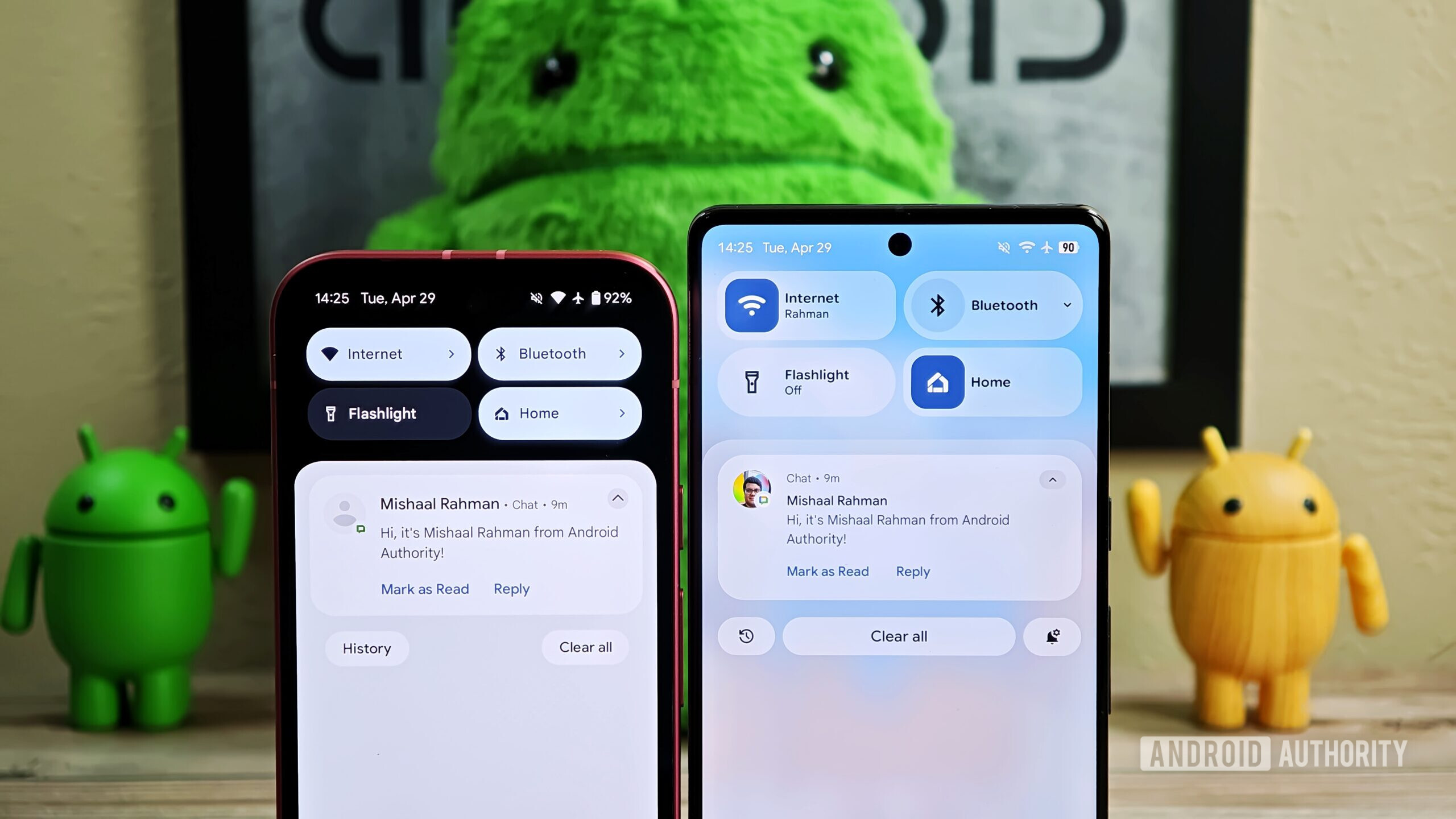
They just keep making the quick action buttons worse, don’t they?
I miss the Android 11 style ones, myself.
android 4-7 were perfect. it all went to shit with Oreo, we just didn’t realize it at the time because we thought the changes were minor inconveniences we’d get used to. once md2 dropped, we should have realized we were cooked, but it was still… innocuous how small and mildly annoying the changes were. by 2020 though i had noticed: no good updates had come to my phone in almost 4 years and every update just broke something that used to work. then in 2023 google announced gemini was adding new features to the assistant. features that had slowly gotten broken but had worked back in 2015. this is our lives now. a constant churn of features being taken away and brought back
Ooh, ah, thinner sliders, background blur in quick settings.
Quit fucking around, and give us real changes. Like letting us fully disable immersive apps (I’d like to see my status bar in maps, thank you very much), fix the worthless waste of space oval quick settings, which I just stopped using because they’re now useless. I went and loaded a sidebar app, because it works so much better than the now pointless quick settings.
And let users adjust a lot more stuff, like for accessibility. I can’t imaging handing a new phone to someone with vision or motor issues. I hit the wrong thing all the time, and I don’t have either issue.
Oh, bringing color back to the status bar, but only for Google icons? Can I please have the color back like I had, oh 15 years ago? So I know who messaged me by the color of the icon?
Keep on dumbing things down, while also making them more opaque.
Yup. This is like Windows 11 for smaller screens. Pretty, but useless. Fuck.
What sidebar app did you are you using?
Combination of Macrodroid’s drawer feature and Jina Folders. Works pretty well.

Literally just rehashing old UI that’s been around for over a decade.
Windows Vista, Rainmeter and custom Windows themes from Deviantart have had these motifs for over a decade.
It’s closer to Win8’s Metro and Win10s FluentUI more than Vista’s Aero but your point still stands. These are decade old design philosophies.
They asked AI to improve the design. 😬
Looks the same but worse. Work on bugs and efficiency instead.
Can they stop? I’m tired of having to relearn how to use the same dumb system every time they come out with a new version. Even more obnoxious is how they keep moving further in a gesture direction. Stop taking away my damn buttons!
Wow, finally. The new changes are much appreciated and long. I like the blur UI from Smart Launcher 6 and what ColorOS has done for the notification shade. As long as they keep the unified notification shade. I’m fine.
Ugh, I don’t like what they’ve shown here. It looks like iOS, and it looks dated at that. I’m open to it looking nicer once take, but I’m not holding my breath.
It feels too samsungy to me. Overall it seems a tiny bit better, but man just give it more wacky or intense colors from the wallpapers and avoid this flatness please. I want MORE FUN
These are super sexy changes. Finally we’re seeing some progress in Android again.
Hahaha, love the irony.
Fuck, not again…