
You must log in or register to comment.
hey I had that winterboard theme like 15 years ago
Using the developer beta and my phone runs quite hot. Of course, it’s a beta so they’ll probably reduce the effects to make it less of drain on performance and battery life. There is a reduce transparency toggle which does help a bit, esp. for readability. Hopefully when iOS 26 is released there’s an obvious option to reduce transparency.
My opinion on the “liquid glass” is mixed. Some parts look pretty cool. The apps (Mail, Photos, etc.) use it quite well, with only some parts are transparent making readability a bit better. I really like the change to the search bars being at the bottom, makes the phone more one-handable. Safari doesn’t look too good in my opinion, the glass effects are a bit much. The camera app just hid all the buttons, which is a bit annoying. You can have it show flash and live photos toggles in settings, which is good.
The lock screen effect with the “3d” photos is very cool, but the phone runs extra hot when it’s enabled so I turned that off. The glassy clock is pretty cool and there’s the option to make it normal again if you select “solid”. Swiping up from the lock screen makes a weird glass effect with the edges distorted and lots of rainbow fringing, which looks a bit odd. When you swipe down you can see the home screen app icons until it’s all the way down, then they all pop out of existence and the background is replaced. Bit jarring. Similar effect with swiping up, background changes with no transition, but the apps appear in an animation this time. Weird. I’m assuming this is probably a bug with the beta, at least I hope it is…
Onto the home screen. I think the “liquid glass” themes make the tinted icons look a bit better than just colour on black, I like that bit of customisability. I still do not get the “clear” icons, it quite literally is transparent and you can barely differentiate the icons. You can always swap it to the default, but there is still some annoying glass effects on app icons where it clearly isn’t natively built (I’m guessing the glass effects is applied to all icons automatically incl. third party apps, but it doesn’t look too great with some of them). The app folders look terrible though and the reflection/refraction is really distracting. The pop ups when you select text is especially annoying, popping up a huge bubble. I’ll need some time to get used to that vs just clicking right to share, translate, etc. The control center is not very nice to look at but it works fine.
Overall, in places where it’s used tastefully (in a lot of Apple’s apps, for instance) it works quite well if a bit distracting. I like the lock screen and home screen customisation and the ability to change it to “solid”. The glass effects are still quite distracting though. The reduce transparency toggle does help a bit with readability, but it’s annoying that it’s buried deep in accessibility settings. Not very accessible at all. The lock screen 3d effect is cool but is a bit subtle, and it makes the phone uncomfortably hot. There are still plenty of bugs, but that’ll hopefully be fixed in the public release. I like the option for the tinted icons but do not get the clear icons. Camera app isn’t too functional, just hiding everything isn’t better than before! The iOS 26 beta is quite fun, if very buggy, and the liquid glass works in some places but doesn’t work in all places.
Almost everything in that list of new features sounds negative to me. A few are neutral, and one might be positive depending on how it’s implemented (having the phone monitor a phone call while sitting on hold). Pretty disappointing, Tim Apple.
The announcement also marks a change in how Apple signifies its major updates to iOS. Under the previous marketing scheme, this year’s major release would have been iOS 19 — the direct follow-up to iOS 18. But now, Apple’s big iOS updates will be numbered based on the year following their introduction
Well that’s interesting. I was certain The Verge was trying to be funny. But this tracks, now Apple has Biggest Number™.
Edit: This has to be a joke. Who the fuck thought this up? I can’t take this seriously…
It’s not a matter of biggest number, it’s a matter of consistency.
They have five operating systems, macOS, iOS, iPadOS, watchOS, visionOS.
So currently we have macOS 15, iOS 18, iPadOS 18, watchOS 11 & visionOS 2. That’s absolute confusion. Do I have the latest version? Dropping support for an older version, how many years ago was that?
A version number should convey useful information, and the year it was released is useful information. Especially when major updates come every year.
Edit: I forgot tvOS, also version 18. So six operating systems.
I was just discussing this with a friend, I have no clue these days what iOS or macOS version is the latest. I guess this does help but it feels like a Windows 8 to 10 jump in steroids
what would you have them do? anything else would be just as arbitrary.
That jump at least had a reason, as a bunch of older software checked if they were running on windows 95 or 98 by checking for “windows 9”.
And what it actually feels like is the jump from windows 3.1 to 95. Because it’s literally the same one.Win 10 and 11 do also use something like this, though it’s more hidden as it’s the update numbers - they were yearmonth (1507, 1709) and are now yearhalfofyear - 20H1, 21H2.
It’s not a matter of biggest number, it’s a matter of consistency.
They have five operating systems, macOS, iOS, iPadOS, watchOS, visionOS.
So currently we have macOS 15, iOS 18, iPadOS 18, watchOS 11 & visionOS 2. That’s absolute confusion. Do I have the latest version? Dropping support for an older version, how many years ago was that?
I don’t disagree with you on principle, but I still think the implementation is fucking bonkers.
A version number should convey useful information, and the year it was released is useful information. Especially when major updates come every year.
Major updates should come when they’re needed, not on a set schedule. CVEs don’t wait. Yes, I know patches and security updates are a thing. I still think it’s ridiculous. And I absolutely blame Apple for setting the “new thing every year” trend in motion.
How would you prefer they handle it?
Just to look at macOS version history,
The first public release was “Mac OS X 10.0”, this continued until “Mac OS X 10.7 Lion”. The “big cat” became part of the marketing name because the OS & version were a mouthful and throwing numbers around wasn’t helpful.
We drop the “Mac” next year, then switch to mountains, but it’s not long before we reach, “OS X 10.10” aka “OS ten ten ten”.
Well it wasn’t long before we simplified further and just said “macOS”, but then took a while before we dropped the “10”. Now we just get “macOS 15 Sequoia”.
For nearly 18 years the Mac operating system had an unnecessary “10” that conveyed zero information.
Just to look at macOS version history,
Yeah, I remember when Mac OS X came out. It was a pretty significant improvement from Mac OS 9 (I grew up on System 7/Mac OS 8, dicked around a bit with 9). Unfortunately, they beat that horse until it lost all meaning, and then dragged the corpse until there was nothing left. It was ridiculous 10 years in (looking at you, Microsoft), and was borderline meme status when they finally dropped the OSX branding altogether.
How would you prefer they handle it?
They were doing fine once they dropped “10”. Major version updates have a major version number. It was fixed. Done. Why fix what isn’t broken? Just because the version numbers of your various operating systems don’t match, doesn’t mean it’s “broken”. They’re different operating systems. Versioning has lost all meaning at this point. Shit, even Windows 11 still uses NT kernel 10. And before NT Kernel 10? It was 6.3.
What the fuck even is proper versioning anymore.
I’m just ranting into the void now.
See but I would argue that five different version numbers across five different operating systems is broken. (Ok two of them do match up.)
Specifically the watchOS version is the important one that stands out. watchOS version 1 works with which version of macOS? Which version of iOS or iPadOS?
Also when it comes time to end support for devices, how do you keep track? If Apple provides 5 years of updates, do you know if your phone is still supported?
If my phone is running iOS 14, is that supported? Is that new? Is that old?
The key thing to keep in mind is that the entirety of this ecosystem is based on yearly releases.
Just for “fun” let’s look at Windows. The current version is 11. It was released in 2021. So I guess as long as I have Windows 11, I am up to date. But… That’s not true. Windows 11 does have a version number that’s not directly end user facing. That version is 24H2.
Now the “24” is the year, that’s useful. Now what’s stupid is the “H2”. Because sitting here in June 2025 I would expect “25H1” to be released anytime now. But Microsoft only used the H1 once, about five years ago. Now “Window 11 version 24H2” is better SEO vs “Window 11 version 24”, so maybe that’s why they kept it.
Major version numbers are used when stuff changes, and especially when shit breaks. Can the latest OS X 10 run the same software and on the same hardware as the first OS X 10? If not, increase the major number.
Samsung has been doing that with their Galaxy for a while.
Yes, but Samsung went from S10 to S20 -> 21 -> 22, etc. That move made sense. And even skipping the Note 6 for the (ill-fated) Note 7 made sense as that was just a single number skipped.
iOS 18 -> iOS 26 makes absolutely no sense. Maybe wait until iOS 20, then release iOS 30? IDK, but this is Apple we’re talking about. Sense was never in the cards.
iOS 18 > 26 doesn’t make sense, but from 26 onwards it’s not a problem.
Can’t wait for the release of CUPS 26…
🙄🙄
CUPS doesn’t have a yearly release schedule. iOS does.
I’m aware. Just making a tongue-in-cheek jab.
it’s not that unusual, lots of software is named by the date. i think it makes a lot of sense especailly for apple, now they don’t have a different release number for all their different platforms.
Though naming it by the following year instead of the release year is clearly a marketing move.
okay ¯_(ツ)_/¯
removed by mod
jfc relax. it’s a number.
removed by mod
dude seriously you need to chill.
Gives me iOS 7 vibes.
I like it in theory, but in some of the examples they provided on https://www.apple.com/newsroom/2025/06/apple-introduces-a-delightful-and-elegant-new-software-design/, reading text isn’t the easiest with all the colors and blurs everywhere.
reading text isn’t the easiest with all the colors and blurs everywhere
Agreed - I like the look of these things in an abstract sense, but it makes the text really hard to read. I
assumehope there’s a way to disable it in accessibility settings.Also not a fan of the critical UI elements being popped out into floating islands, very easy to accidentally hit underlying page content when there’s effectively zero padding around controls (on touch devices, as the ad companies have discovered by making the × icons smaller and smaller).
Wow, that is bad. The music one is probably the worst of the examples. The artist name is barely readable most of that clip.
The notifications are rough too, a big wall of white text against a burry multicolor background is not fun to read.
I’m sorry if it’s a dumb question, but didn’t Microsoft already do this with Vista and Win 7? And I’m pretty sure transparency has been a thing on Android for a good while now:-?
Frutiger Aero.
I honestly don’t even know why I’m paying attention to Apple at this point, I think it’s like digging my nail into a freshly scarred-over cut, just to tease that sting out a bit. It’s the only way in which they have ever contributed to my feeling alive.
I only “follow” because whatever Apple does gets broadcast by every media outlet in existence. Also Google started blindly following Apple design since they killed my beloved blob emojis.
The blob emojis were one of their best features, that’s so true! I kid you not, every single time I’ve used Slack for work, for every single company which used it, someone had already uploaded the blobs! I really didn’t understand that move, the current Smile emoji looks psychotic.
Did they? MD2 and MD3 look very different from Apple’s design languages
Google themselves don’t really follow material all that closely over their entire product line.
Android 6 was basically the peak of the UI, IMO, the icons were very consistent and nice early material.
In later versions they shrank the icons and stuffed them into circles and started using a horrible color scheme, then they killed blobmoji and started outright copying Apple’s hideous emojis with that awful gradient and pseudo-skeumorphic visuals.
i mean yes, but this is a more dynamic transperency that reacts more to backgrounds, merging/separating with other elements, etc.
I mean… look, I’m genuinely not trying to be a sour asshole, but why did we need this? How is this furthering the development of smartphone tech? It’s, like… sure, pretty graphics are nice, but do we really need ray-tracing on our phones? (I know it’s not ray-tracing, but you get my point)
It’s what happens when they run out of useful things to improve but still need to announce something to make people think they’re getting an upgrade.
It’s just a UI update, you know, like literally every other OS does periodically?
I don’t actually like this redesign tbh, but come on, people do care about design and UX.
Nobody said we need pretty UX design, it’s just nice to have, and that’s fine. Not everything needs to be furthering the development of XYZ. Beauty is fine, aesthetics is fine, art is fine.
But yeah, I don’t have an Apple device and likely never will, so this specific instance doesn’t matter to me.
Honestly, it looks kind of terrible to me. Not to mention how unreadable text is since there’s apparently no guaranteed contrast with black text due to the transparent backgrounds. I feel like I’m going crazy with all the random articles praising it.
I need to buy three immediately!
Vista called and wants it’s ugly back
What a readability nightmare.
Apple is crashing down slowly, but surely
This is such a step back to 2005 and those glassy Winamp skins. It looks absolutely terrible. I wonder how Apple users put up with that
I beg to differ. It’s not a „putting up with“. I don’t hate modern flat designs but if I was putting up with anything it’s that.
Loved the translucent look back then, still love it now. Am very looking forward to the design update. Especially since the new design is not just some standard windows aero like transparency but actually has glass like refractions.
I’m very glad we’re getting something with a little more depth again, without going full 180 to the clutter of peak skeumorphic iOS <7.
I’m a little bit concerned about readability of text on the translucent backgrounds but on the other hand, it feels unlikely that Apple didn’t think of that…
Edit: typo
Yep. I was really annoyed when Windows moved away from the aero effects of Vista and 7 to the flat look of 8/8.1, 10, and 11.
(Yes yes, Windows bad. I have to use it for work.)
I’m looking forward to this, I think it looks gorgeous.
A kind of enshittification, out of boredom I guess…
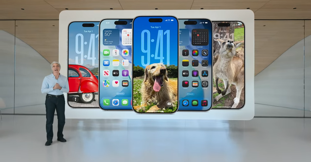
What’s the liquid glass exactly?
Overheating silicon
It means making it look like Windows Vista. Because that’s what we all wanted, the perpetuation of a crappy design.
jfc. that is one ugly looking ui. really scraping bottom of the barrel. that is soo last years.


