
You must log in or register to comment.
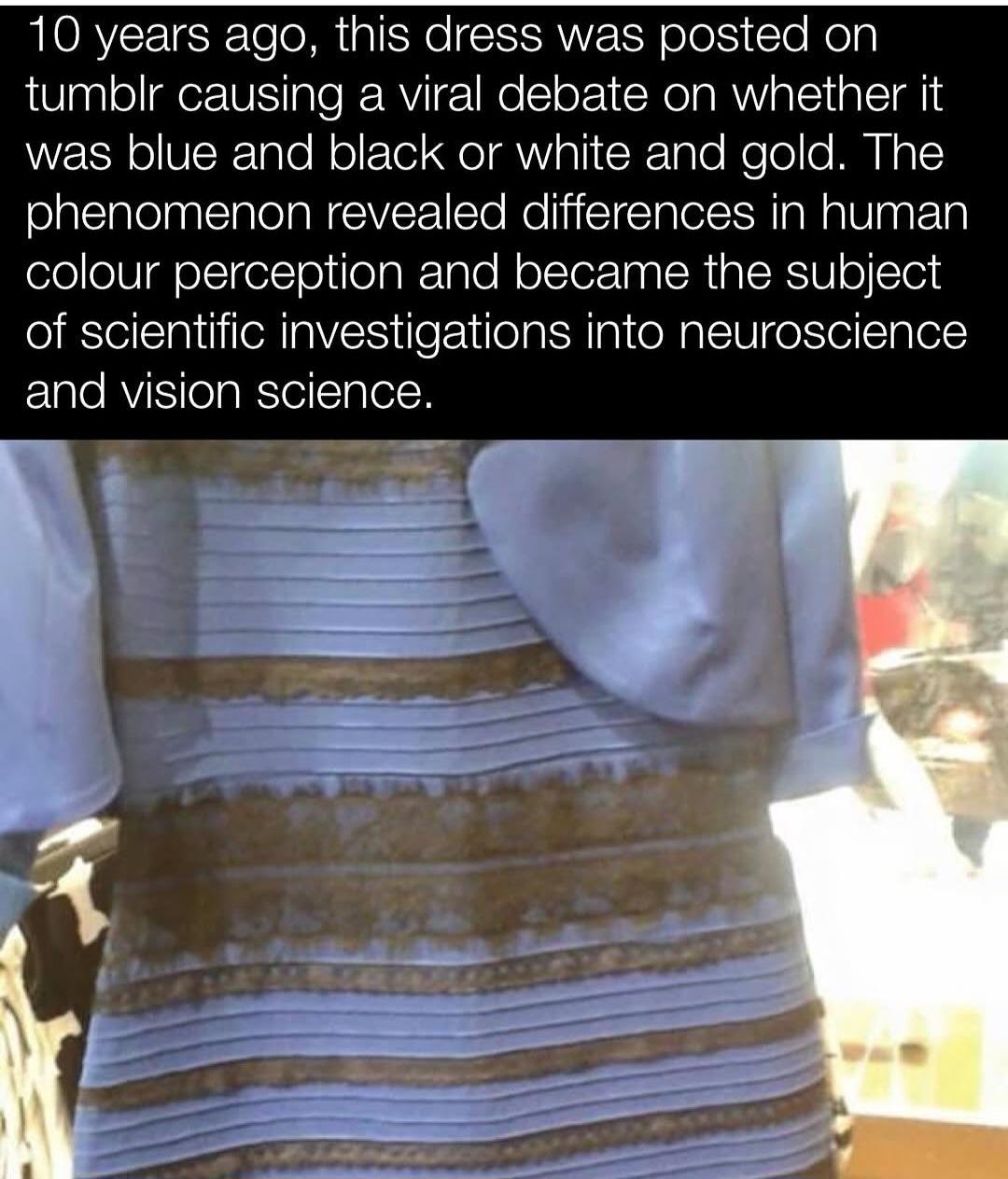
I’m still convinced this is the biggest troll. It’s clearly white and gold
Same, I always assume the ppl. Saying it’s black and blue are trolling me.
Stop trolling me. It’s blue and black. I could never figure how people might perceive it otherwise.
They see the blue as shaded white, and the glossy black has enough yellow reflected in it that they think it is shadowy gold. Basically, you’re seeing the dress as if it’s lit from the front. You see the colors as blue and black, because that’s what’s on the screen. But other people’s brains decide that the dress is backlit, so the colors facing the camera are actually shaded.
You can literally sample the rgb values and see it’s blue and black
Edit: am I part of the joke here??? It’s clearly blue and black…
am I part of the joke here??? It’s clearly blue and black…
The objective fact is…it is a blue and black dress. Other photos of the same dress show that.
But I cannot, for the life of me, see how anyone can possibly get that from this photo. Sample the RGB values all you want and it clearly is not black in this photo. The exposure and white balance have messed around with it so much it is incomprehensible to me how anyone can see it as blue and black.
“The phenomenon revealed difference in human color perception…”
Yes, you’re becoming a part of the joke. People LITERALLY see the dress differently. It doesn’t matter what the objective facts are. TBH, it says a lot about humanity. Even when we have evidence that subjective experiences can vary, and even contradict each other, we still end up arguing over whose viewpoint is “correct”.
That we’re curious problem solvers?
Anyway, science has determined that my way is most based
A study carried out by Schlaffke et al. reported that individuals who saw the dress as white and gold showed increased activity in the frontal and parietal regions of the brain. These areas are thought to be critical in higher cognition activities such as top-down modulation in visual perception
Speak for yourself. I’m a solvem probler.
clearly some problems need to be taken from behind
Solve me Daddy
The lighting of the room is clearly yellow. The black stripes look to be a very glossy material, which when lit with yellow light reflects goldish. There’s no way that lighting turns a white dress blue.
See, it always looked to me like blue light (or maybe shadow) around the dress itself, where the only sense it makes to my brain is that the fabric is white.
Whatever is to the right and behind the dress is definitely in bright yellow light.
Behind the dress, yes. No one’s disputing that. The difference between that bright light and the dress itself makes it look like it’s in shadow, at least to some of us.
Yes, and a room with that kind of lighting wouldn’t make a white dress look blue. Just the radiant light from those surroundings proves that it can’t be in that kind of shadow.
What room? It looks like we’re looking at the back of an object that’s facing out into bright sunlight.
Whatever the setting is, it appears to be bathed in bright sunlight. That’s the important part.
The front of it presumably is. But the back, that we’re looking at, seems to be in shade.
Light bounces around. That’s the whole point of ray tracing. Even if the dress were not in direct light, the light bouncing around the environment would prevent the kind of shade necessary for that.
The lighting of the room is clearly yellow.
That’s not clear to me. The dress looks like it’s in the shade.
Look at everything to the right of the dress, even to the left. Everything is illuminated with bright, yellowish light.

Optical illusion innit
Hey, just arguing with you in a different comment chain now. So, like, I see the optical illusion. But the background is clearly yellow in the picture? So I don’t understand how your brain is interpreting that part? To me it seems like you’re ignoring the background of the image for this point. Can you go more in depth on that part, specifically? Does that yellow light look blue to you?
Looks like a sunny background and that the dress is in the shade
So the idea is that the dress is, what, covered in an exactly dress shaped and sized amount of shade? Or else why wouldn’t we see shade anywhere else?
Because shade works in 3D and it’s not clear how far away the background is from this picture. But yes, ‘dress shaped and size amounts of shade’ exist; trees, could be on a shaded balcony, etc.
If anything, I’m more interested in how THAT color is being interpreted than the dress itself. Does it become shade to people because they perceive it relative to the dress? Because, I mean, we know that it is factually light. So how are people perceiving it to be the absence of light? Can you explain that bit?
The brain doesn’t just read raw brightness; it interprets that brightness in relation to what it thinks is going on in the scene.
So when someone sees the dress as white and gold, they’re usually assuming the scene is lit by cool, natural light — like sunlight or shade. That makes the brain treat the lighter areas as a white-ish or light blue material under shadow. The darker areas (what you see as black) become gold or brown, because the brain thinks it’s seeing lighter fabric catching less light.
You, on the other hand, are likely interpreting the lighting as warm and direct — maybe indoor, overexposed lighting. So your brain treats the pale pixels not as light-colored fabric, but as light reflecting off a darker blue surface. The same with the black: it’s being “lightened” by the glare which changes the pixel representation to gold, but you interpret it as black under strong light, not gold.
I dunno. It’s clearly a blue and black dress in a washed-out photo.
I guess I’m just used to seeing washed-out photos, and mentally adjusting the “whitepoint/exposure” (I’m not a photographer) in my brain or whatever.
I have washed out Polaroids from my childhood, so. I don’t think there’s any great mystery here.
If you tilt the photo around on your phone you can start to see it turn black and blue. IIRC it’s because the phenomenon depends on the angle viewed at
You can sample the colours and see it’s white with a very light blue tinge and gold.
People who see it as blue and black are (correctly in this case) auto-correcting for the yellow light as the dress itself is black and blue.

Whereas people who see it as white and gold are (subconsciously) assuming a blue shadow and seeing the pixels as they’re displayed.
You selected the brightest highlights on the dress. I selected more average colors here. I also included WHITE AND GOLD next to the selected colors, so you can see what they actually look like. Are you really saying that blue is white and brown-grey is gold?

Well you would select the brightest bit to get an idea of the bit that was least impacted by the shadow.
But yes still closer to white and gold than (dark) blue and black
It’s very clearly white and gold.
You can literally sample the rgb values
It doesn’t matter. This phenomenon can be explained by something called color constancy.
I remember some versions of this image where I could literally switch between perceptions at will, when I imagined different surrounding light temperatures/environments.
It’s a subjective perception.
I can literally switch between perceptions with this exact image. It’s sort of like that “are there six cubes or ten” illusion. Depending on how I look at it, I can see either one.

Exactly. Or that silhouette of a spinning ballerina. I can switch the direction that she is spinning at will as well. There’s nothing to go by because it’s a perfectly flat, projected silhouette without any shadows, so anybody is free to interpret the rotation however they like. 😁
Where the hell is the black supposed to be? Nothing is that dark here. I can easily accept blue, white, or gold, but there’s clearly no black.
You’re good. It’s black and blue. At a pinch, maybe blue and black.
Color is created in the brain, not in the pixel values. Pixel values often have no correlation to the color that’s produced in the brain.
What is global illumination from sky lighting again ??
Carcinogenic.
I’ve always really liked this explanation image you can find on Wikipedia page for it. Essentially, people who see white and gold are mistaking the lighting to be cold and blue-tinted, rather than warm and yellow-tinted.

The portions inside the boxes are the exact same colors, you can easily check this with a color picker.
As in using the colour picker on the image and finding the corresponding code? That’s actually an explanation that I can get behind. Classic example of trust your instrument.
I see the dress as gold and white, no matter ehow hard I try to see the other side of the coin.
Yup. Really you don’t even need the color picker, as the two horizontal bars seamlessly connecting the two dresses are there to show the same thing.
I think the most fascinating thing about this example image is that I can trick myself into thinking the dress on the left is gold and white. By zooming all the way in so that I can only see the black portion of the dress inside the box and then squinting, it begins to look gold to me. Then scrolling up slowly, the blue portion comes into frame and looks white. It isn’t until I zoom out that the illusion is broken.
I was once able to see the original image as black and blue (though I haven’t managed it today unfortunately), and its baffling how large of a difference it is. You’d think its like some bright sky blue or something, but no, its a deep blue like in the image I sent and our eyes are laughing at us.
Nope. Color cannot be measured, it is created in the brain. Pickers show pixel values (stimulus) and often don’t correlate to the experienced color.
But you could use one I think, and then have that colour isolated and then dump it somewhere
You cannot measure perception with a color picker. Eyes + brain is not a measurement instrument.
Just like you cannot measure amount of salt used in a dish with your tongue.
Ah, so white and gold folks are, indeed, mistaken.
Thanks!
This has been known for almost as long as the picture has been around. Still doesn’t allow me to see it.
Incorrect. It is impossible to deduce the “real” color from the photo, both sets are true.
The photo is simply bistable.
You can argue that “the real dress bla bla bla”, but nobody’s looking at the real dress and everyone’s looking at the photo.
But the dress in the photo looks like it’s in the shadow so it’s a fair assumption that the lighting would be blue-tinted.
How does it look like it’s in a shadow? The rest of the photo is over exposed like in bright lights so it’s safe to assume that the dress is over exposed too.
I wonder if could be an age component, too? Artificial lighting used to be a lot more yellow. “Party” lighting tends to be more blue.
Very interesting. I wonder how big the effect of culture is on how people perceive this situation
What the actual fuck? When this first came around, my eyes saw white and gold, in this post it looks like overexposed brown and blue, and looking at this graphic is fucking with my head! Brains are wee photo editors, aren’t they?
I don’t understand this, can you explain it?
In the left I see a black and blue dress with a yellow box. The dress inside the box is still black and blue (with yellow tint).
In the right side I see a white and gold dress with a blue. box. Inside the box the dress is white and gold, with a blue tint.
What am i supposed to see here? What is this telling me?
The dress inside the [left] box is still black and blue (with yellow tint). Inside the [right] box the dress is white and gold, with a blue tint.
The black and yellow colors inside the boxes are actually the exact same color, and the same goes for the blue and white colors inside the boxes (which is what the seamless bars connecting them is there to demonstrate). But they look completely different, right? The picture is showing us two different ways the exact same colors can be interpreted differently depending on the context surrounding it.
If you go to my profile and look at my comment before this one, I posted two slightly edited versions of the image that better show how they’re the exact same color.
The way this connects to the original image of the dress, is that some people see a gold and white dress because they think the dress is in blue-tinted lighting, as though they were standing in shade. People who see an overexposed image with a bright yellow tint, on the other hand, will likely see a blue and black dress. I couldn’t tell you why it happens, but it’s the way our brains perceive the lighting that’s doing it.
Yeah, this is the best explanation for why this ‘controvesy’ happened.
Certain background lighting conditions and colors can significantly alter the color and luminance of certain objects in that lighting environment, which otherwise, in less extreme lighting environments, look different.
Even just understanding basic color theory can show you how to make a color pallette out of either mutually complimentary colors, or highly contrasting colors… and how humans largely, (though apparently to differing extents and by different means), interpret a total color space by comparing and contrasting the colors within that space to each other, as opposed to against some objective reference point of all possible colors.
The other part of this explanation is that…
People were not talking about the same image.
Someone would argue one way, another person argues another way, and then someone else would do some kind of photoshop job to argue for one side, and their explanation and reasoning and justification would get lost, and ok now you have multiple images spreading around and being argued over by the same population that would…
… in 5 years, essentially start a civil war over the idea of whether or not it makes sense to wear a mask during an epidemic of a virus transmitted in the aerosolized spittle from sneezes, coughs, and even just breathing.
But yeah, when this was an ongoing thing, I’d have multiple different people in different camps… sending me actually different images, and it took a while to figure out which one was the actual original origin image.
Which of course I had to do on my own, but critical thinking and basic research skills, an impulse to verify the base assumptions of a claim or argument… many people do not know how to do this, or only selectively do it with things that challenge their pre-existing notions.
Yeah that would never happen a war. Imagine of 3 groups of people worshipped the same God, just prayed to him on the floor, to a wall, and to the ceiling.- I’m sure they would get along and be super harmonious.
If theyre the same color, why can i see the black outlines way clearer in the yellow dress w/ blue tint side ?
That would be because the outlines themselves are not the same colors, just the blue/white and black/yellow sections. Here’s an image I quickly edited with the outlines and skin removed, so you can see just how much an effect they have on the image. Both dresses still look normal, but they no longer look like completely different colors when compared together this way.

(edit): And here’s the same image with the outer boxes removed, to show how much the lighting is affecting things, where one of the dresses just looks completely wrong to me now.

I feel so dumb, you did such good work on this and… OK maybe I’ll just take another look in the morning and it’ll make sense
lol I prob need those images described cuz for some reason…. I don’t even really know what I’m looking at heh… I’m not this dumb on other topics
The two boxes are meant to be different types of lighting. The box on the left is a warmer, yellow lighting while the box on the right is a colder, blue lighting, which you can tell from its effect on the grey background. The portions of the dresses inside of this “lighting” are the exact same colors, which I tried to help demonstrate with the second picture. The portions of the dresses outside of the “lighting” represent their real color without any lighting affecting them.
The point of the image is just to show how two different colored dresses could look exactly the same depending on the lighting. At the same time, the real dress from the original image is seen as different colors by different people because brains are weird and they interpret the lighting differently.
Some people see a gold and white dress in a blue-tinted light like they’re in the shade, while others see a black and blue dress that is overexposed by a bright yellow-tinted light.
You are wonderful!
A couple very helpful things you said:
Its effect on the gray background plus different color dresses can look the same based on lighting. (lol the second point is childishly basic but yeah it helped)
Going to show this to a friend and see if I can’t just deepen my understanding a bit more. Thank you [king][queen][royal] Lemming
Edit: r u a scientist? Well, I mean “classically trained” in that field/industry? Cuz obvy ur citizen scientist AND EDUCATOR 🫡
I never understood this concept until you made the outlines the same. That’s the tip i needed to get over the edge. Thanks!
When the discussion started, I saw white and gold too. Then, at some point, I saw blue and black and since then I’ve never been able to see it as white and gold again.
And you are obviously right. I can see it with my own eyes.
I can see both so I promise you it’s not a troll, but it is a wild phenomenon.
Then you clearly have a brain/eye defect because not only does it look black and blue, but the actual dress in real life is black and blue.
I’ve only ever seen it as blue and black. I can’t force it the other way like I could with Laurel and Yani. Y’all seeing white and gold astound me.
I still think the white and gold people are trolling.
If this “viral dress debate” has taught me anything is that you can claim whatever bullshit online and bunch of people will believe it. Post an orange and claim it’s blue even though it’s clearly orange and there will be a percentage of idiots who will believe that the orange is blue because someone said so. And we’ll have virale debate about a fucking orange.
Of course there are vision conditions like daltonism and we have variances in perceptions of color gradients, but white and gold doesn’t suddenly become blue and black…
white and gold doesn’t suddenly become blue and black…
This dress is blue and black 🙄
deleted by creator
The whole argument around it is not how we perceive it but how camera perceived it in a flawed lighting condition.
That’s like taking a shitty 2 Mpix photo with a potato from 2003 and truncate it to 8 bits and then claim broccoli is fucking blue because the camera had no fucking concept of a tone mapping or color temperature and captured it as blue.
Also if you put color picker on it it’ll be in the white spectrum and barely register a mild hint of blue. And if the dress was blue, then you’re one shitty ass photographer and has nothing to do with our actual eyes. You can make a blue dress look almost white. Anyone who ever had aquarium with beautiful metallic blue fish and used wrong lighting and turned them into bland beige silver color will know what I’m talking about.
It’s not as simple as that. There actually is a human perception element. Take a copy and ask a few people what they see. Even while you are all looking at the exact same thing, people can disagree. It can even happen to you where the colours flip.
Colors do not just magically flip, not outside of gradient variances and medical conditions. This is absurd bs just like this whole “viral” debate where people were arguing over how camera captured the stupid dress. The camera captured it in that stupid way to look entirely different, not my eyes. Even color picker in image editor proves that on the photo of the dress, the gold is gold and the white is so far washed out blue that can easily be declared white. Are you going to claim mathematical tool has wrong perception of color too?
The camera captured it in that stupid way to look entirely different, not my eyes.
It is clearly blue and black on this photo.
Photoshop’s color picker disagrees with you…
Are you blind?
Confidently incorrect perfection.
I’m curious which color you perceive?
You mean which color camera perceived when the photo was taken?
I mean what do you see when you look at the picture? Genuinely curious 😊
I never really understood the debate. In reality, if you were standing in front of the dress it is black and blue. Now, if you take a digital photo of the dress and post it on the internet as a terribly compressed jpg, with weird white balancing, and brightness/contrast turned up and down it is gold and white. The debate isn’t really about the reality of the color of the dress but the reality of a badly edited photo.
It’s more about the colors around it. This image from Wikipedia does a really good job illustrating the effect.
Context is extremely important in identifying color. As Technology Connections tells us, for example, “brown is just orange with context.”
What always confused me is, the picture clearly seems to be overexposed, which means the blue/black interpretation should be obvious.
It’s because we’re also very used to seeing photographs of a subject in shade while the background is in full sunlight. If you take a picture of a white and gold dress in the shadow of a patio, with the background all fully lit by bright sunlight, the actual pixels representing white objects in the shade would be that bluish gray tint.
The problem here is that the dress isn’t in the shade but those of us who see white and gold simply assume that it is in shade, while black/blue viewers (correctly) assume that it is under the same lighting conditions of the overexposed background.
This thread has been helpful for understanding how others could see it as white and gold; I never realized people were actually seeing it as in shadow.
I agree. But my wife was so firmly in the white/gold camp that I had to find this (and a better image of the actual dress, which is indeed blue and black) to help us understand one another’s perspective.
And what everyone seemed to omit: the reality of peoples’ wildly uncalibrated monitors/phone screens.
Properly calibrated screen for graphic design here, multiple mobile devices. Never any major variance unless it’s a different image.
if you take a digital photo of the [ … thing … ] and post it on the internet as a terribly compressed jpg
That sums up the entirety of the content on a number of popular subs on the R-word site.
Confusing perspective? No. More like confusing JPEG artifacts.
You used to be able to report shit for not being confusing, but it was placebo at best. That site sucks so much.
Is it, though? Is this dress in the pic only white and gold to everyone who looks at the picture/the original?
For your information : the dress is really blue and black, according to the store and manufacturer. The vast majority of people see it as white and gold, but I personally think most people are not used to decrypting overexposed pictures, hence their inability to perceive the right colors.
not used to decrypting overexposed pictures
I used to see it black and blue, now I see it white and gold.
+ I do photography and often have to work with overexposed pictures
Edit: just looked at it again now its black and blue. Wtf brain
overexposure is not the issue but improper white balance, the camera was probably set for ~6800K but the lighting in the room was ~2700K
I’ve never seen it at white and gold. Even the brightened photo, while I understand what’s happening to make people see white and gold, is still blueish/purple and black to me. Does that mean I have a tumor?
So closed minded smh
Hey, I have friends who are white and gold… I’ve worked with white and golds.
Wow you figured out how to break JPG encryption? Someone call Alan Turing, we got a prodigy over here
Decrypt is closely related to the word “interpret”, which is something I personally interpreted from a history of decrypting English text written by nonnative speakers on the internet. 👍
The same words often have different meanings in different countries; something you should take into account in case you ever decide to take a German gift from a slim Dutchman.
“Decipher” is a mostly synonymous word which is more commonly used in that context.
I’m French, we often use comparable actions verbs even if it’s not their real context. More commonly known as the metaphore stylistic device.
I’m not French, we also do it, it’s commonly done and you were completely legible. Dude needs to chill
Is it common for the French to put together random semi-related, mostly nonsense words to try and sound like you know what you’re talking about?
No need to be so sassy c’mon
Being sassy is fine, but being sassy and incorrect makes you look silly.
Just calling em like I see em, but fine. Carry on with the nonsense
I was gonna let you be stupid without saying anything, but you doubled down twice so now I will prove that you are wrong.
The first definition of decrypt in the American Heritage Dictionary is “To Decipher” I’ll admit, not super helpful, so let’s look at the definition of decipher. “To read or interpret (ambiguous, obscure, or illegible matter)”
So for someone to “decrypt” an overexposed picture, they would be, by dictionary definition, trying to interpret what the ambiguous picture was actually showing, since the lighting was making it unclear.
You are in the wrong when saying they used the wrong word, you just don’t have as good a command over the English language as you thought
Do you see em as white and gold?
I have not enjoyed passing through your comments in this thread
Sounds like you need to open a dictionary ! It’s one of those big, stern books. Books are those stacks of paper bound together on one side.
It’s subconscious it’s not something you can learn. If that were the case people would have no issue understanding how others weren’t ‘decrypting’ the photo.
Also the majority see it as blue and black. 30% as white and gold.
The Journal of Vision, a scientific journal about vision research, announced in March 2015 that a special issue about the dress would be published with the title A Dress Rehearsal for Vision Science.
The first large-scale scientific study on the dress was published in Current Biology three months after the image went viral. The study, which involved 1,400 respondents, found that 57 per cent saw the dress as blue and black, 30 per cent saw it as white and gold, 11 per cent saw it as blue and brown, and two per cent reported it as “other”. Women and older people disproportionately saw the dress as white and gold. The researchers further found that, if the dress was shown in artificial yellow-coloured lighting, almost all respondents saw the dress as black and blue, while they saw it as white and gold if the simulated lighting had a blue bias.
Another study in the Journal of Vision, by Pascal Wallisch, found that people who were early risers were more likely to think the dress was lit by natural light, perceiving it as white and gold, and that “night owls” saw the dress as blue and black.
A study carried out by Schlaffke et al. reported that individuals who saw the dress as white and gold showed increased activity in the frontal and parietal regions of the brain. These areas are thought to be critical in higher cognition activities such as top-down modulation in visual perception
ITT: people telling other people they’re trolling rather than accepting that humans can perceive reality differently, and the own perception is never objective.
“humans can perceive reality differently”, yea, that’s true, but the thing with the dress picture is that it’s so obvious that there is a bright white light, that people doesn’t see it, like, never in it’s entire life have ever use a flashlight or somelight like that and see how shuch kind of light can get colors brighter. We have the sun, damnit. If the light in the picture were more blue or purple like, the dress would be more darker, BUT! if the dress were actually white and golden/yellow,with the light said before, would be getting the same result, but it’s not the case.
“humans can perceive reality differently”, yea, but this is not of one cases
Well, except, there is an objective perceivable reality. And we all see it. If you saw the dress in the correct lighting, you wouldn’t have trouble discerning the color unless you had a malformed perception in the first place.
No this is exactly incorrect. We do NOT perceive objective reality. All perception is subjective, and then goes through a further filter of interpretation. If someone says something is blue, there is no guarantee they perceive it the same as someone else. On top of societal pressure itself being able to change perception.
This is why in every scientific endeavor we try to take humans out of its as much as possible.
Right, we may not perceive objectively, but there is an objective reality and it is perceivable.
The reality is that this dress is blue and black.
If you see it as white and gold, either there is a lighting issue manipulating your perception or your perception is malformed in the first place.
Your eyes should be automatically accounting for the exposure and you should be perceiving this objective reality correctly. If you aren’t, you are objectively wrong, and so is your perception.
Hope that clarifies for you!
Do you realize we could both look at a red surface, both call it “red”, but for me it may look like blue looks to you? We would never know, because we grew up pointing at something and calling it red.
You are calling it “malformed perception”, but thats exactly my point: ALL perception is malformed. Humans are not capable of perceiving objective reality and the belief that we can is an issue at the root of many of societies problems.
Right, so why does what you just said matter, exactly?
You do know that we know the scientific reason for why we see what colors, right? And that we can check things to determine what color they are because of that?
So… again… that doesn’t matter. There is an objective reality. We might not perceive that reality the same or in an objectively correct way, but we do tend to perceive it in a CONSISTENT way.
The people that are wrong about this aren’t wrong because they “see different colors” because of some “subjective perceived reality”. That’s not how it works. If that were the issue, it would be indiscernible and unknowable. Because we would have no idea that we are seeing different things. People know they’re seeing different things, and we can explain why (like I already did. It’s lighting). Context is an important part of perceiving, ykno.
It is interesting it’s only the black and blue people who don’t seem to get it and get emotional over it.
Probably bcos the white and gold people are strictly wrong and it’s incredibly obvious to black and blue people but for some reason there’s a stupid debate because some people are bad at looking at things?
That take only works if you ignore how visual perception actually works. White and gold viewers aren’t wrong—they’re seeing the same pixel values as everyone else, but their brains interpret the lighting differently. The photo has no clear cues about illumination, so the brain fills in the blanks. Some people assume shadow or cool lighting and perceive the colors as lighter, others assume warm light and see them as darker. Both are valid perceptual outcomes given the ambiguity. But here’s the kicker: the actual pixel values in the image are pale blue and a brownish gold. So in terms of what’s literally in the image, white and gold viewers are actually closer to the raw data, regardless of what color the physical dress is in real life. The idea that black and blue people are just “right” misses that distinction completely. What’s especially funny is how often that group doubles down like they’ve uncovered some grand truth, when in reality, they’re just less able—or less willing—to grasp that perception isn’t about facts, it’s about interpretation. It’s like watching someone shout that a painting is wrong because it’s not a photograph.
Ig what you’re failing to understand is that since I, ykno, interpret the lighting correctly? I know I’m right? And everyone that’s wrong is… Bad at looking at things.
If the question were literally referring to the pixel color codes, I wouldn’t argue. But the question refers literally to the physical dress.
Can you explain why people see the lighting differently?
It’s not though, it’s about the picture. We don’t have access to the dress only a digital representation which objectively is a very pale blue and brown, not black and blue.
I gave some of the reasoning as to why this happened in my original comment, but given you’ve doubled down on ‘interpreting the lighting correctly’ and that people are just ‘bad at looking at things’ I guess it’s a bit above your pay grade.
Nonononono, you are wrong. The question has always been “is this DRESS this color or this color?” NEVER EVER has the question been "Is this PICTURE of the dress this color or this color?
I doubled down on… being correct? I mean. That’s what happened. I interpreted the lighting correctly. So… go ahead and argue against that?
What do you mean you gave your reasoning? You’re talking about how you explained how some people interpreted the lighting incorrectly because they are bad at looking at things?
It is a picture of a dress. It’s not a real dress. It’s a digital representation. Any question posted alongside it is regarding the digital representation obviously as it is not a real dress in front of us.
You doubled down on lacking the depth to understand what’s actually going on and why you cannot see the true pixels displayed when others can.
Sorry, forgot to clarify in my last post:
How, exactly, is the lighting ambiguous? The entire picture is covered in golden light.
The image has a strong yellowish tone, but there’s no clear source of light, no visible shadows, no specular highlights, and no environmental cues like windows or lamps. The background is a blown-out mess of overexposure, and the lighting direction is totally unclear.
Some people’s brains interpret that yellow cast as warm lighting falling on a blue and black dress. Others interpret it as cool shadow across a white and gold dress. That’s why it’s ambiguous — the image lacks the kind of contextual clues we usually use to judge lighting. What you see as a scene bathed in golden light is your brain choosing one of two plausible explanations and running with it.
If the lighting were actually obvious, this would never have gone viral.
…shortly after, the internet broke people’s brains though addictive feed algorithms and everyone lost their minds. But then Lemmy was born to restore the internet to an early more fun time. Lemmy just hopes that one day it will have its own dress moment.
Never understood this one, or believed anyone who said they saw black/blue. You can zoom in and colour pick, the colours are measurable and objectively gold and blue-white.
Sorry but it’s white and gold. The white only gets a blue hue due to the ambient lighting.
And it never is black!
I can’t see it as anything but white and gold. However, other photos clearly show it is black and blue.
Interestingly, if I’m scrolling past, my brain will sometimes perceive it as black and blue for a fraction of a second. I can normally flip optical illusions at will. This one jams me in the wrong viewing mode.
I still don’t see either. It looks blue and gold to me
Me too!
Same!
Strangely enough, I saw it as black and dark blue at first, but then something switched and I’ve been seeing it as light blue and gold ever since!
Same. Initially white and gold, but now mostly blue and gold, although if I stare at it I can make it change back and forth.
THANK YOU
This is the first time I’ve seen this take upvoted.
ffs now it looks blue and gold. am i dying?
it has always looked light blue-ish, like a periwinkle, and gold to me, as well
I swear this is a gif with very long loop time. I see it black and blue 90% of the time and the its in my feed and bang, white and gold… and I can’t change it no matter what I try.
ARE YOU FR? WHO REMEMBERES THIS? IS THIS A SARCASTIC POST??? SAY SIKE OP
So people looking at this photograph actually can perceive this to be white and gold? thats utterly wild. And hard to believe.
deleted by creator
C’mon, it is clearly blue and black 😁
The actual dress was in fact blue and black.
those color illusions always wreck my brain

This literally clears up nothing for me and I’m about to lose it. It’s still fucking blue and black
The real dress is actually blue and black, yes, but the illustration tries to show how the exact same colours can look different depending on lighting and context.
In the diagram, the dress on the left is strongly blue and black, while the dress on the right is strongly white and yellow.
And yet the connected parts of the dresses with the “pipes” between them show the exact same colour on one dress can look like a different color on the other. The “pipe” is there so you can follow it with your own eyes from one side to the other and observe that it is indeed the same colour on both sides, despite looking very different when observed as part of the whole image.
The point being, how our brains perceive colour is very situationally dependent, and some people assume a different situation than others, hence the differences in perception.
People tend to believe that vision is absolute, that we all have the same eyes and see the same things, but that’s absolutely not true. The dress phenomenon occurred because It’s not about what your “eyes” see in absolute terms, it’s about what your “brain” does with that information.
another thing that makes it weird is the black lines for the folds of the fabric are much darker/defined on the “blue” side
if you’re in a room with yellow lighting, then the “black” actually looks black. but if the lighting in the room is blue, then the “black” looks yellow. it’s the different surrounding colors that makes one certain color look like 2 different colors
What finally worked for me on the image above is to look at the yellow dress on the image above on my phone, then zoom in on the part in blue light, then squint so I barely see what I’m doing and move the zoomed in section so that it only shows the party of the black and blue dress in yellow light, and then open my eyes again. Then it finally looked yellow and white.
This explains it neatly, the “gold” (which isn’t a color btw) is just brown, and the blue is quite light.
It’s all about contrasts, put a color near a light one and it appears darker, put it near a darker one and it appears lighter.
Bet the bordercolor on different browsers/phones made it look more one way or another.
Also, cold shadows are devoid of yellow so a blue is easily mistaken for a shadow. The impressionist used this trick a lot, light blue/cyan for shadows. Sounds crazy but it works.
Very clever trick.
The link looks blue and black but the post still looks white and gold…
Edit: IT CHANGED TO BLACK AND BLUE WHILE I WAS LOOKING AT IT
deleted by creator
Yes. The people who see white and gold must not register the yellow indoor light of the picture and are probably very outdoorsy people.
Brother I’m more vampire than man and I can only see white and gold. I have no idea how to use it as black and blue
Nope.
I’ve actually experienced the perceptual shift from blue and black to white and gold. The moment was fleeting, but definitely registered white and gold. And then back to blue and black, and I’ve never been able to replicate the shift.
I’m usually pretty good at shifting between the two ways to perceive optical illusions. But for this one I cannot see anything but white and gold. Even knowing that it’s actually blue and black, I still see it as that.
Having seen (briefly) what you see, I get it.
Hm, this is interesting - I am indeed “outdoorsy” and could only see “white and gold in shadow”. I think this might also be because of the highlight on the right suggesting that it’s daylight all around and the dress is in deep shadow, and the blue color is also highly reminiscent of “white cloth in deep shadow”. This XKCD helped me clear up the confusion and now if I squint I can see both color schemes:


