- cross-posted to:
- [email protected]
- [email protected]
- cross-posted to:
- [email protected]
- [email protected]
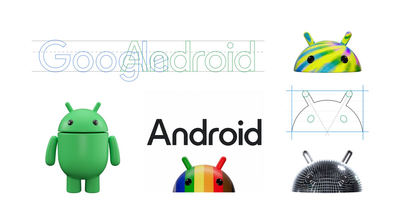
The bugdroid is now in 3D lol
You must log in or register to comment.
It’s fine. Very much AR-vibes like others say.
Don’t see why they couldn’t just spew iterative inclusive designs over the 2D one, this is kind of badly animated and has a 00s vibe to the concept. The disco ball-skinned and spiky mohawk examples are downright repulsive designs
deleted by creator
Not seeing the improvement. Looks like change for change sake.
it does match Material You better imo
Looks like change for change sake.
GUIs swing back and forth between 3D and flat ever since Microsoft released Internet Explorer 4 for Windows 95 which introduced flat GUI toolbars. That watercolor Office release had the look planned for WinXP but Apple released Mac OS X with its (for that time) super realistic 3D icons and GUI widgets and Microsoft wanted to counter that. In fact, most such changes were initiated by Apple and were never about functionality.
So we got away from the 3D style just to go back to it?
Not to mention how that had an android generator app thingy around 2.2 but after a short time stopped updating it then pulled it from the store.
To me this screams AR/VR focus in the next versions, I think they want to go after Apple’s Vision Pro and do kind of like they did a few years ago when they brought some depth to the MacOS icons
Those new animations seem pretty oriented toward video ads.
I guess some designers needed to prove that Google needed them, or just had enough time for a vanity project.
Looks like Android put on some weight.
Too much upside down cake perhaps?
threee-deee
I‘m all for a return to a more 3D look and feel, skeuomorphism etc. But those just look… off.
This is so wrong.
I don’t like the capitalization of the letter A
It looks… Wrong for some reason
seems like the lowercase era of silicon valley is over
I love it but also if they ever get rid of the mascot I’m going to cry worse than getting rid of the desserts
It is my understanding that the “bugdroid” was not designed to be Android’s official logo, the artist released it under a Creative Commons license, and Alphabet has adopted it as a mascot. Even if Google deprecates its use, it’s still out there.
That’s cool, it means it can be adopted and used without a corporate tinge to it.
They call the droid a bugdroid? Interesting name choice as a software bug normally isn’t a good thing.
For some reason I always thought the Android mascot’s name was “Andy”, but I can’t remember where I had heard that from.
I definitely like Andy over bugdroid though…
Creepy-droid. It’s head and feet are facing forward and the body in between is rotating freely.
deleted by creator
It’s taking inspiration from south park Canadians.
“what are you creeped out aboot eh?”
Waiting for the people who keep saying logos are just getting simpler and simpler
“pLeAsE dOn’T tUrN mE iNtO aN oVeRsImPLifiEd LoGo”